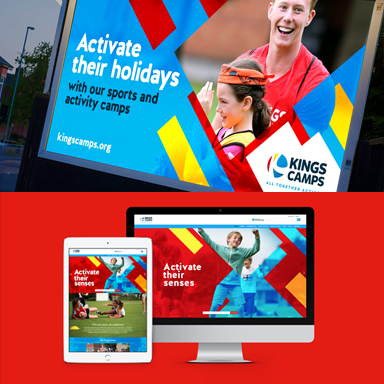
Over the last few months we’ve been working closely with Kings Camps on a number of projects, starting out with a new design direction to work both online and offline. There’s been a lot to work on, but we’re happy to finally share what we’ve been up to!
The initial campaign was designed to focus on what Kings Camps really want to push – getting kids active. A new design was developed by Über, using strong graphical shapes with a sense of energy and movement to convey the message of activating children to tune into their senses. The bold shapes were key for injecting colour, interest and focus on a key part of the visual. The campaign also involved the design and build of a responsive WordPress site, with Über fully managing the site’s layout and content.
Following the introduction of this new design direction, we’ve then worked on a second, summer campaign, this time focusing on school summer holidays and the great experiences available at Kings Camps. ‘Make Summer Count’ became our strong call to action for both parents and kids, with numbers also key to the concept, showing the huge range of activities and the measure of emotional value gained from activities.
Our team has also worked on redesigning and aligning Kings Camps specialist programme logos with the new core identity. Representing Football Kings, Cricket Kings and Swim Kings, all logos appear on the website, future print collateral and any promotional material.
We said we’d been busy! You can view the new site we created for Kings Camps here.


