BUDGENS
Budgens is a UK supermarket chain with over 165 stores nationwide. Positioning itself as a premium alternative in the convenience shopping space, a focus on high quality, locally sourced products and produce makes Budgens stand out from the crowd in this typically price-driven sector.
THE CHALLENGE
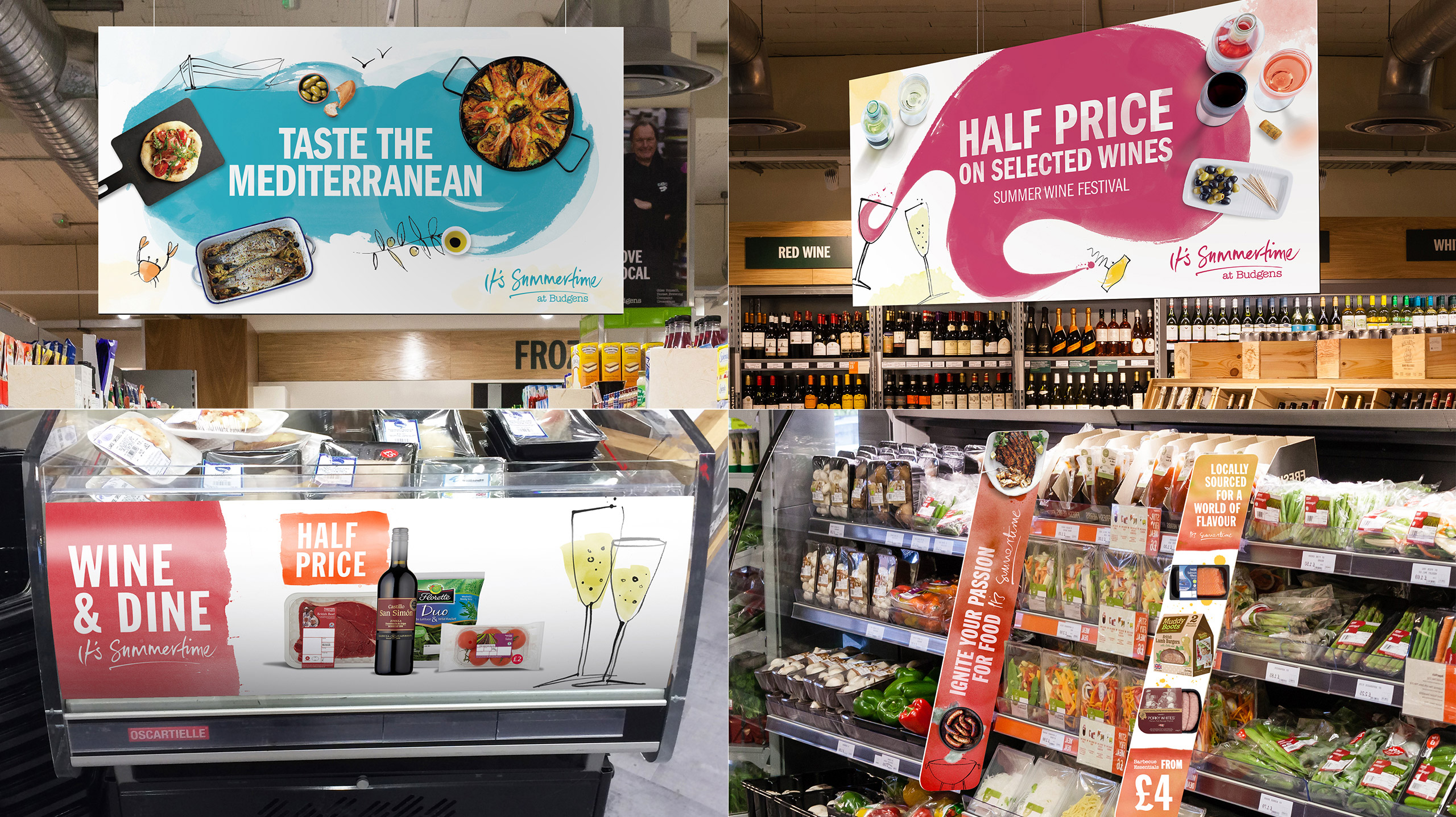
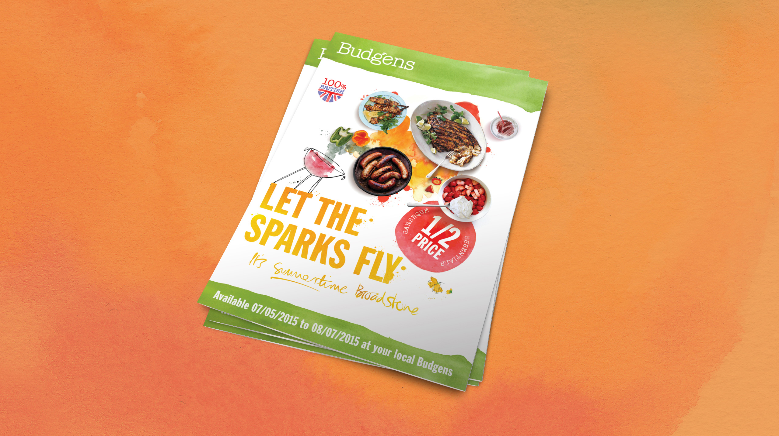
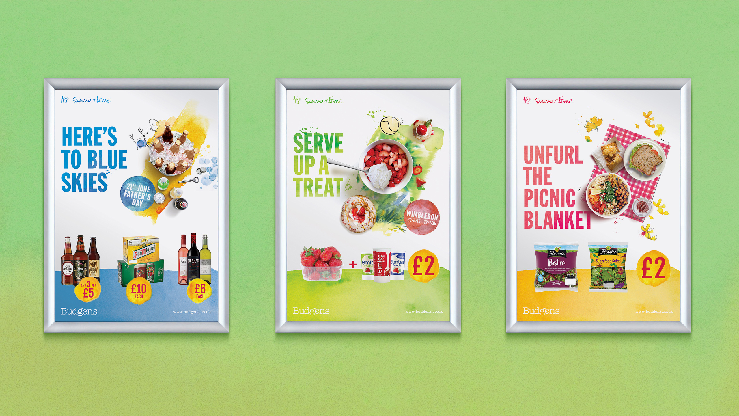
Budgens needed a visual identity for their early and high summer seasons that showcased the fantastic, fresh produce and great value available in-store. The concept had to both clearly affirm the brand’s quality credentials, whilst striking a fine balance to ensure pricing and offers were also clearly communicated to drive sales. It also needed to be highly adaptable to enable it to work on everything from small items of POS such as shelf talkers, all the way up to large-scale external banners.

THE SOLUTION
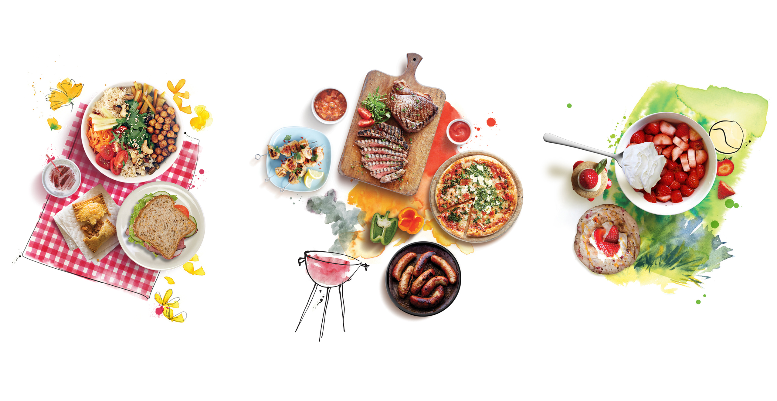
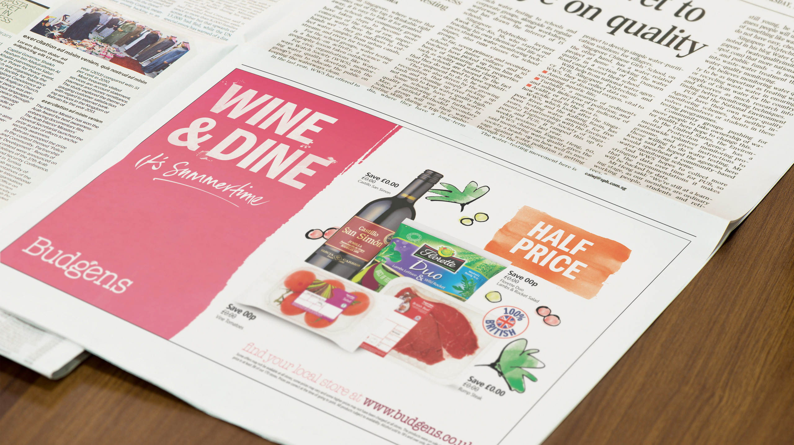
Combining hand-drawn illustrations, watercolours, bold type and top-down food photography, we created a unique and bold concept that showcased fantastic produce and compelling offers in a clear and beautifully enticing way.
It perfectly conveyed the high quality proposition of the brand by delivering a look and tone uncommon in the convenience retail space, yet retained many of the hard-working hallmarks that ensure effective delivery of messaging and - most importantly - driving sales.
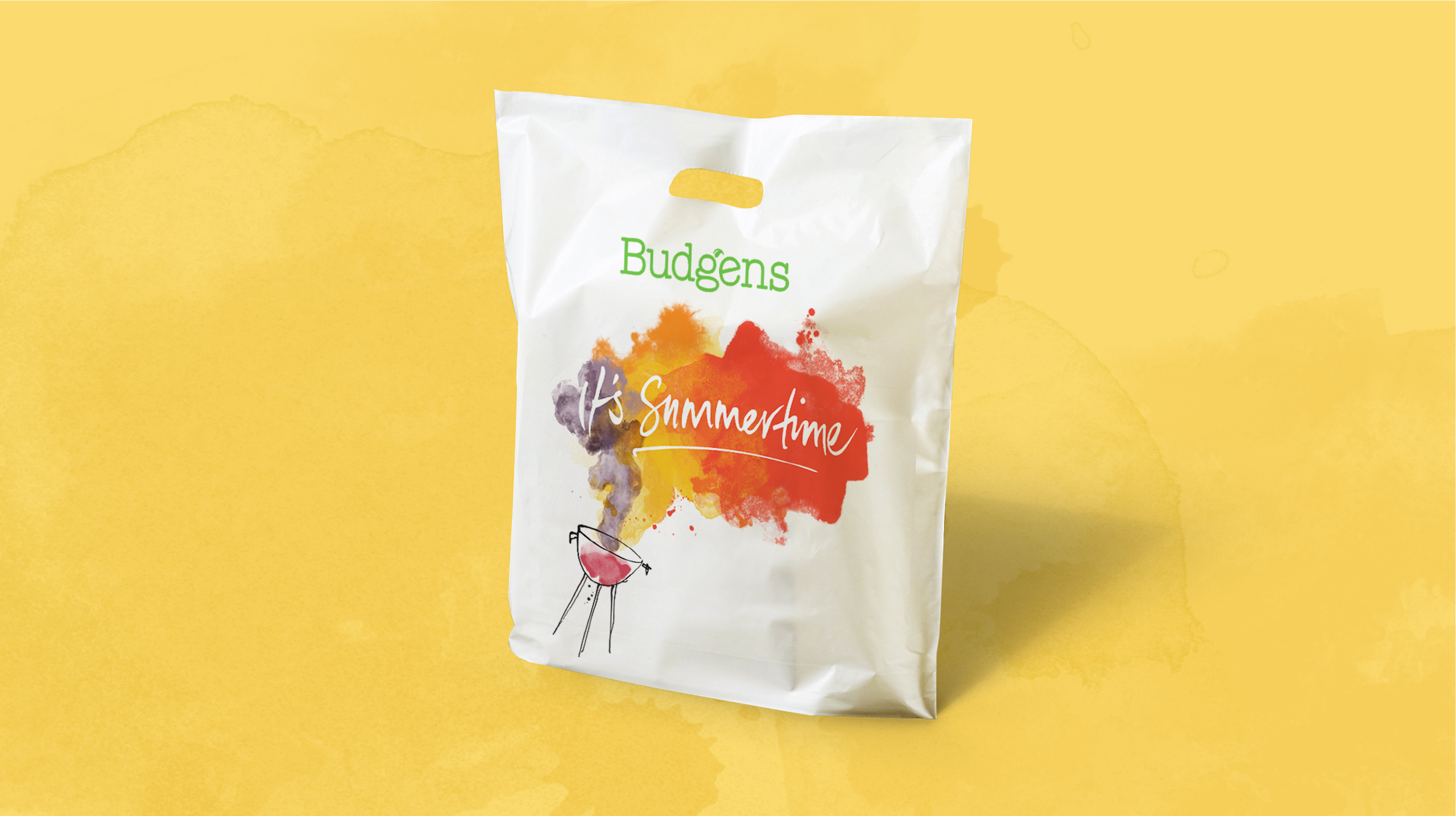
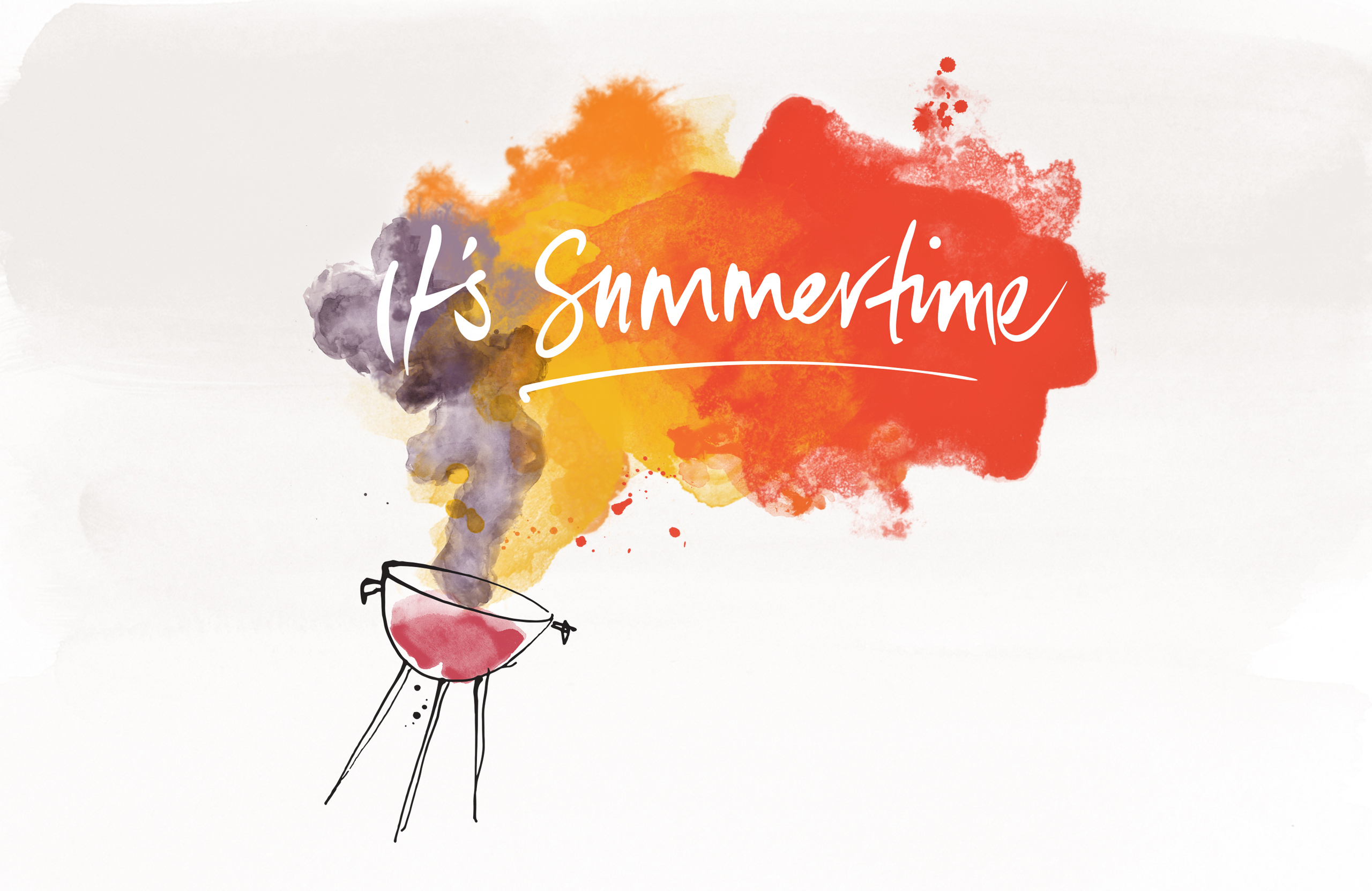
The ‘It’s Summertime’ line was created as a sign-off and used on key showpiece collateral in contrast to the bold headlines and price messages used elsewhere, heralding the start of the season in a friendly, approachable and celebratory tone.
