TUBS
Tubs is a fresh and exciting startup that emerged from a passion for creating innovative and high-quality ice cream. Founded by a group of culinary enthusiasts, Tubs aims to revolutionise the way people experience frozen desserts. Drawing inspiration from local ingredients and global flavours, the company is dedicated to crafting small-batch, artisanal ice cream that focuses on both taste and quality. Whether you're a classic vanilla lover or an adventurous foodie seeking new and exciting combinations, Tubs strives to make every tub a memorable experience.
CHALLENGE
We were tasked with creating a bold, distinctive brand identity and packaging to match Tubs' mission of innovation and quality. As the company expanded, they realised their current branding no longer captured their playful personality and approach to ice cream. We were asked to craft a visual identity that not only reflected Tubs' commitment to small-batch, artisanal flavours but also resonated with their adventurous customer base.
The challenge was to strike a balance between modern, clean aesthetics and a sense of fun, while creating a distinctive personality for each ice cream flavour. The new identity needed to stand out on crowded store shelves, evoke a sense of indulgence, and ultimately become synonymous with the Tubs experience.
SOLUTION
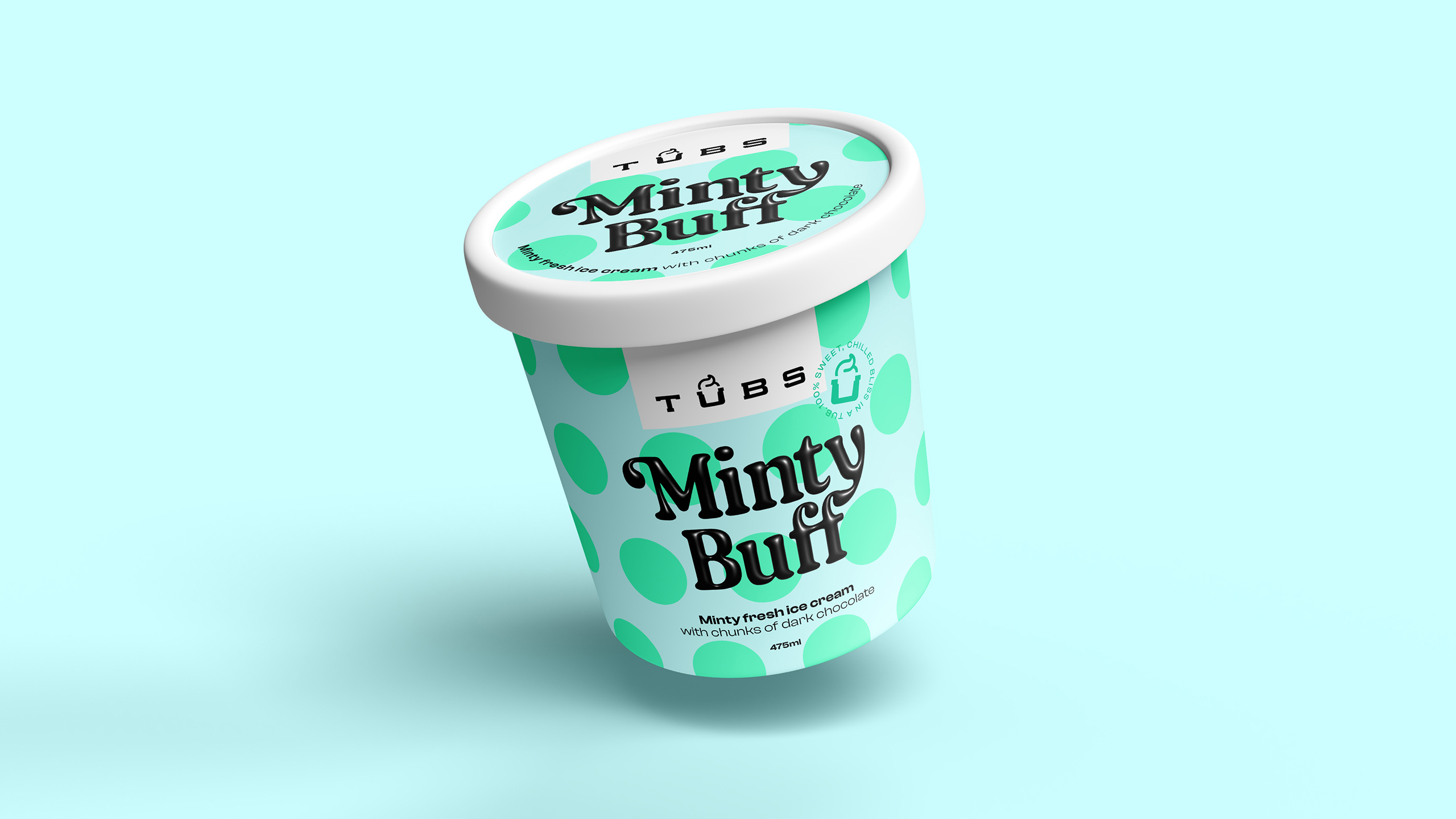
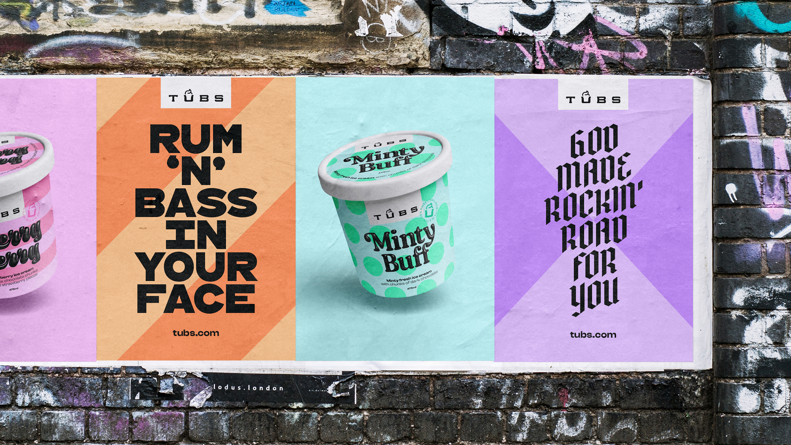
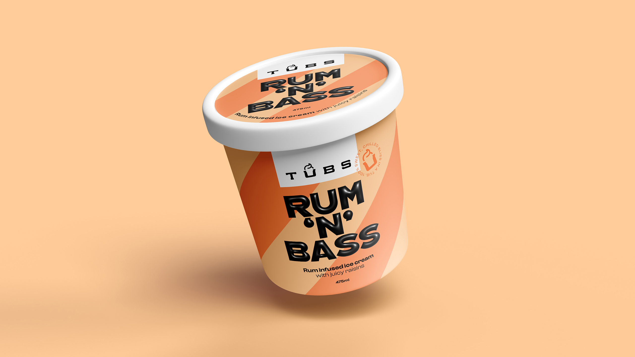
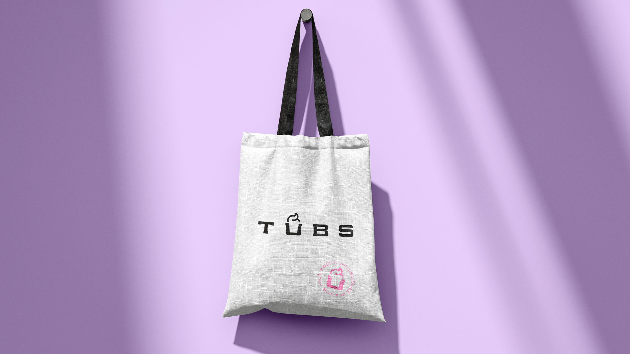
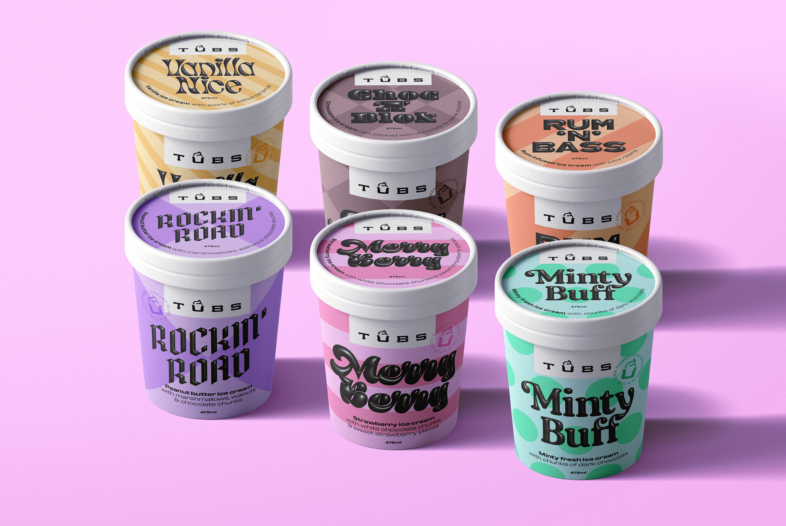
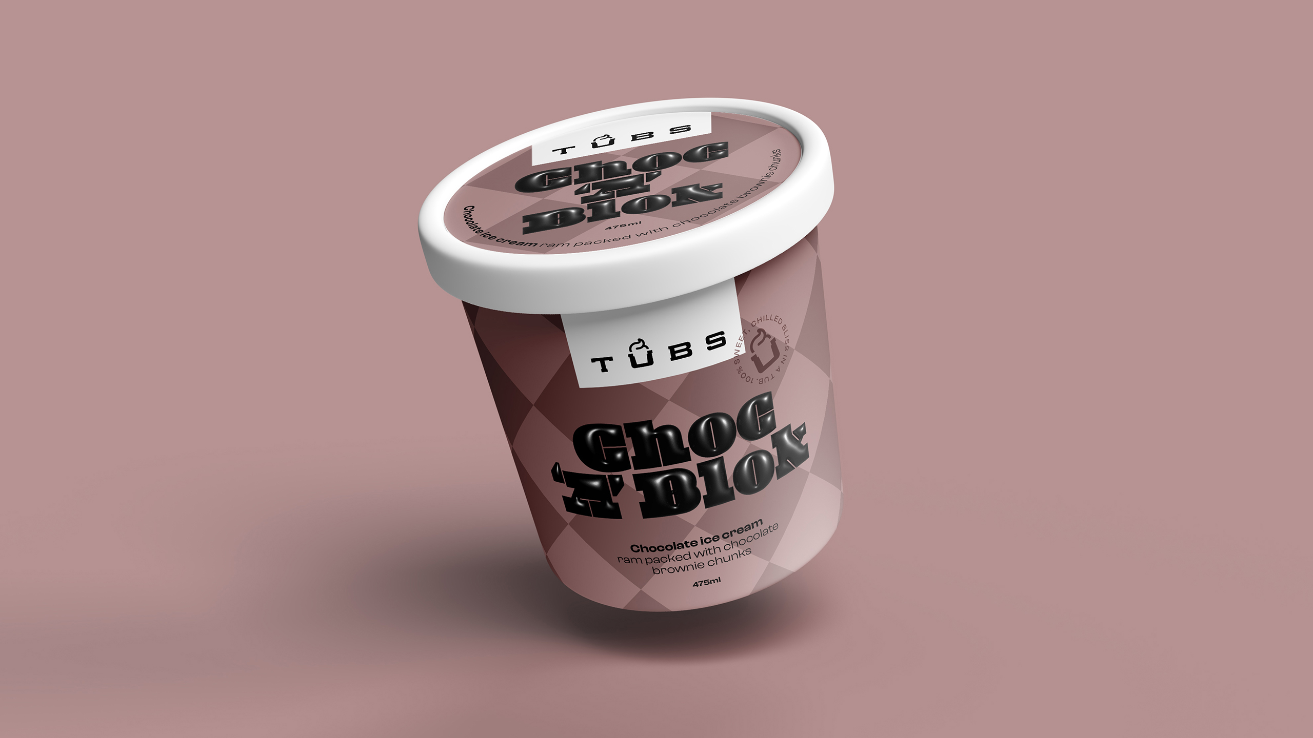
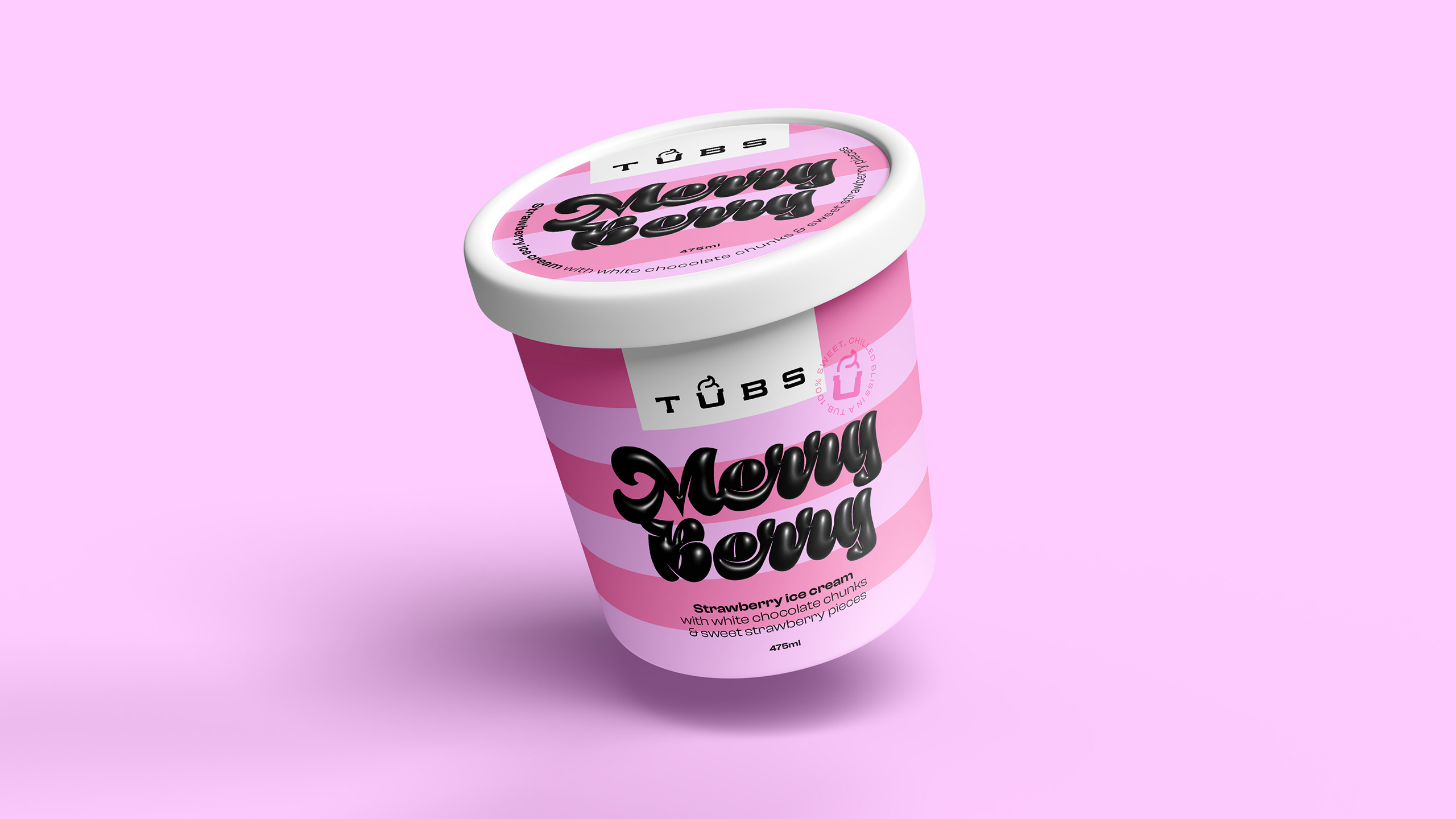
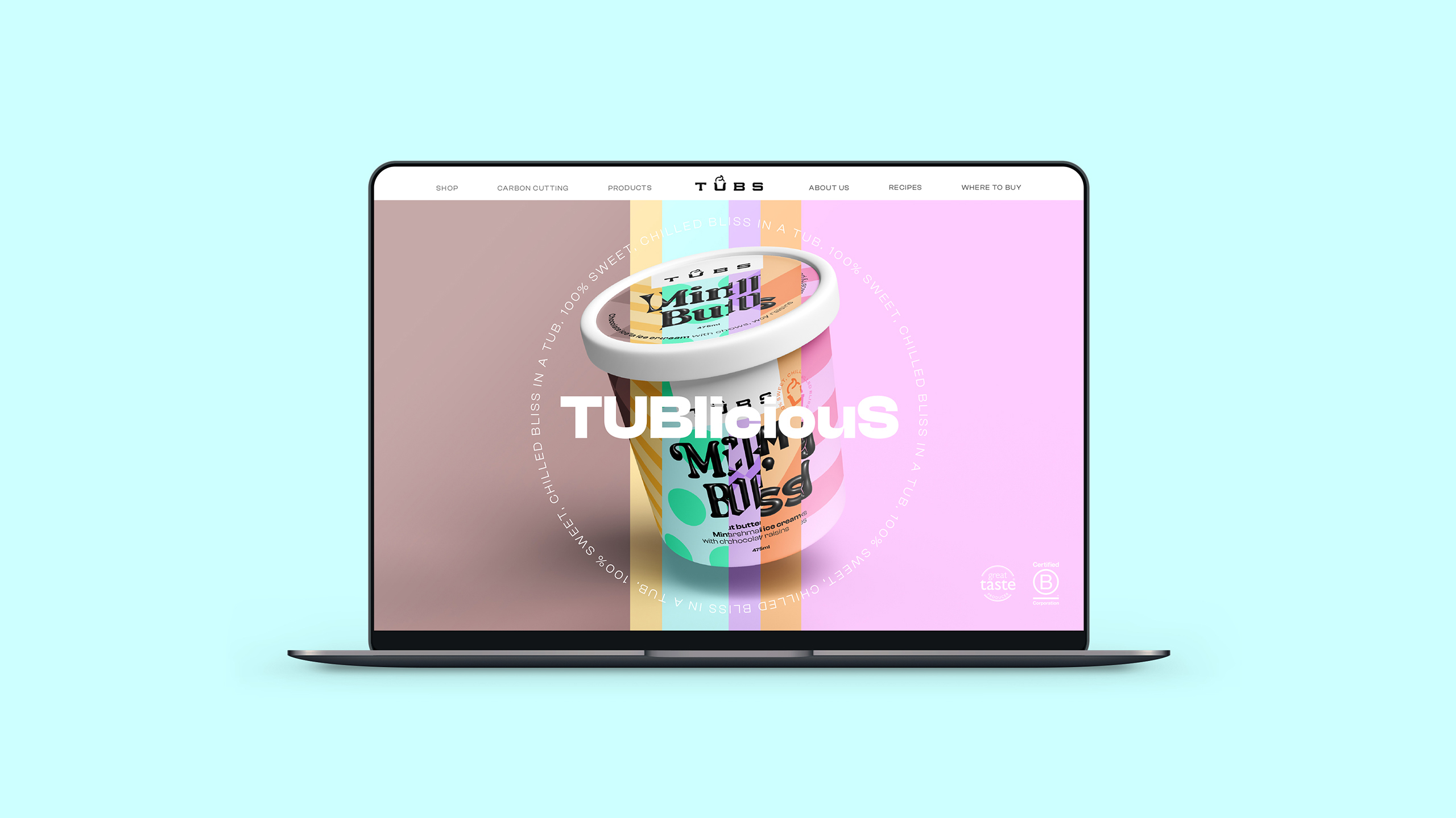
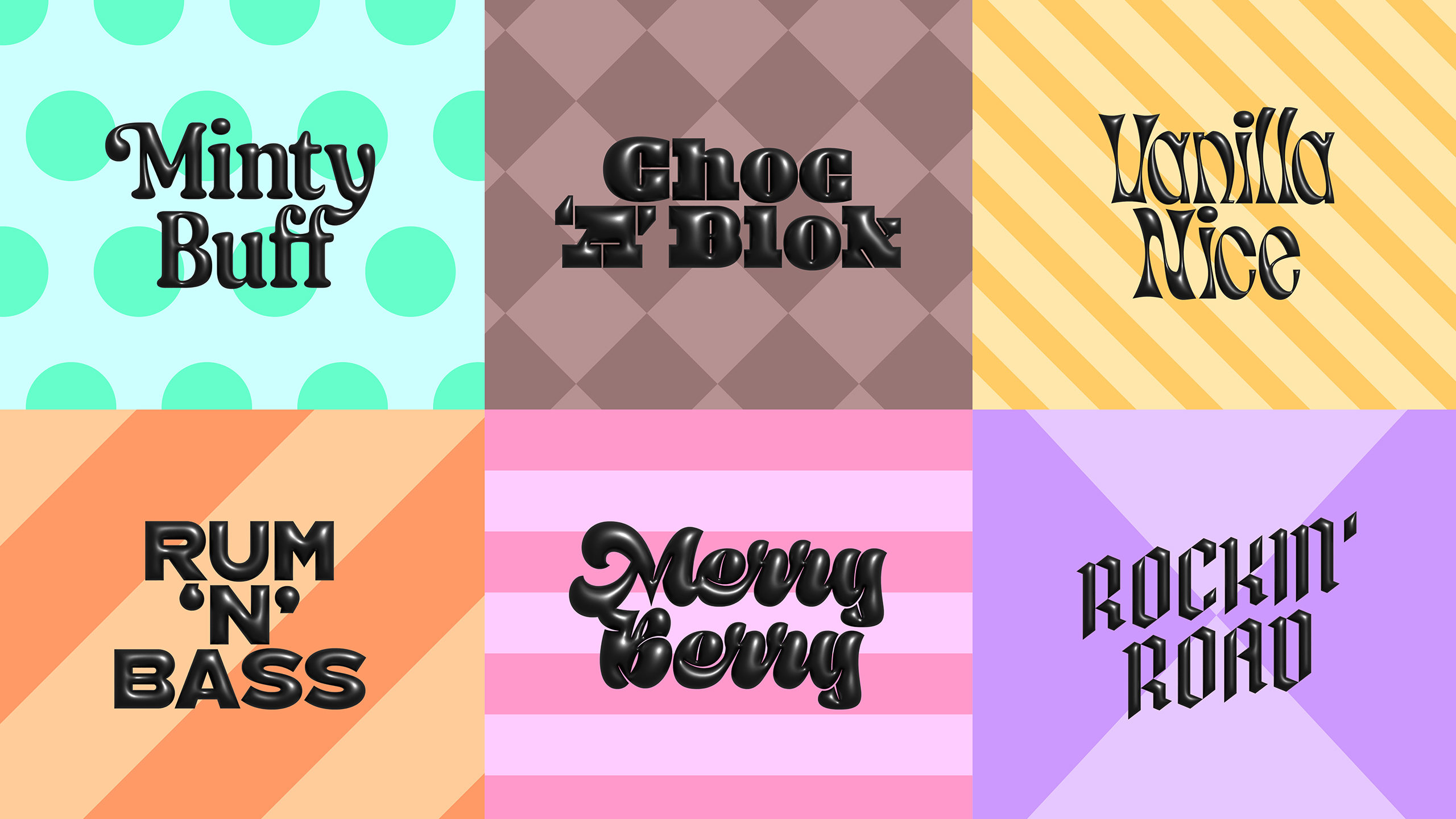
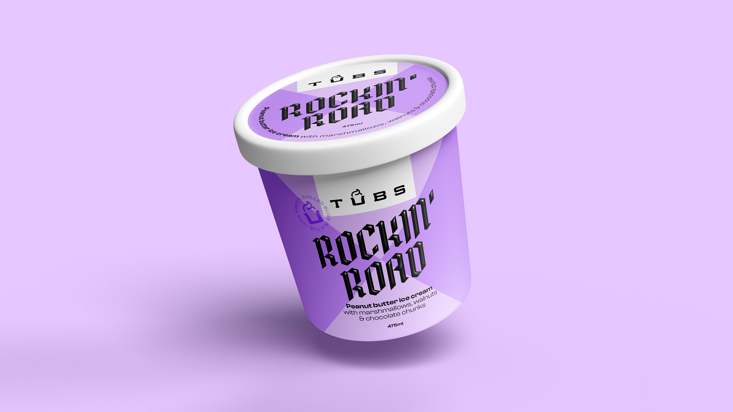
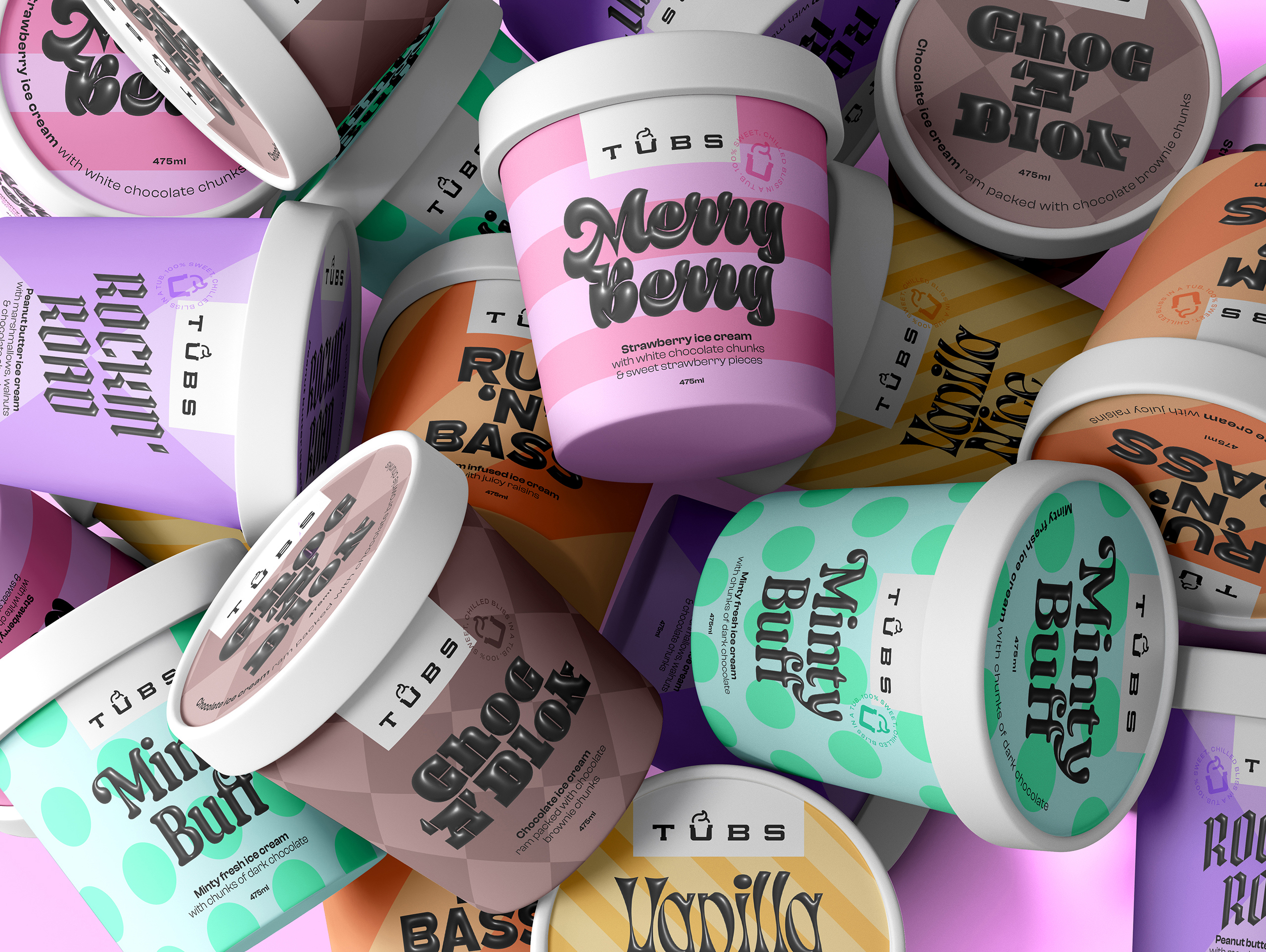
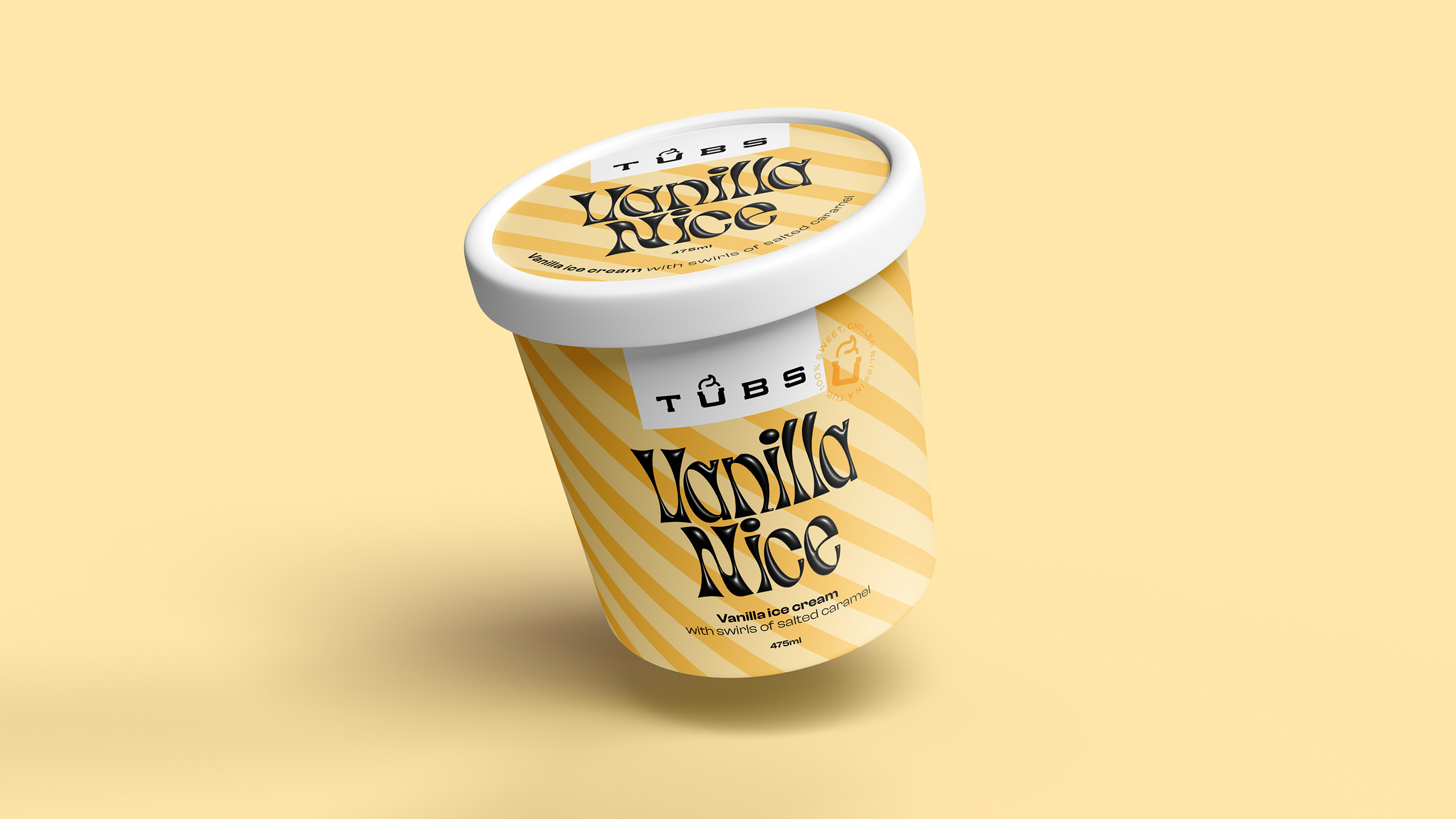
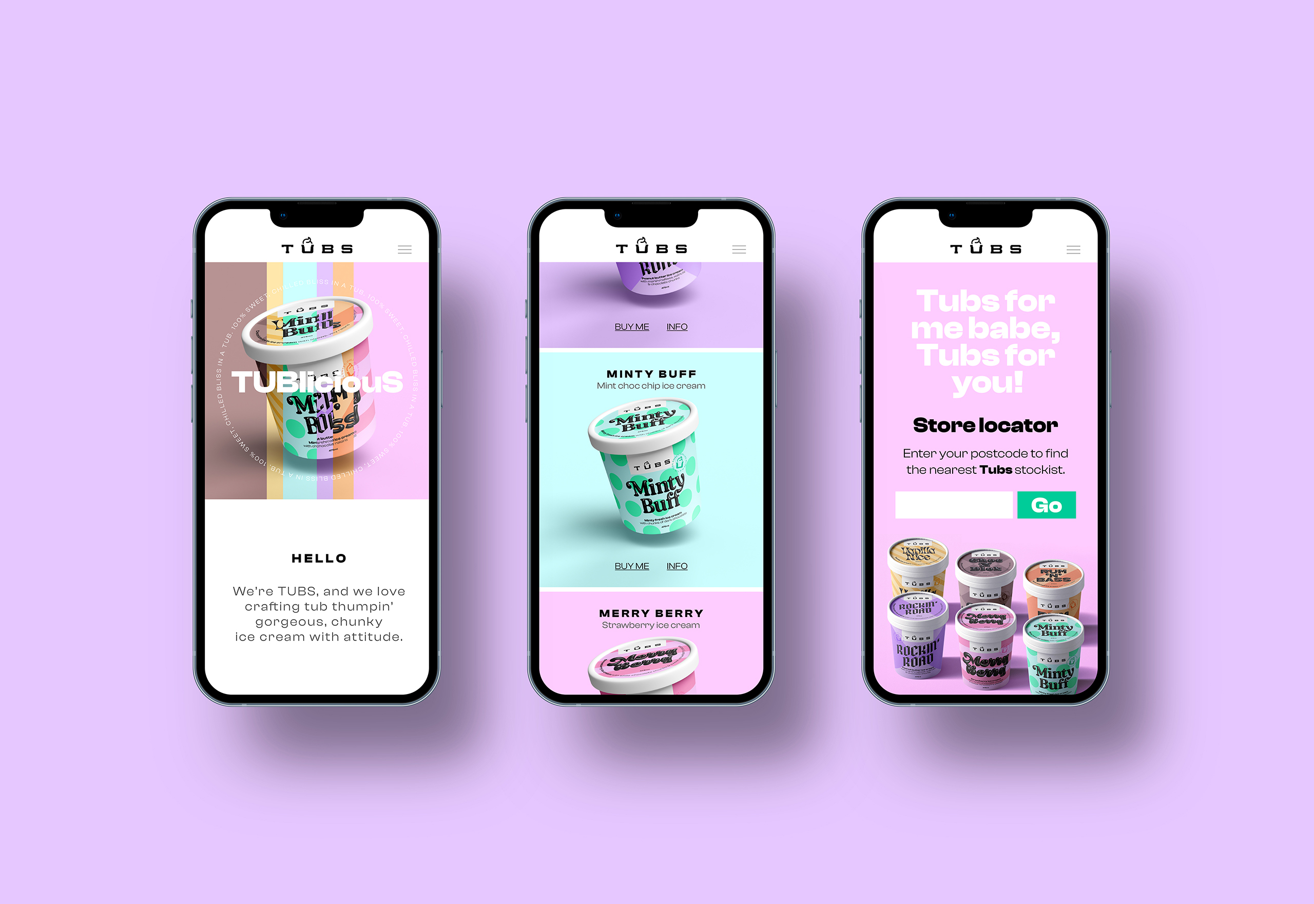
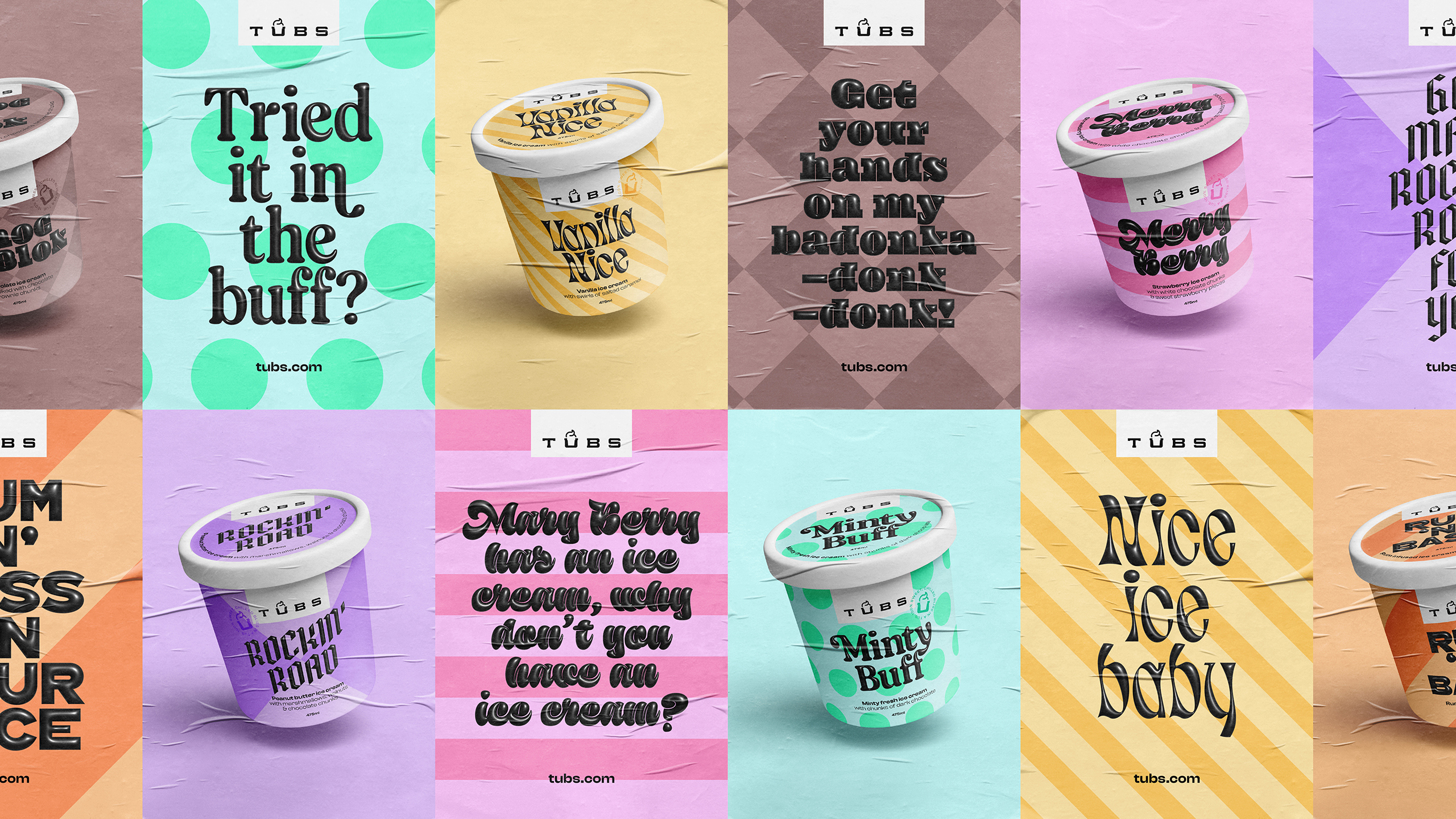
Firstly we focused on the identity for Tubs and created a logo that highlights the playfulness of its name by using the negative space within the 'U' as an ice cream tub. To give each ice cream flavour of Tubs its own – well, flavour, we experimented with all different types of typography. Like a juicy flowing font for Merry Berry, a blocky graphic font for Choc 'A' Blok and a rockin' blackletter font for Rockin' Road.
We really wanted to ramp up the playfulness of the brand with bold typography and quirky messaging. Bright, pastel colours are paired with the contrasting, black, 3D typography, creating a look that is full of flavour and attitude. A roundel stamp is on the side of every tub with the phrase '100% sweet, chilled bliss in a tub,' further emphasising the quality and joy that’s inside every tub of Tubs – because once you get past the personality on the outside of the tub, you get to discover what really counts on the inside.