CrownCruiser
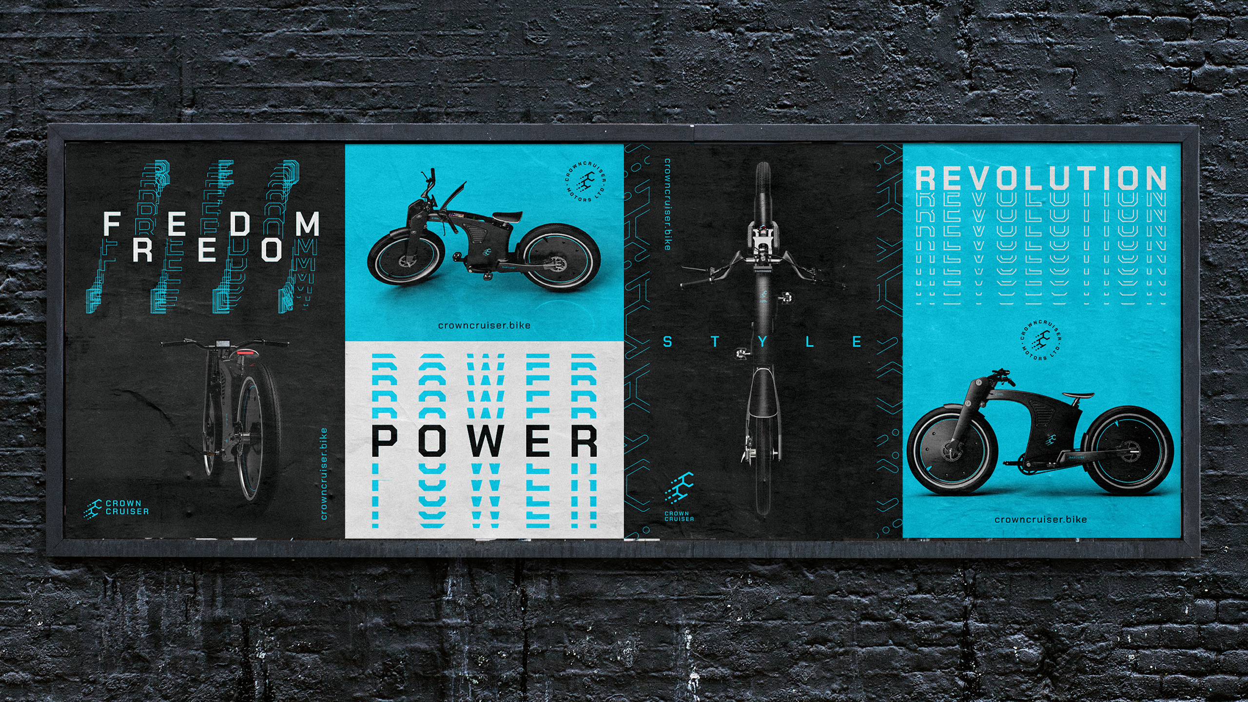
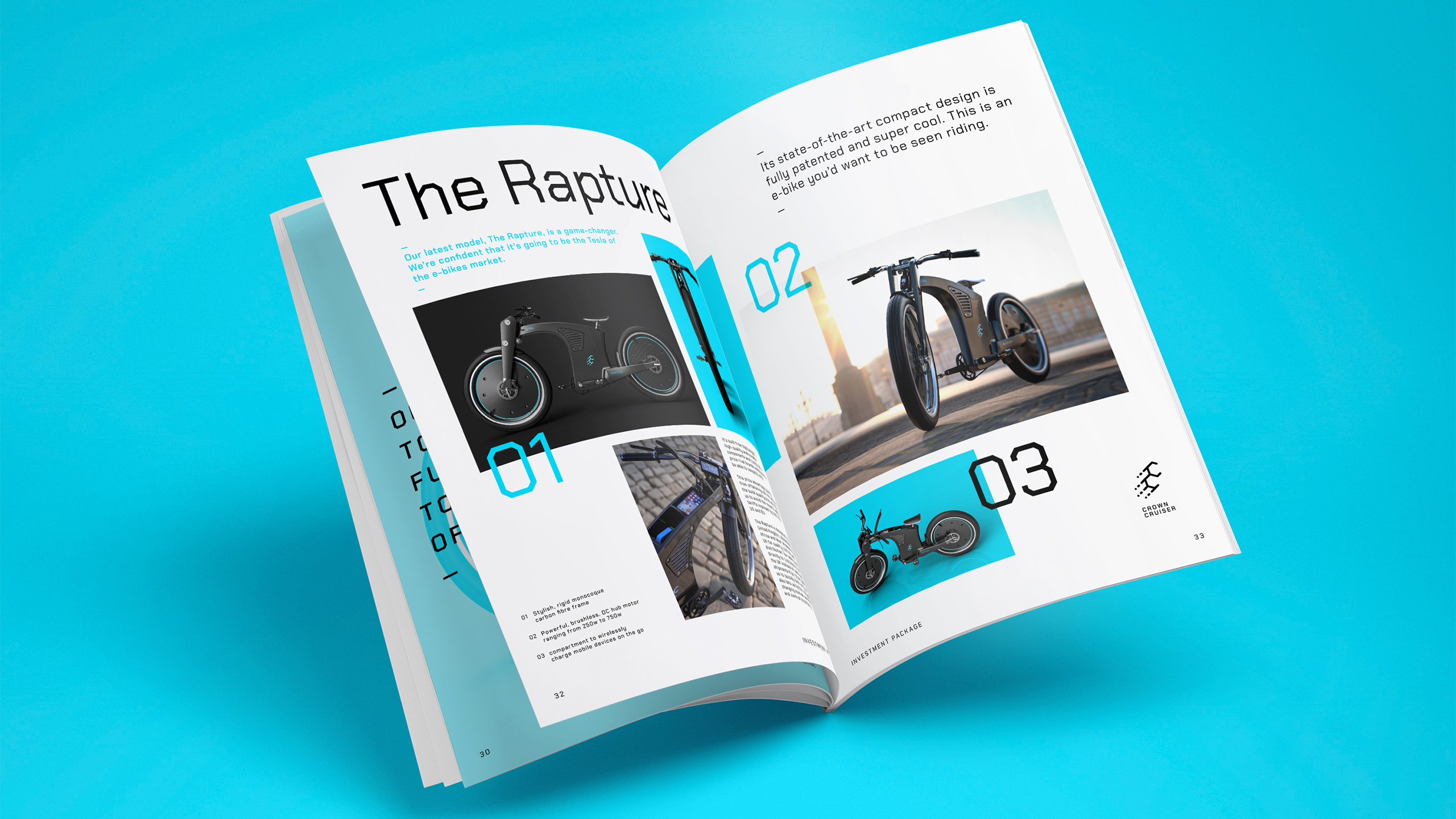
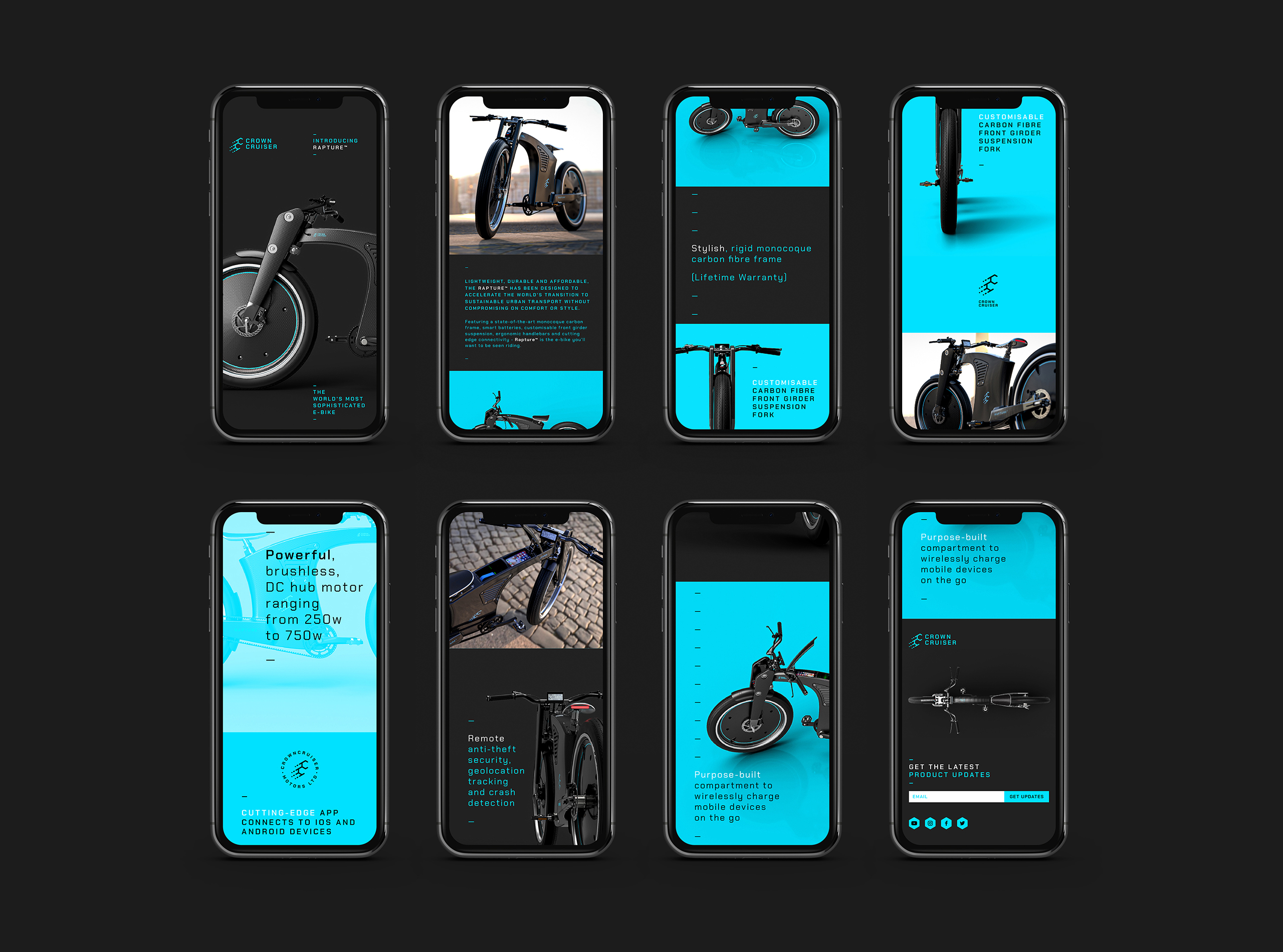
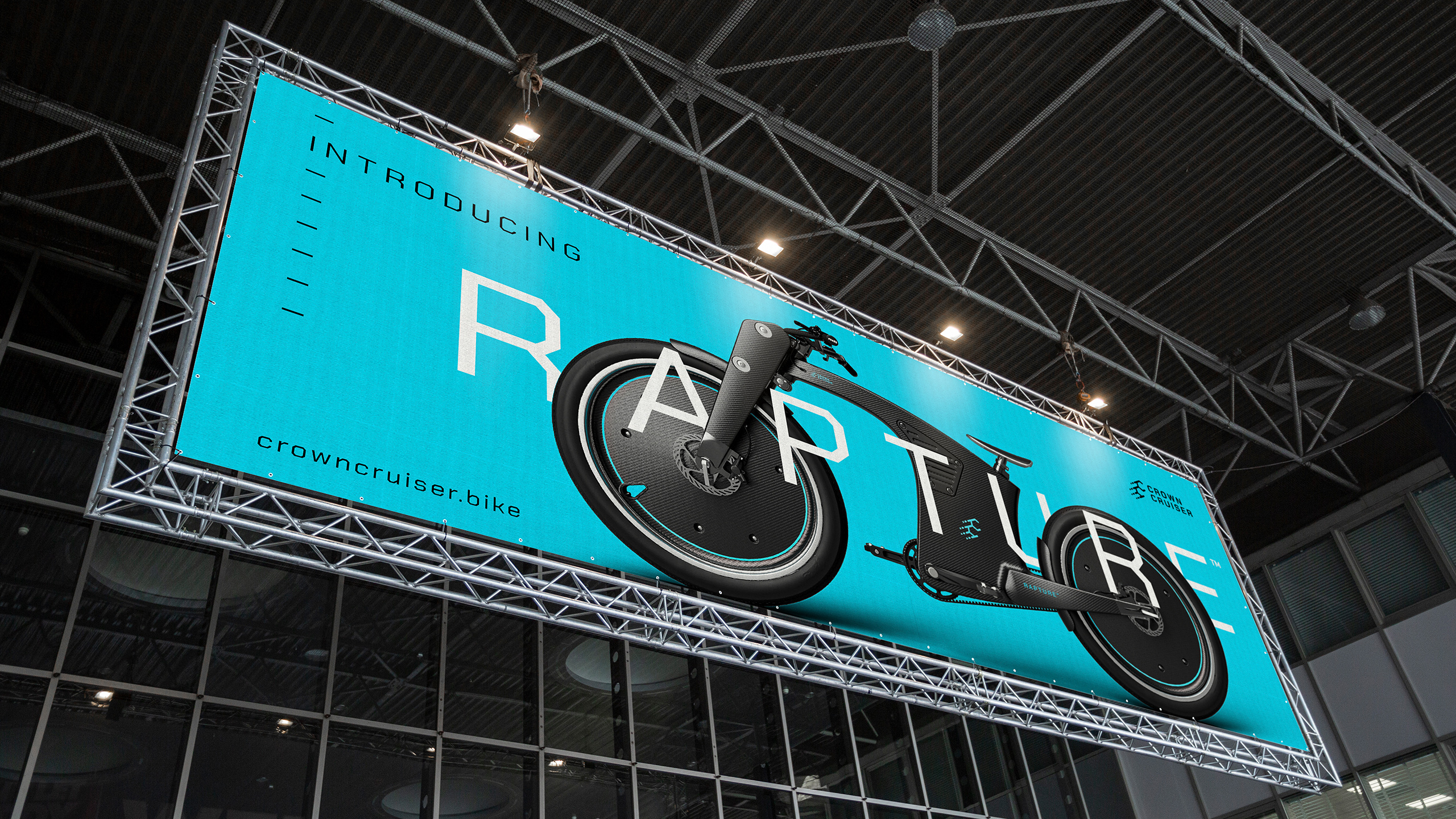
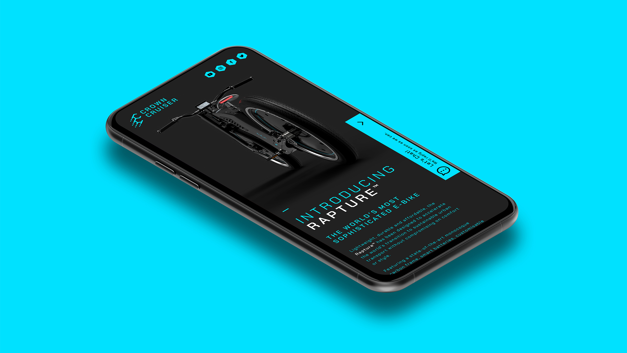
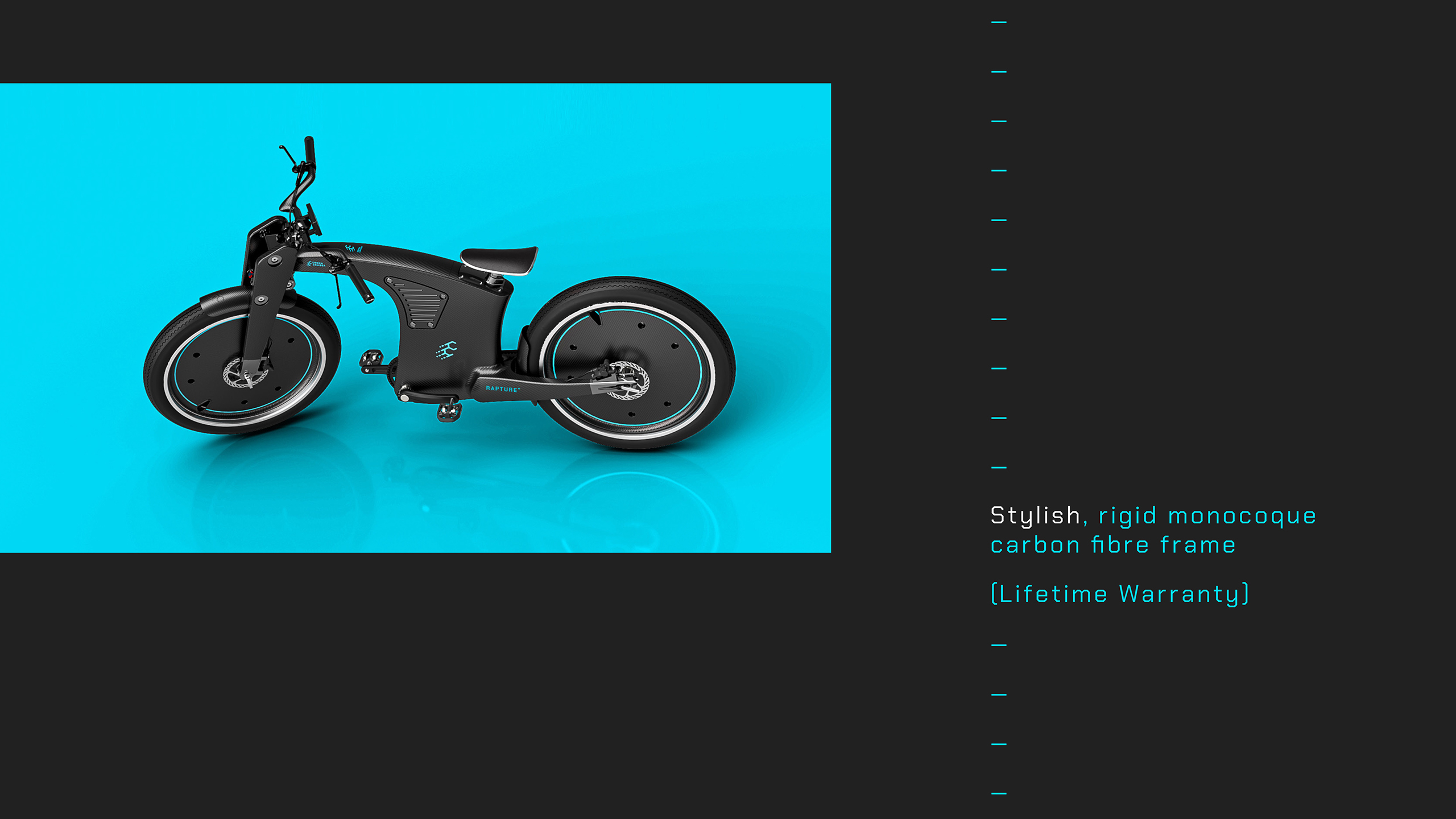
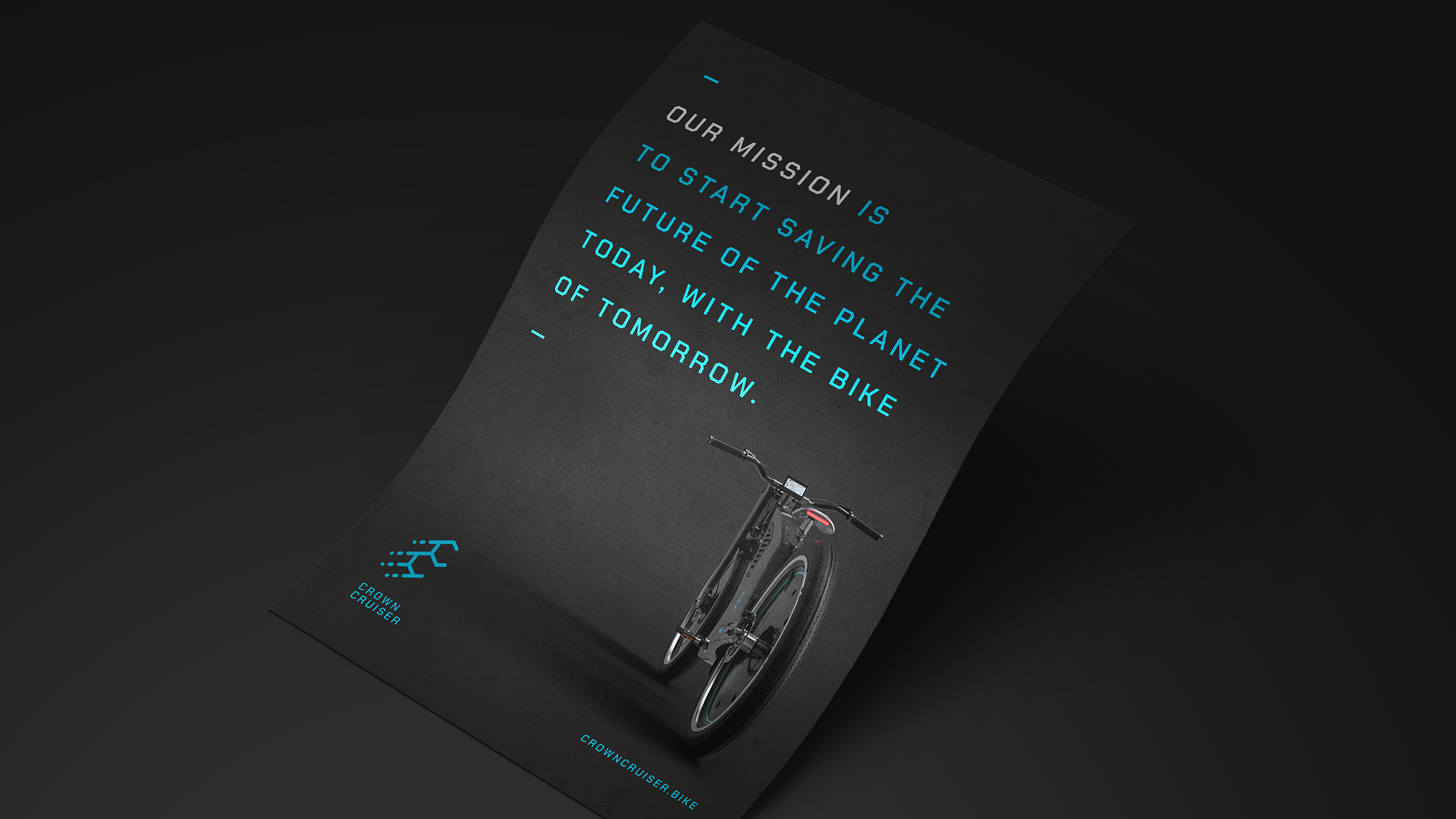
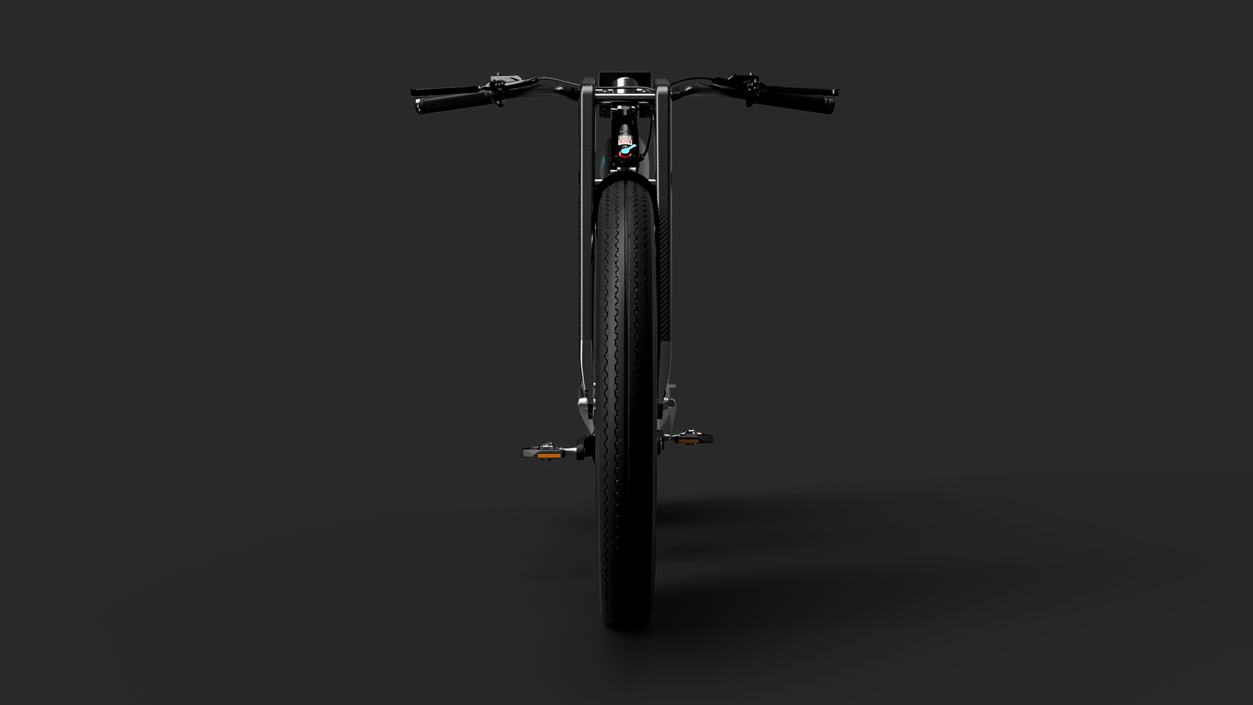
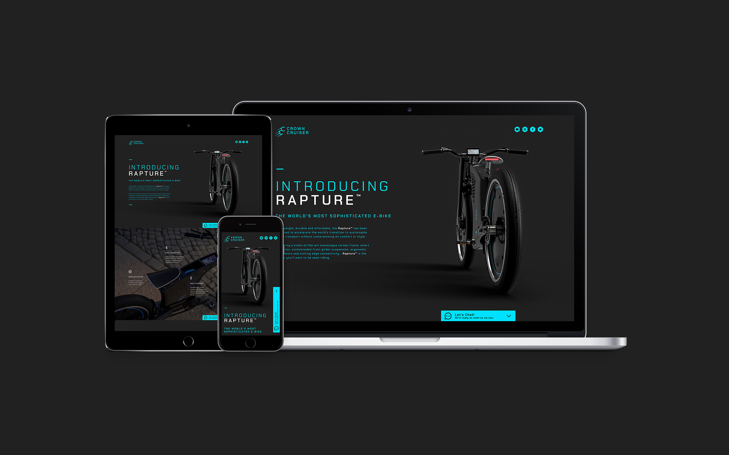
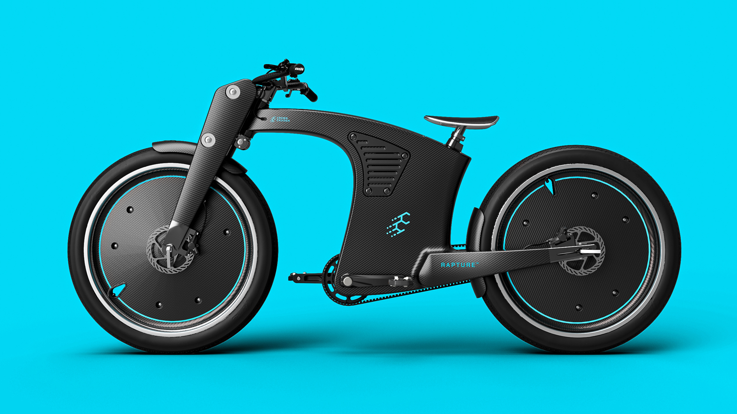
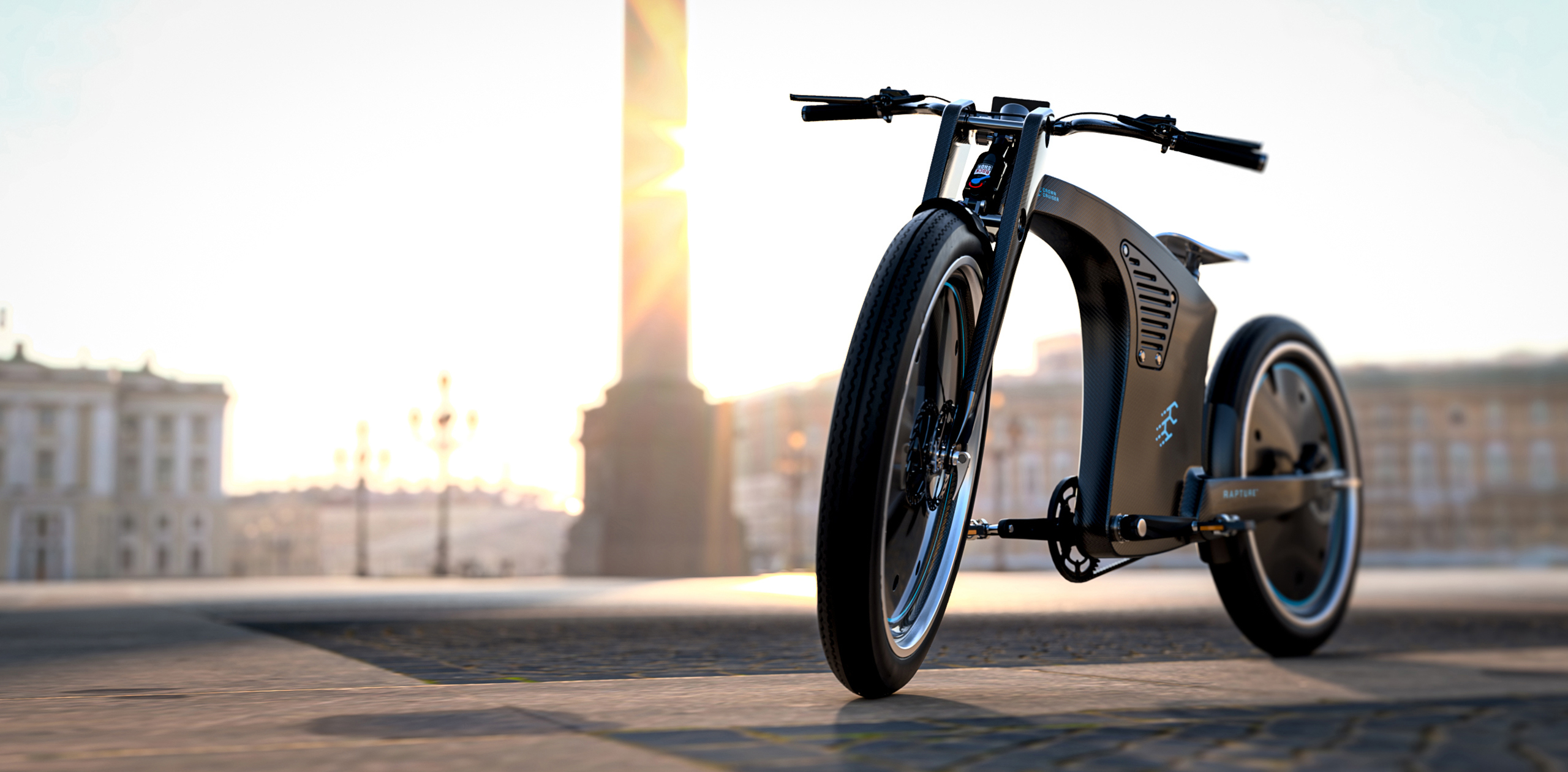
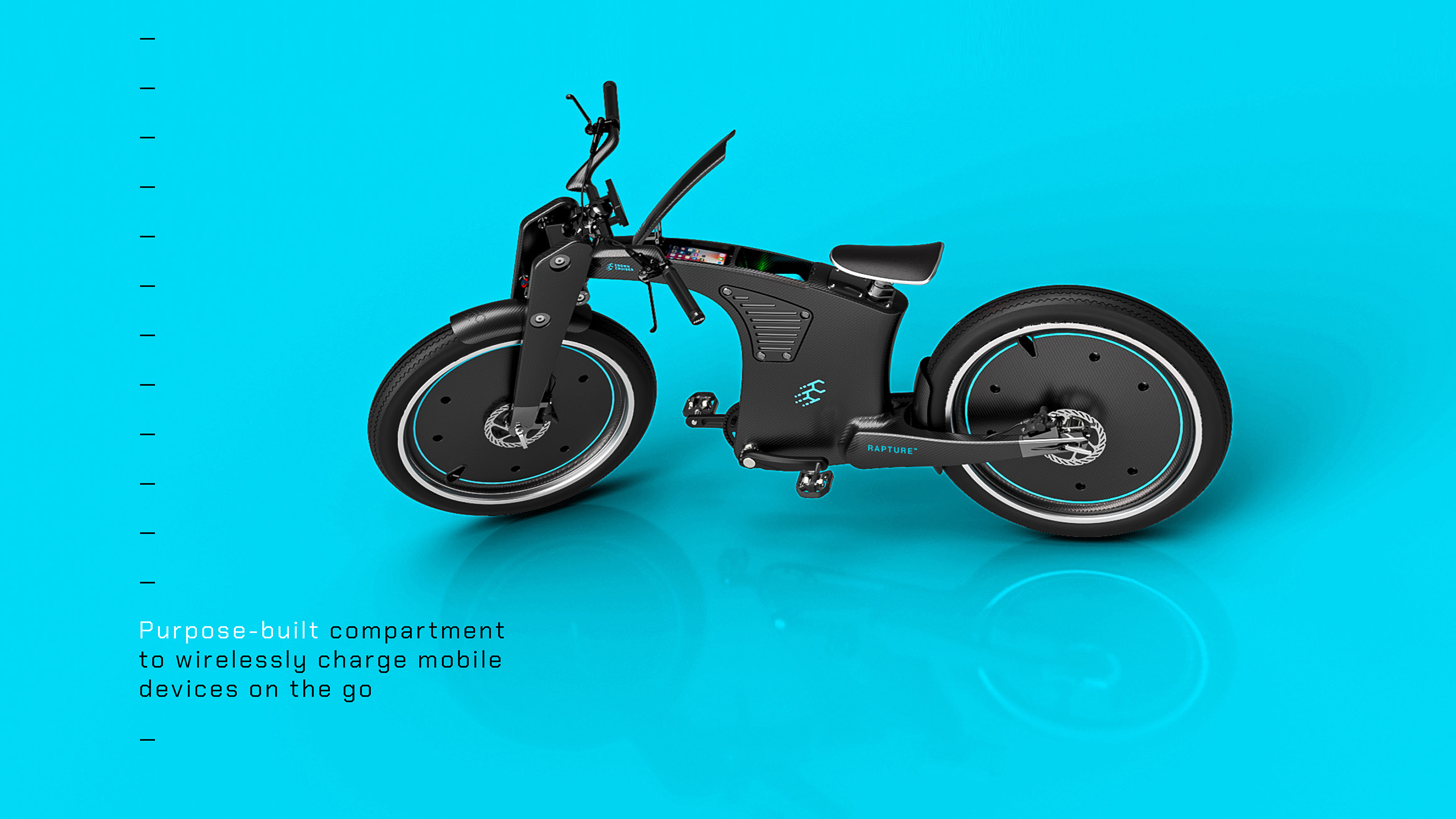
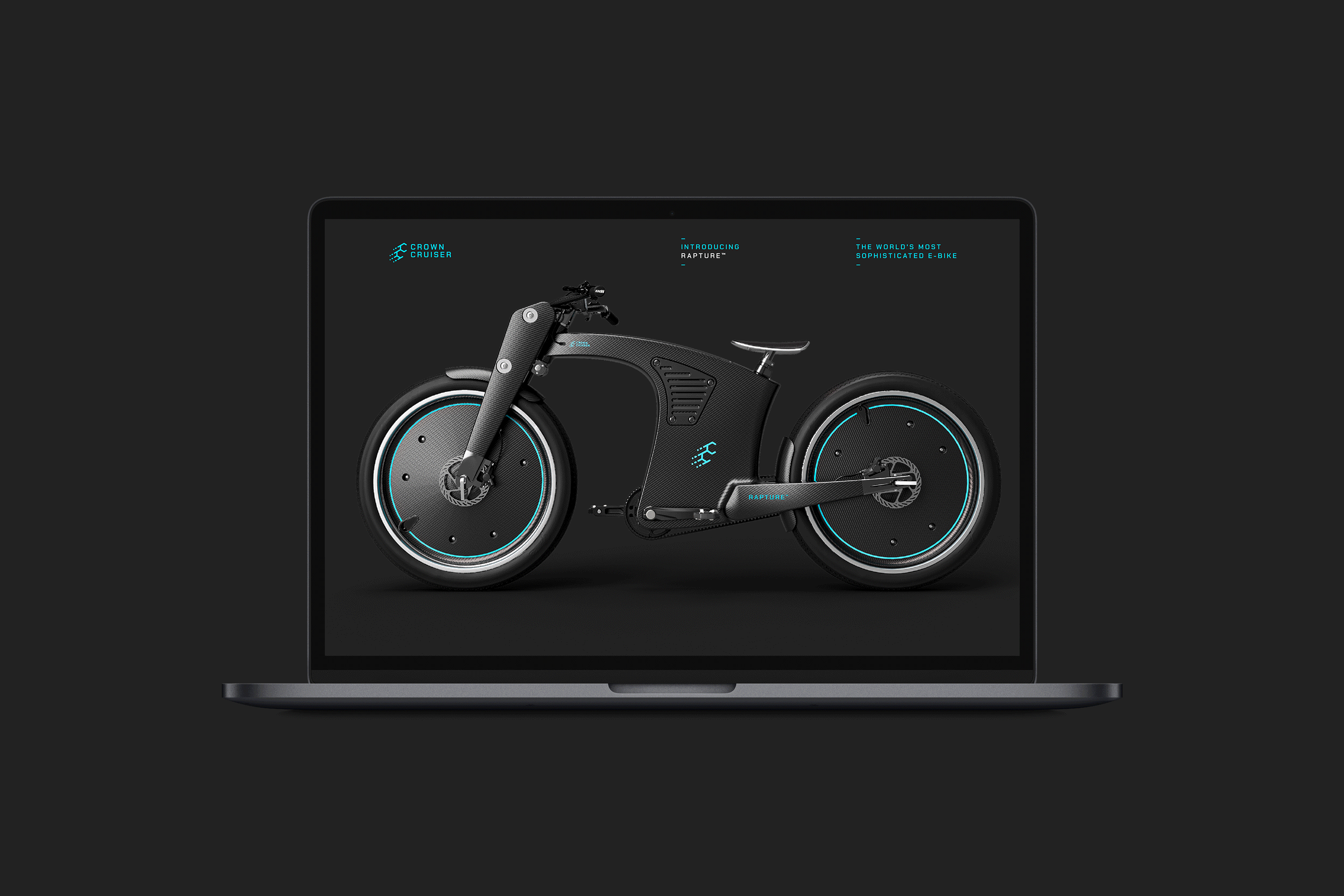
CrownCruiser design and manufacture hand-made, high-performance electric cruiser bikes. Their flagship product, the Rapture™ has been designed to accelerate the world’s transition to sustainable urban transport without compromising on comfort or style.


The Challenge
With climate change posing a very real risk to everyone on the planet, the message to reduce harmful emissions by opting for greener modes of transport has been growing louder and louder. As a result, the market for sustainable travel has been increasing. So, the challenge for a start-up company like CrownCruiser was to not only meet the necessary green credentials but to achieve cut-through with a highly desirable and technologically advanced product with branding to match.
The Solution
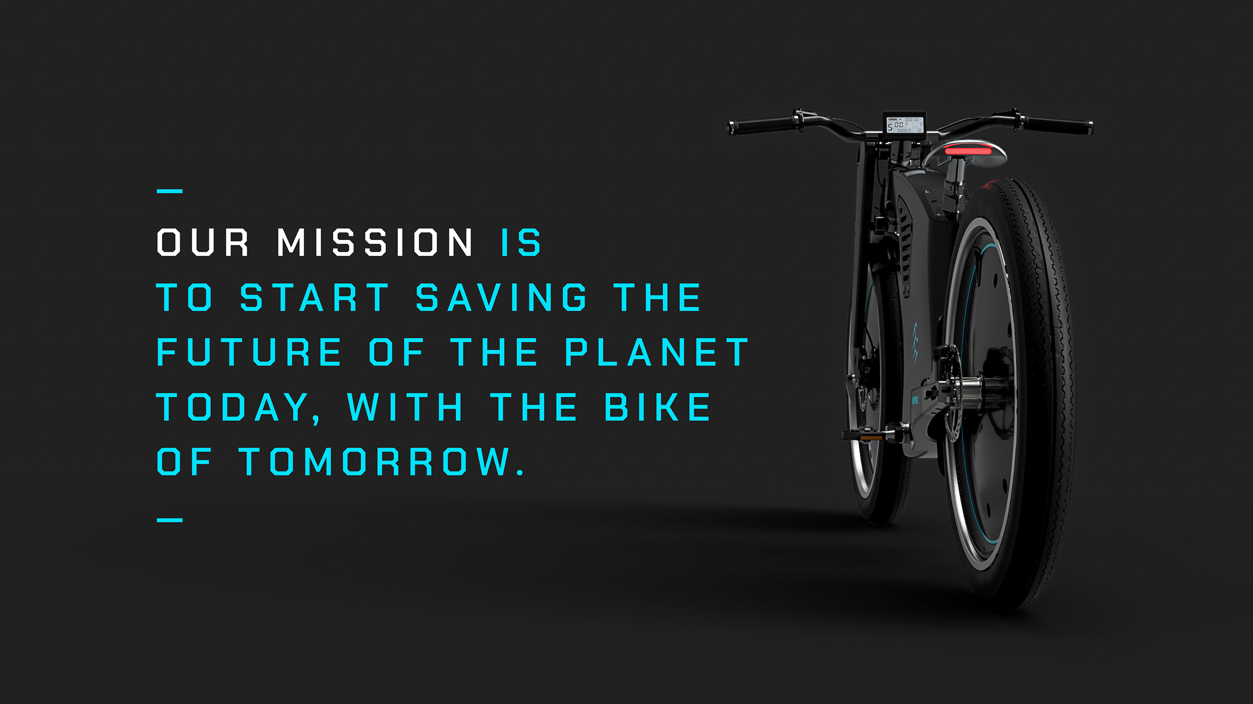
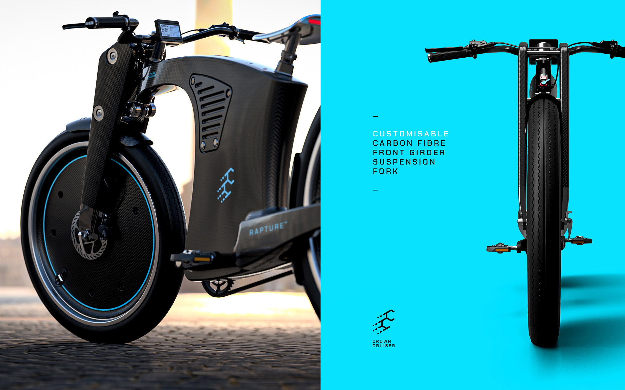
CrownCruiser’s ethos is to be kind to the environment but it was important to avoid the clichéd ‘green’ branding and to not overshadow the fact that the Rapture™ is the world’s most sophisticated e-bike.
Our focus was to create an identity that was cool, cutting-edge and desirable. One that communicates a modern, forward-thinking company that designs and manufactures, game-changing e-bikes using pioneering technology and materials.
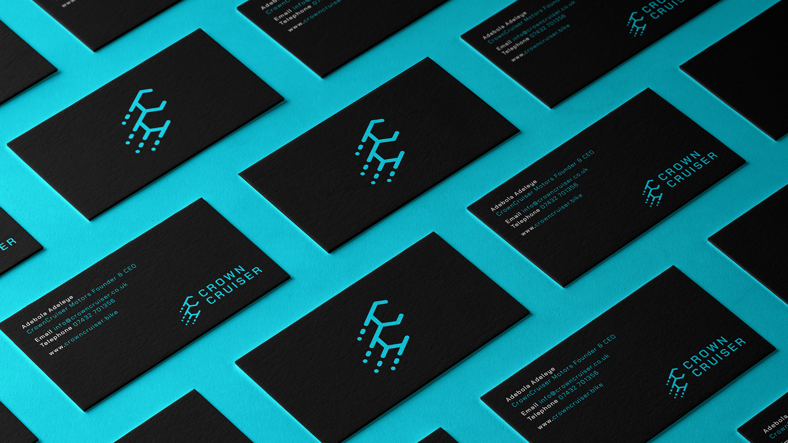
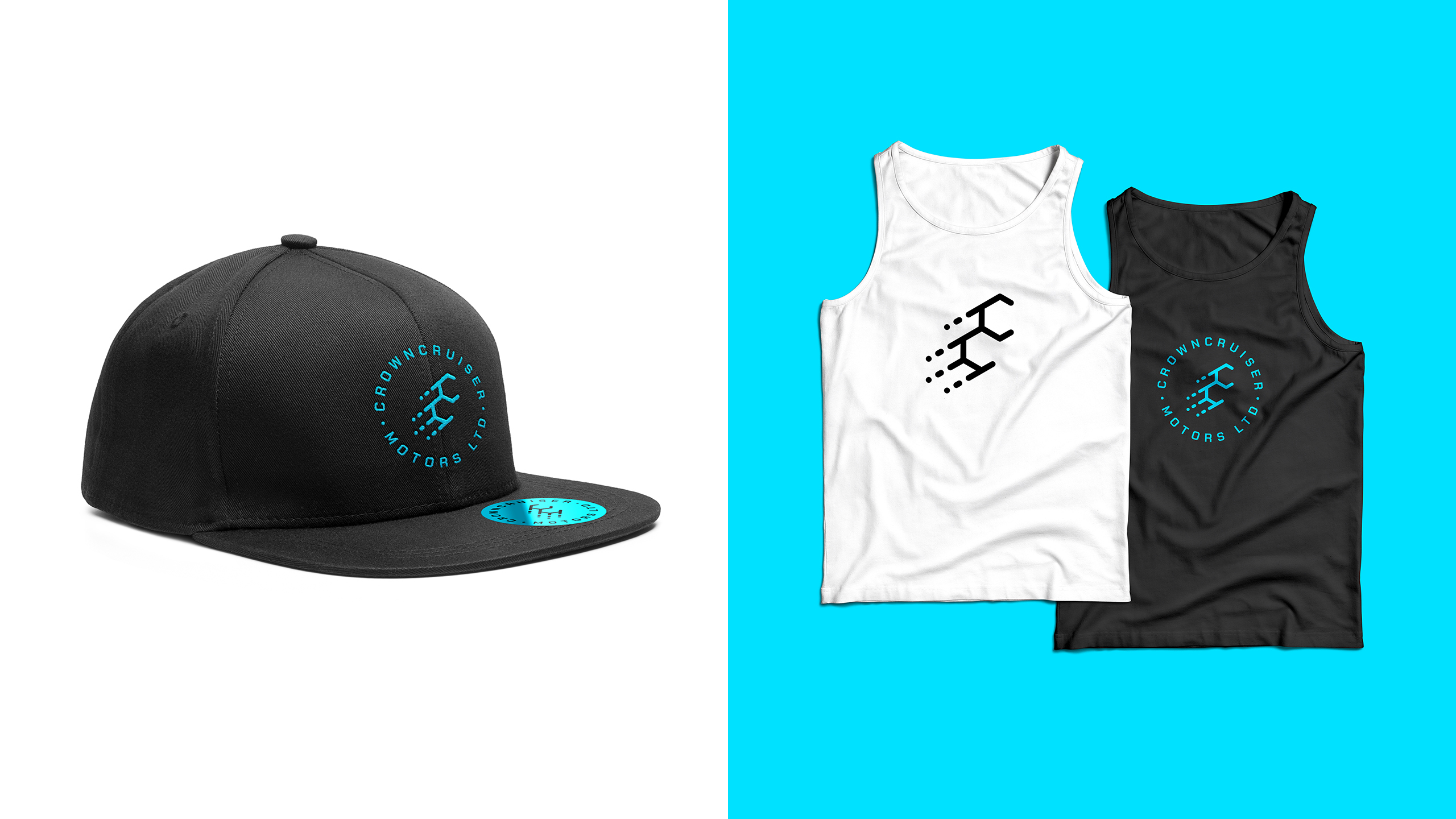
The initials of CrownCruiser have been used in a way to reference this along with key features of the bike’s design, such as its lightweight carbon-fibre frame and durable components. The two ‘C’s have hexagonal shapes to suggest a molecular diagram. Motion lines in the logomark show an upward trajectory for a product that has a positive environmental impact for a greener future, as well as hinting at the bike’s sleek, sporty appeal.