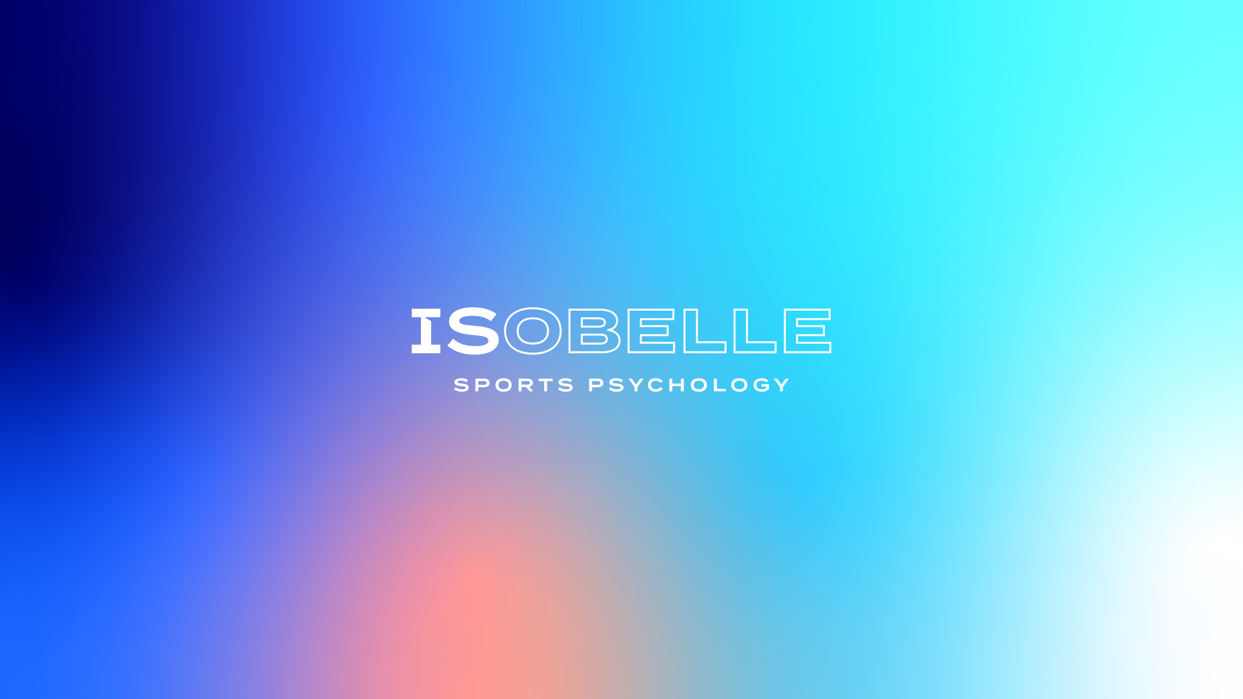
ISOBELLE
Isobelle is a sports psychologist who specialises primarily with athletes, coaches and referees. All the way from amateur to elite-level, she helps athletes reach their full potential through her own unique style of psychology. Her work is centred on how psychology influences sport and how it can improve performance, as well as cope with stressful aspects of certain roles or counsel athletes to successfully deal with the consequences of sustaining an injury.
THE CHALLENGE
As a new player entering a crowded and hugely competitive field in sports psychology, Isobelle needed a brand identity to make an impact both visually and psychologically. Our brief was to create an identity with a visual punch, something that will resonate with her target audience and amplify her message amongst athletes and sporty types.

THE SOLUTION
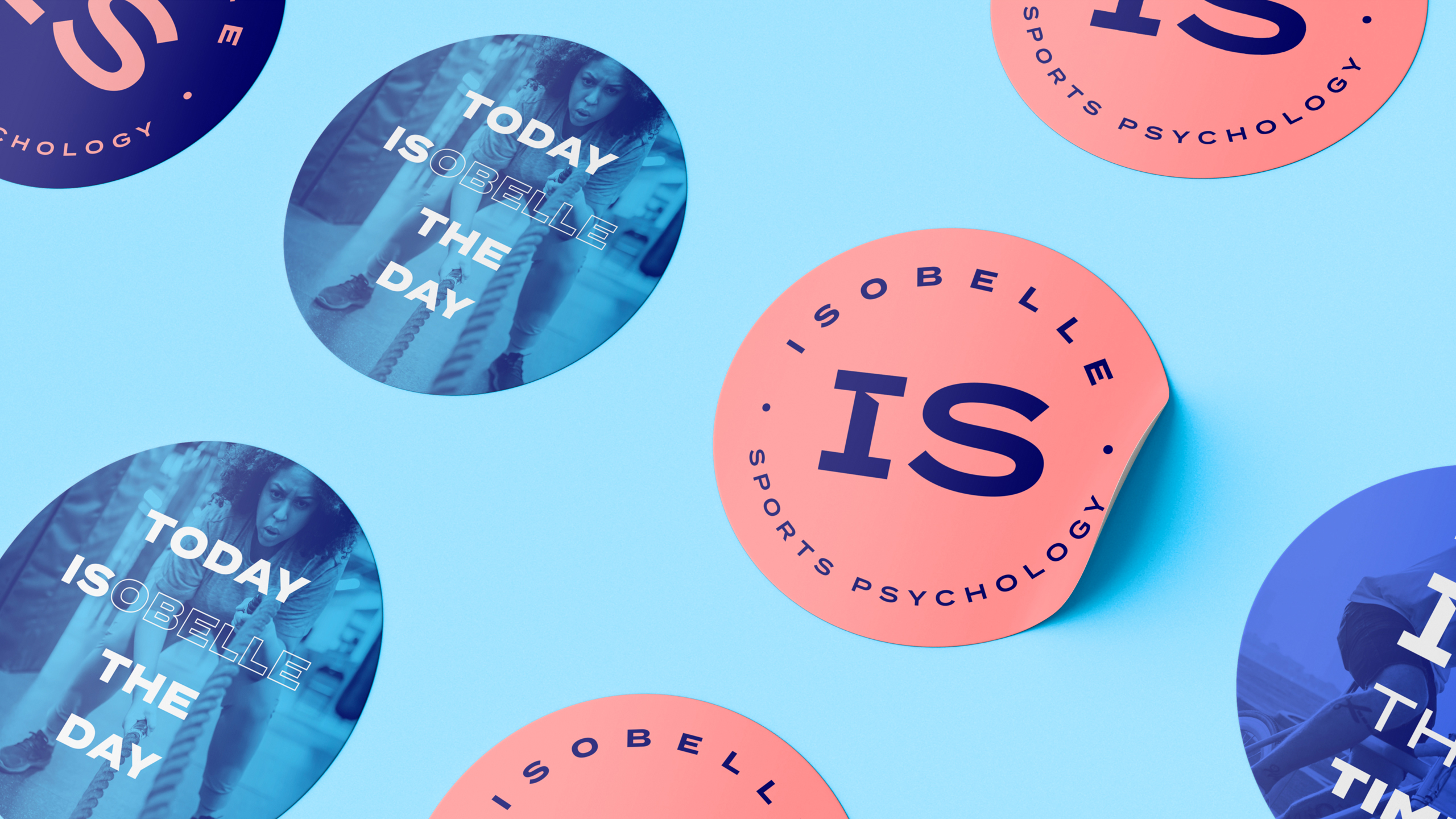
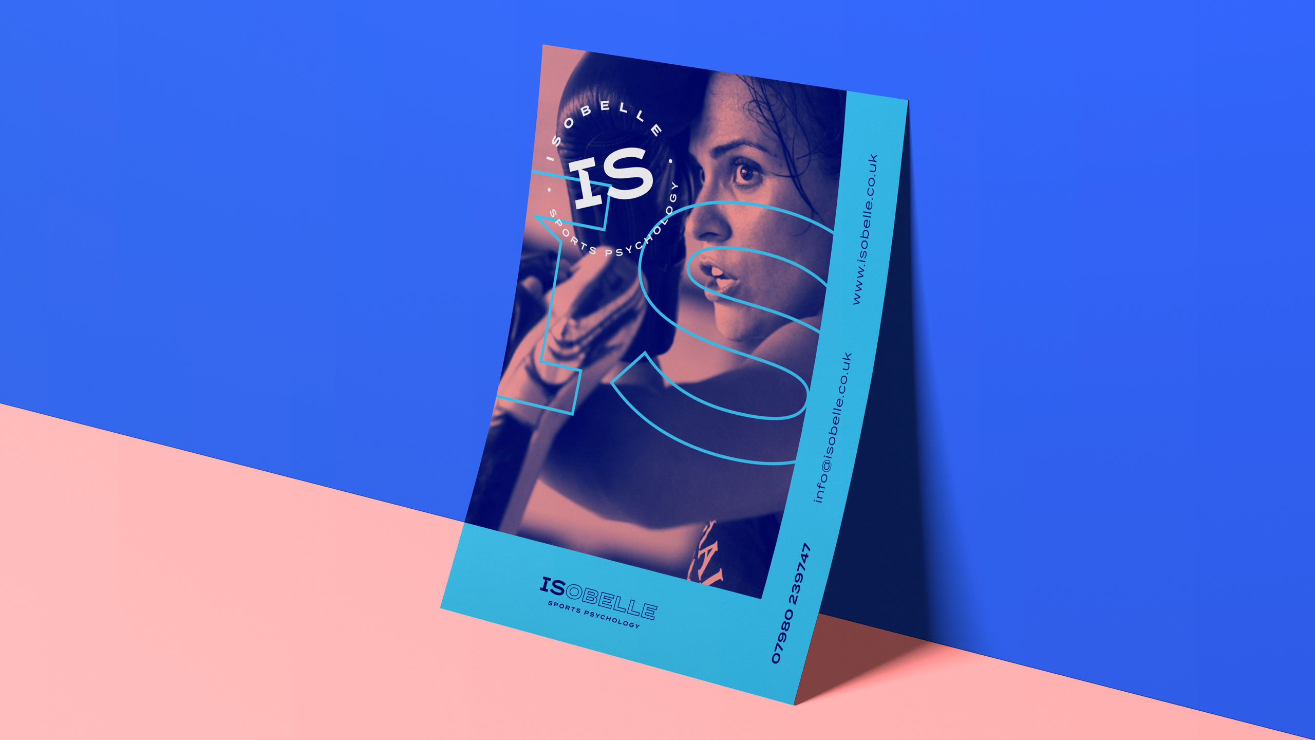
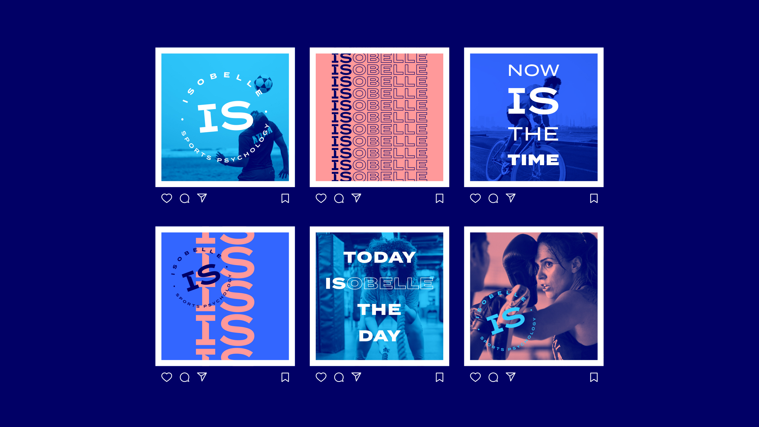
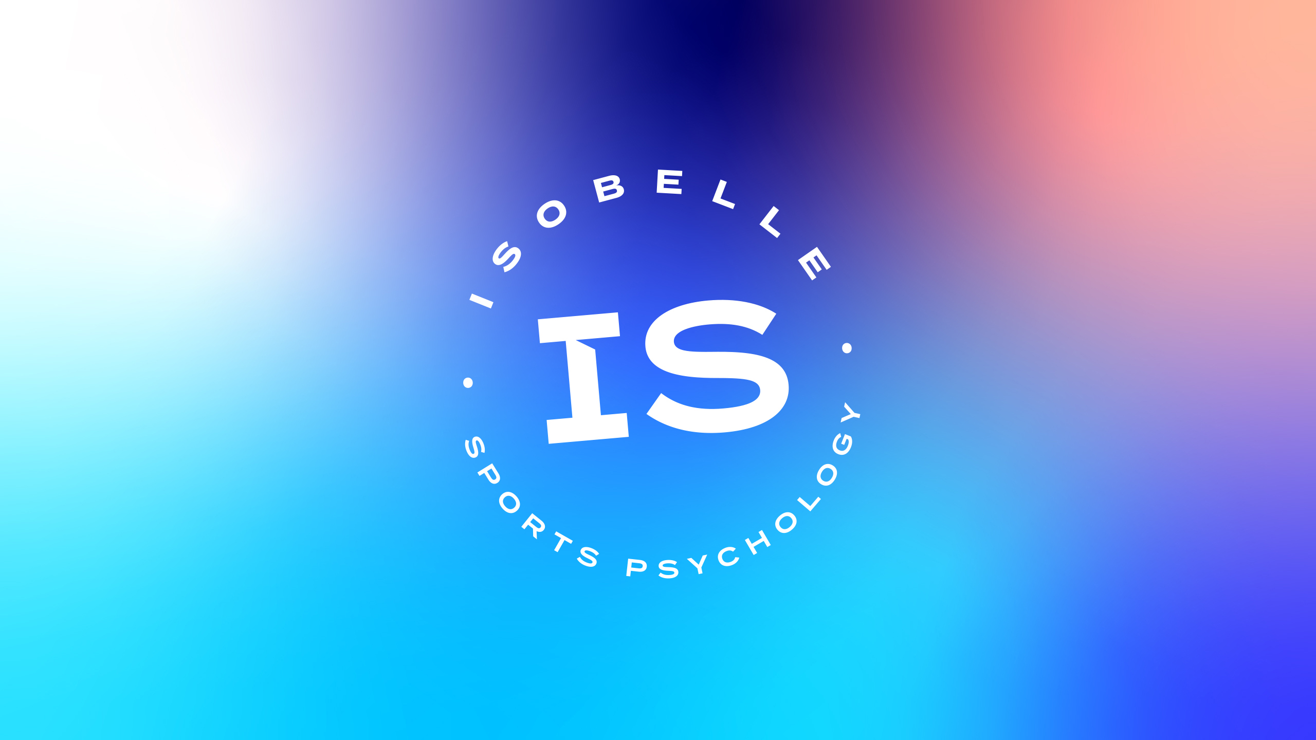
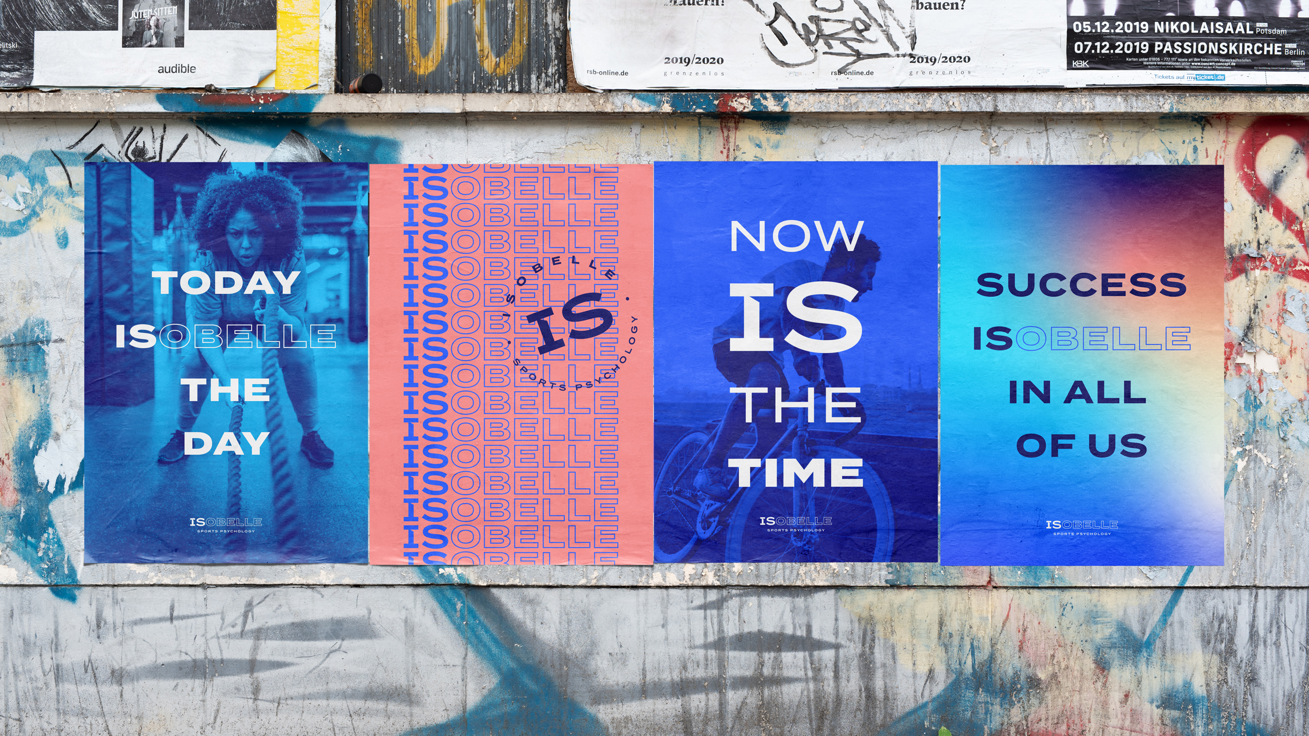
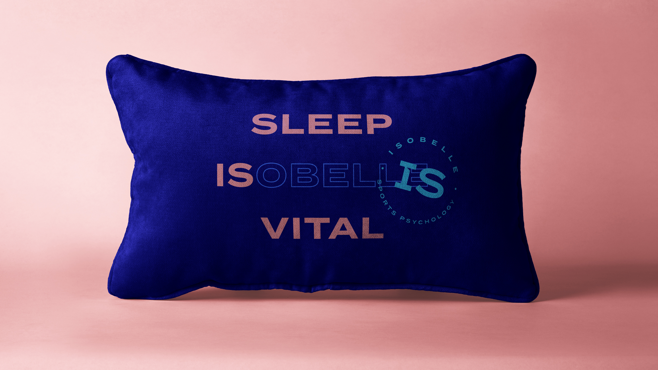
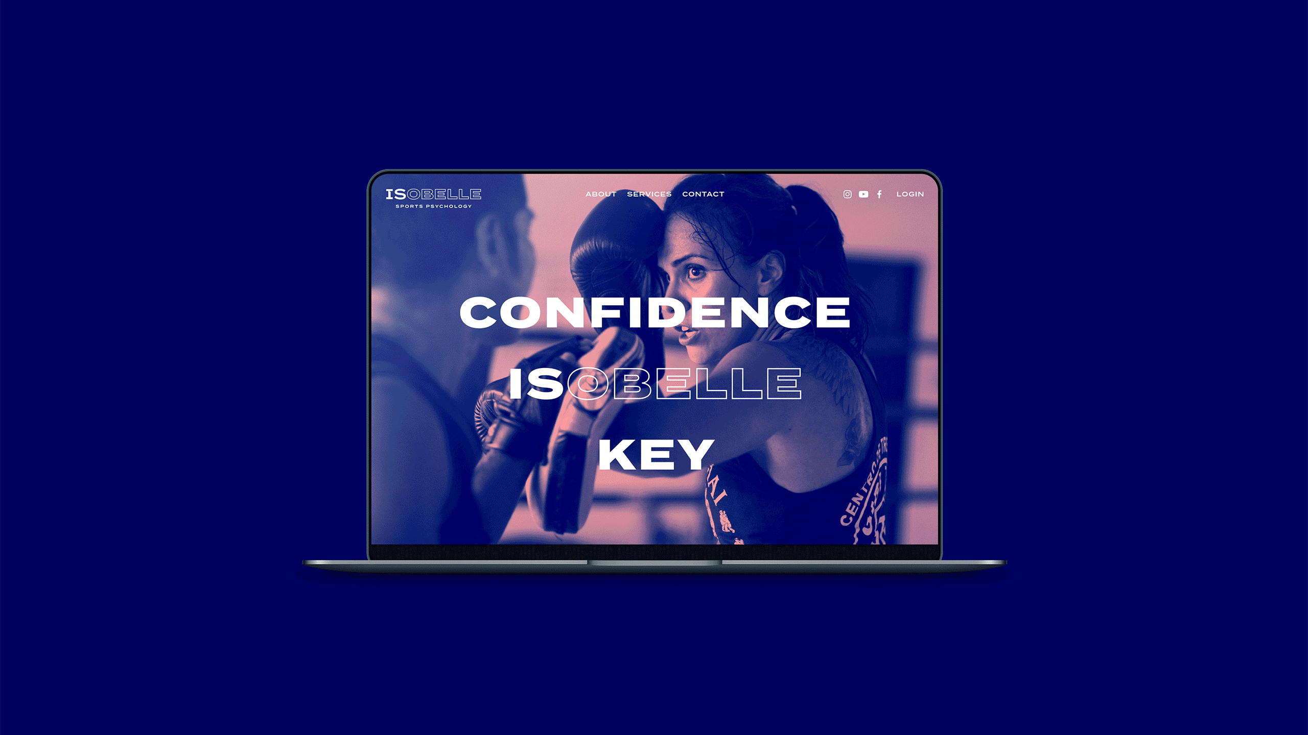
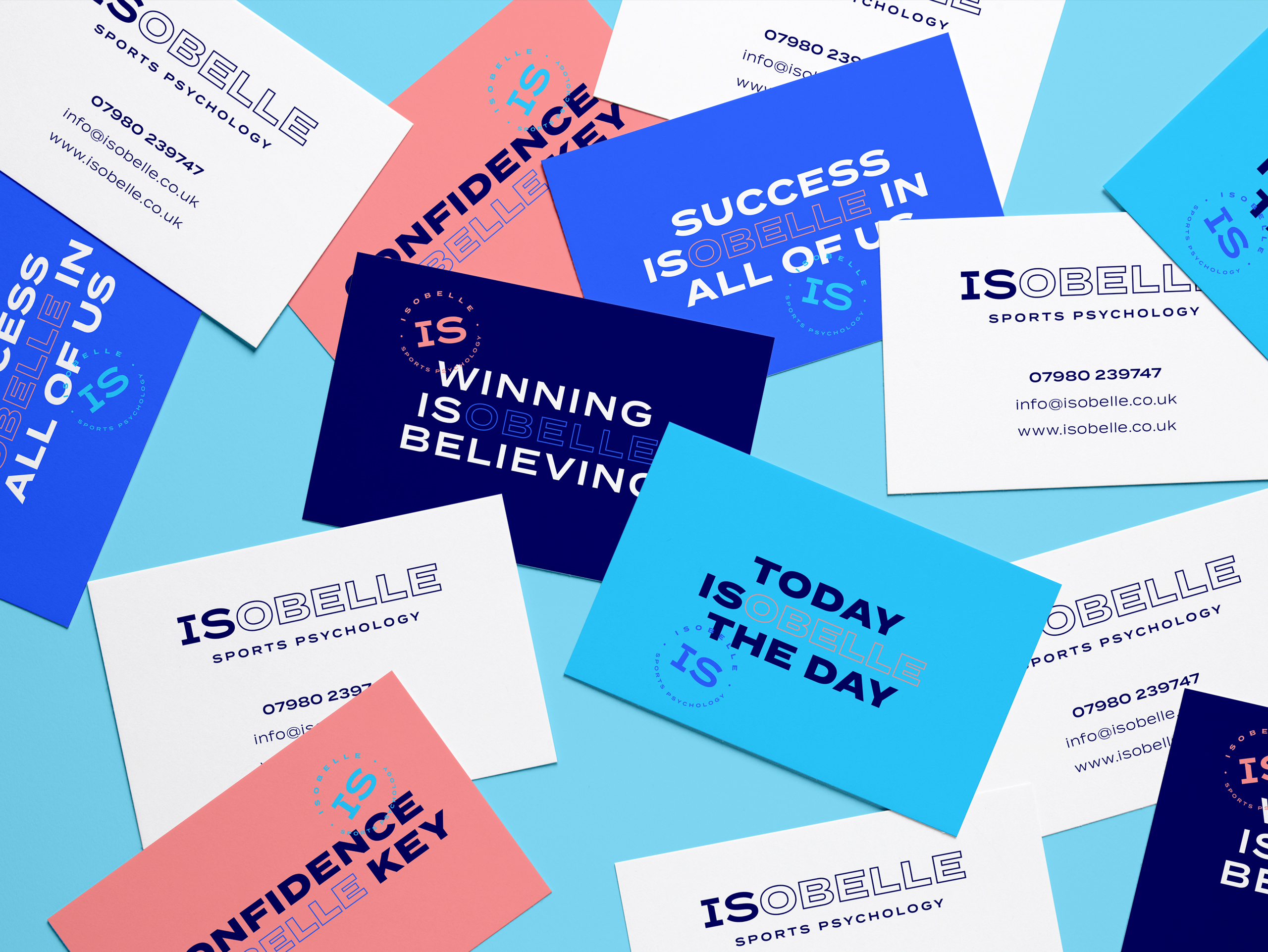
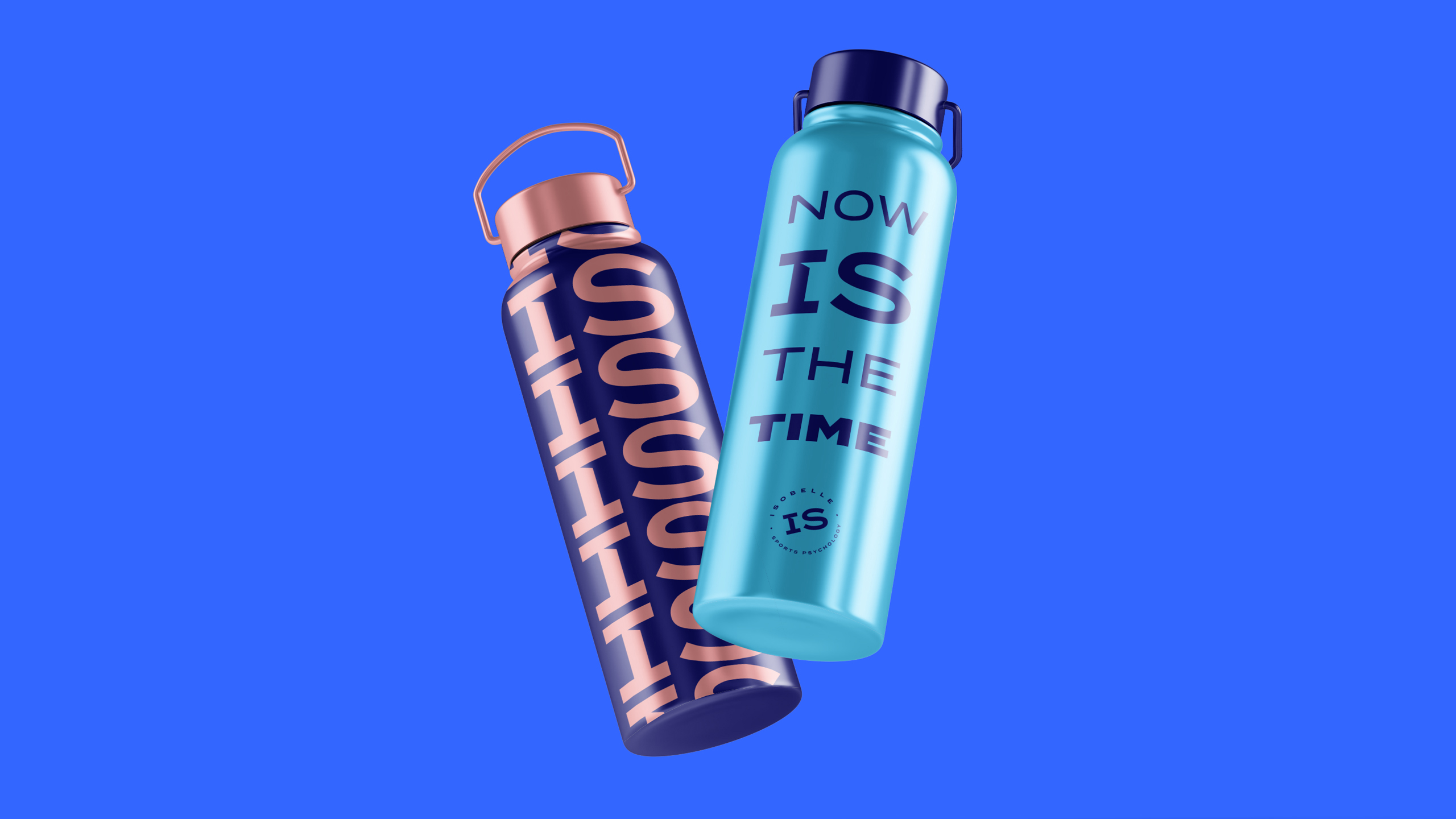
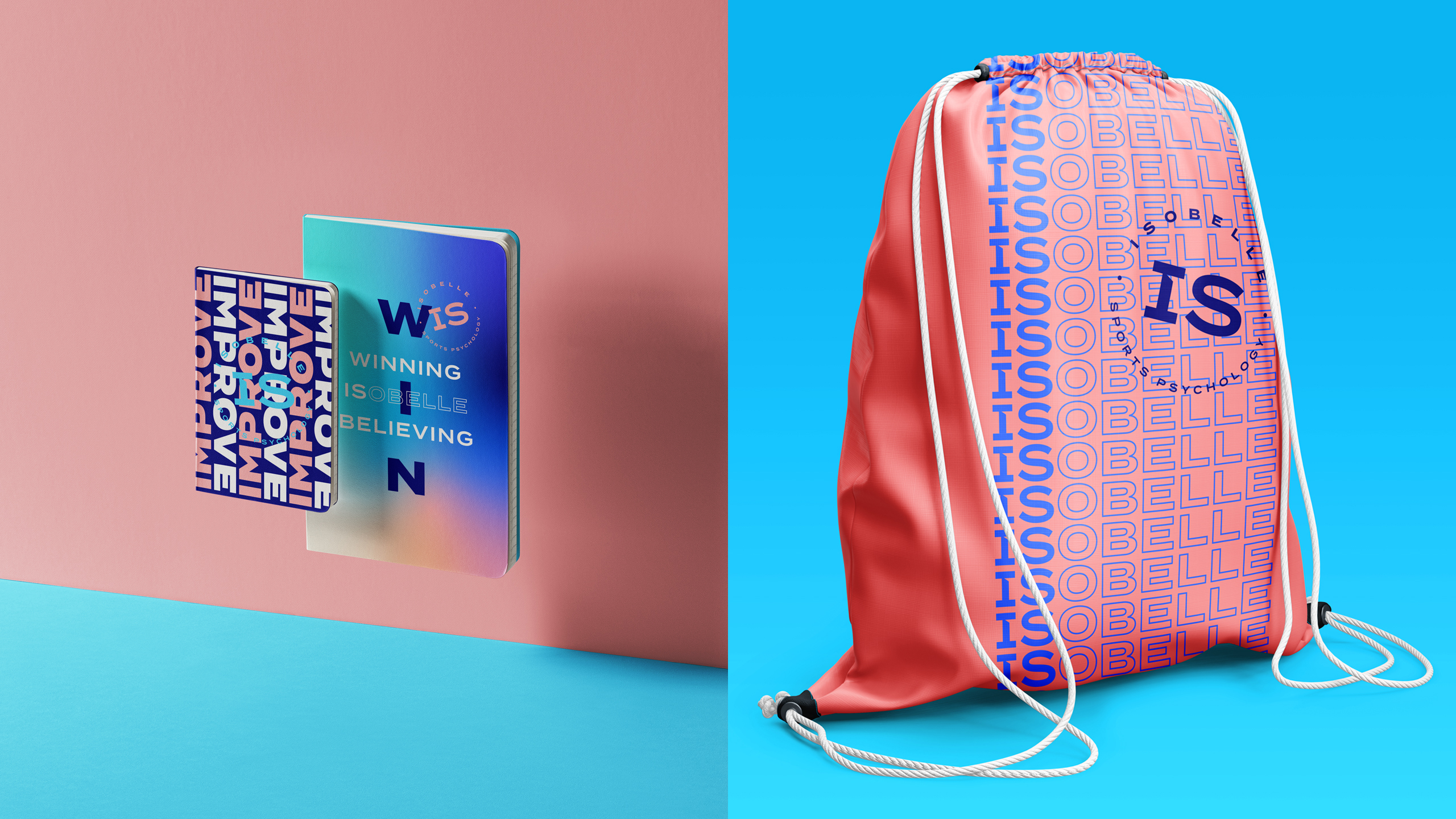
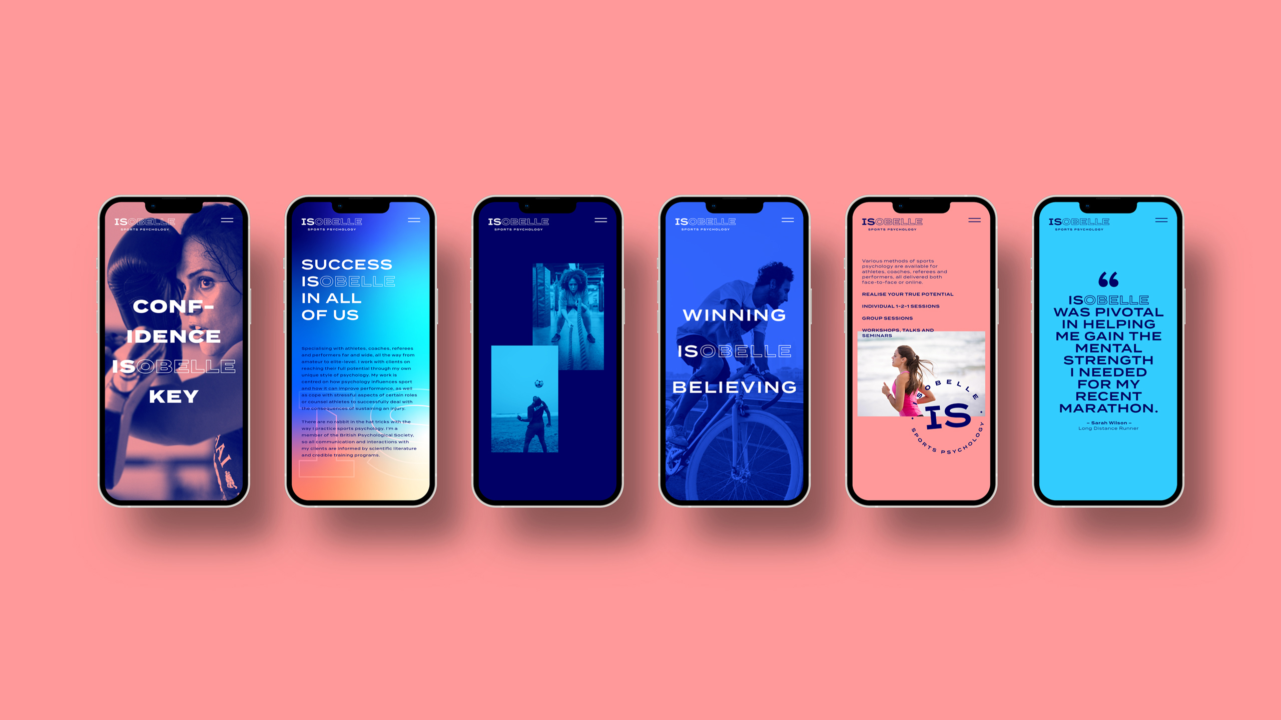
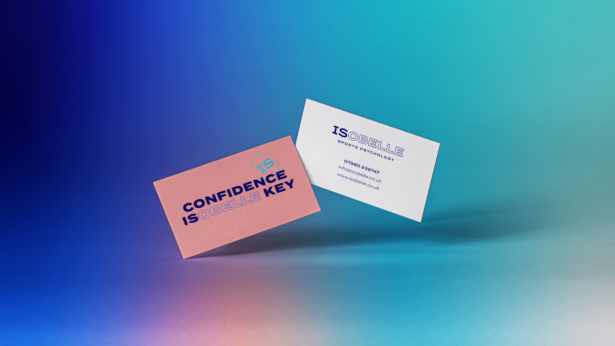
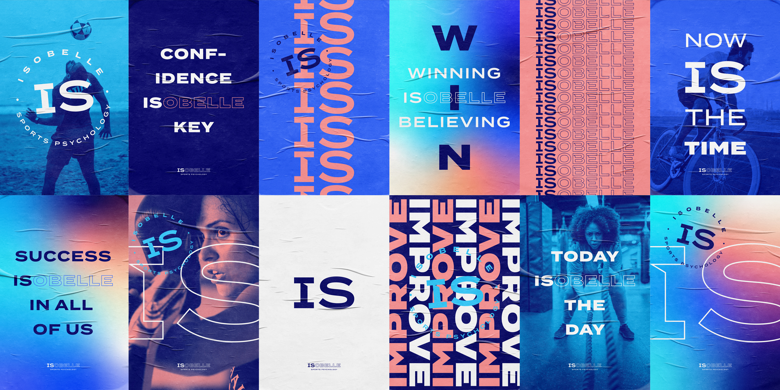
We created a simple, yet thought provoking typographic execution for the brand identity. We highlighted ‘IS’ within Isobelle’s name and used this to great effect by creating a series of mantra style, motivational chants that appear throughout the brand language, giving voice to Isobelle’s positive approach towards sports psychology.
With ‘IS’ being the focus in Isobelle’s name visually, we tweaked the letter ‘I’ to have serifs and a cut to suggest movement, agility and strength. While the ‘S’ remains relaxed, calm and focused to represent a positive mindset. To add a further dimension to the brand language, we also created a roundel version of the identity to support the brand and act as a visual seal of approval.
The typography, imagery, graphics and colours are all contemporary, bold and eye catching. Whilst, the repeated typographic treatment is a further nod towards a motivational mantra. The colour palette, along with the mood gradients and colour washes over imagery, are all designed to indicate the positive effects that Isobelle’s psychology treatment has on her existing and potential clients.