PANAUTIC
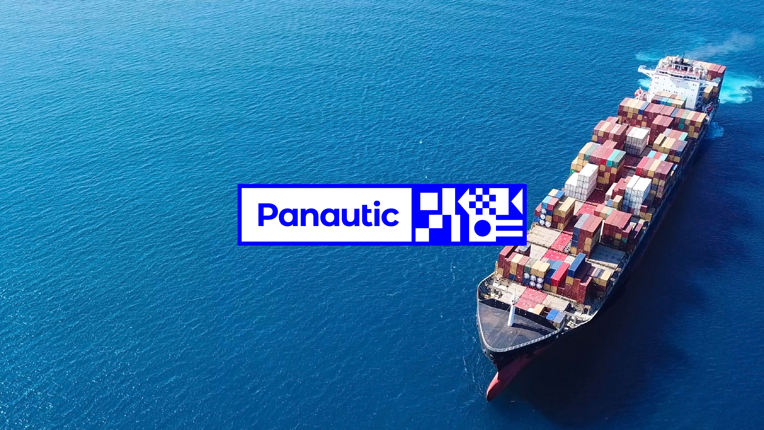
Panautic is a powerhouse in the maritime industry. It unifies key global oceanic partners to create one umbrella, digitally transformative community, within the maritime sector.
THE CHALLENGE
To create a brand that encapsulated the new umbrella group’s purpose and vision. One that can stand-alone and successfully represent each individual, global partner and transcend international language barriers.
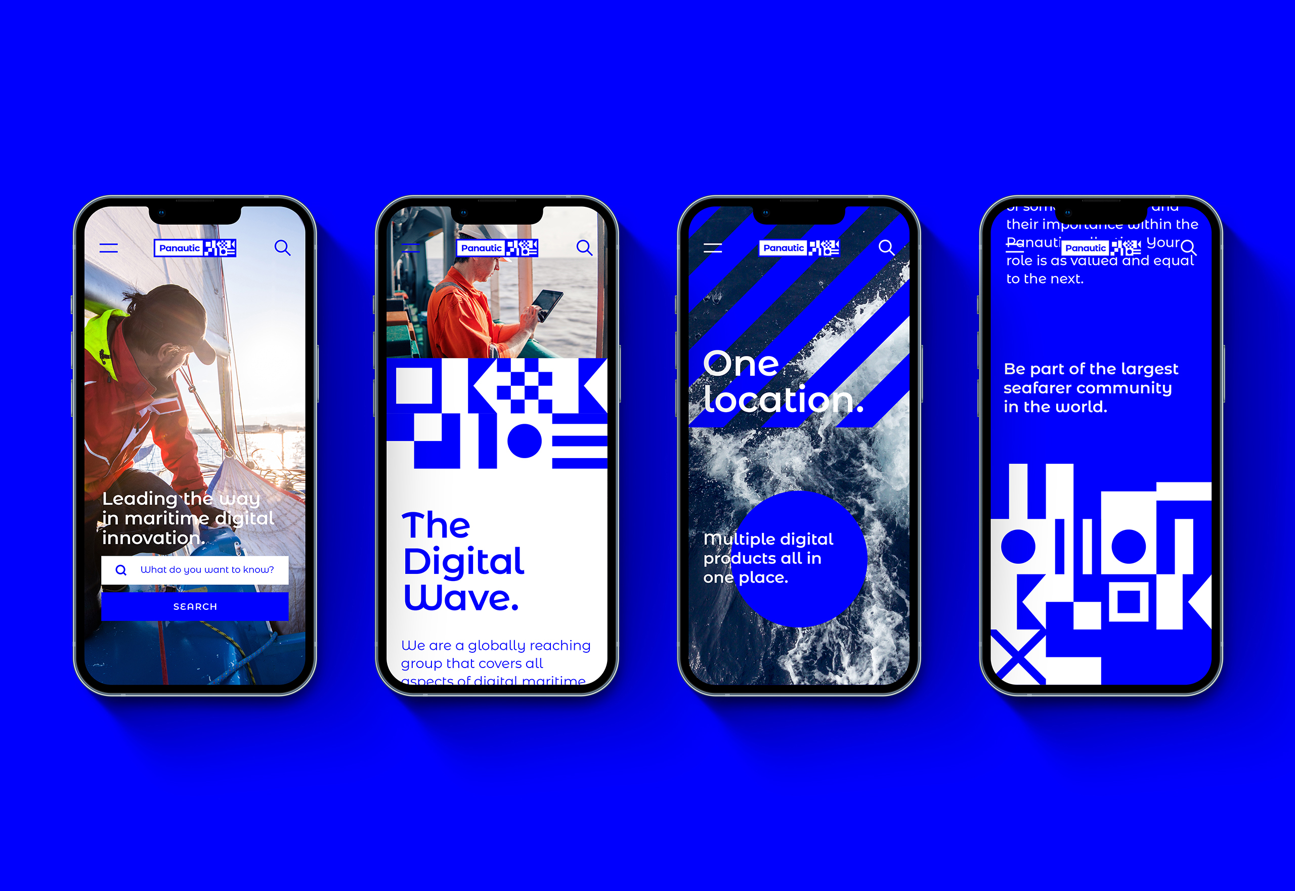
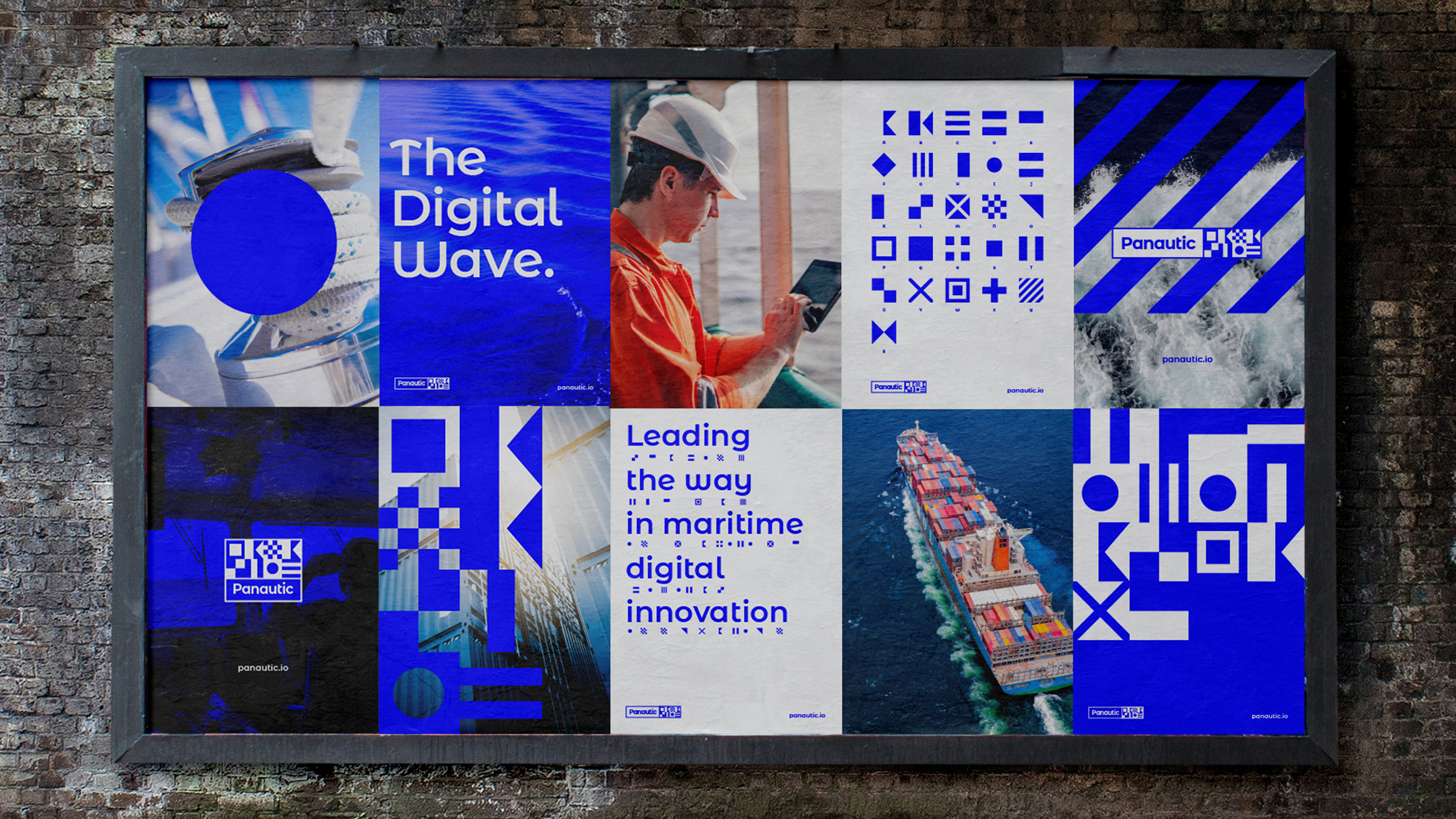
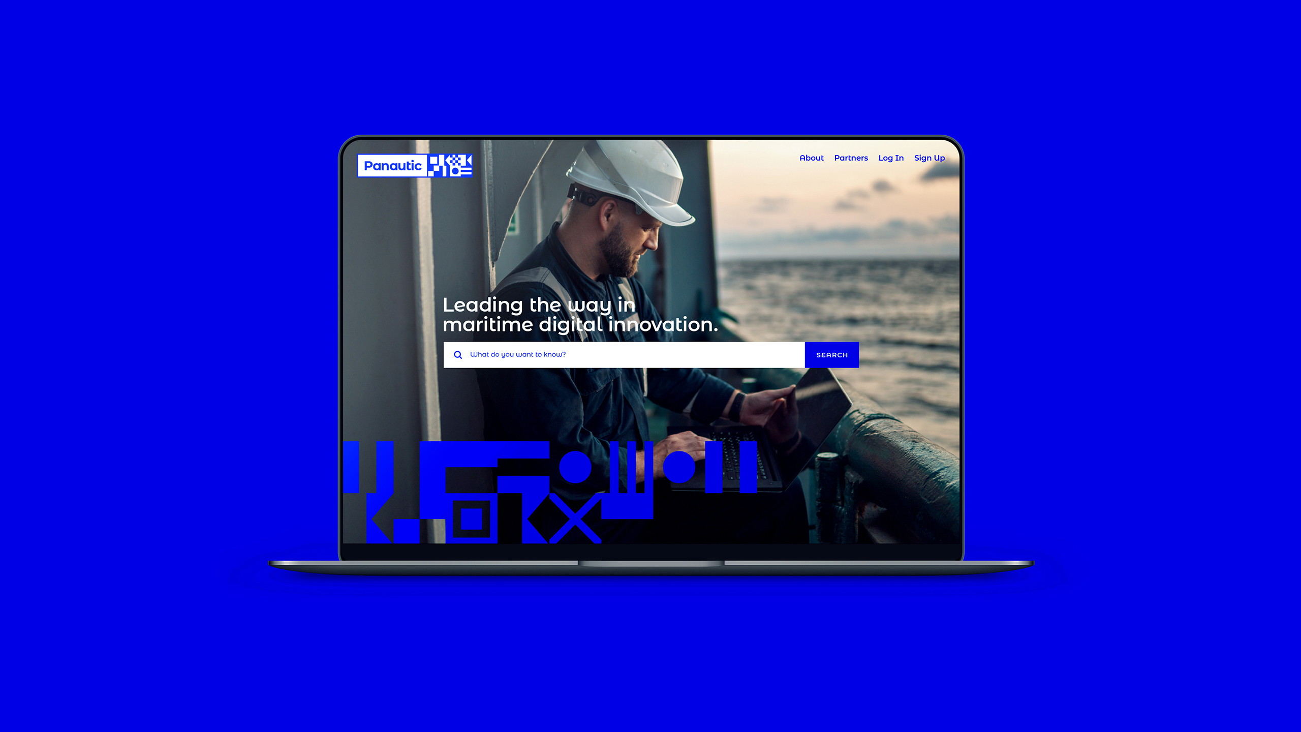
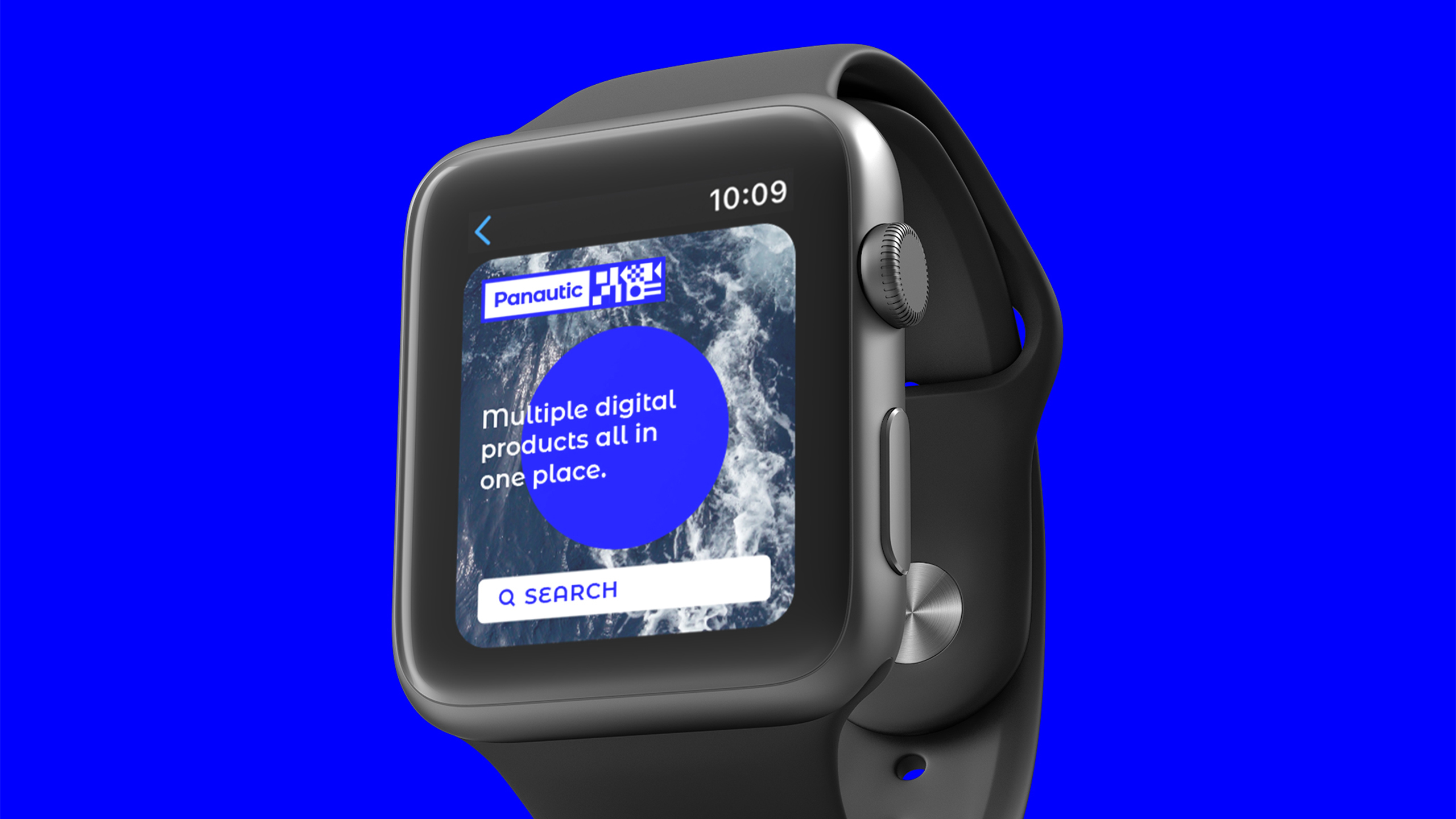
Panautic is a globally reaching group that covers all aspects of digital maritime technology. A powerhouse of the oceanic, digital world. Holding multiple digital maritime products all in one single account. Each member company needed to feel empowered and proud of the new brand, to be a part of something bigger and to feel important within the Panautic collective. That their role is as valued and equal to every other member in the group.
THE SOLUTION
Our process in creating a name for the new umbrella group was based on the concept of a “sum of the parts” company structure. One company facilitating greater growth and development for its members through joint infrastructure and knowledge. Strength in numbers, inclusivity and unification. PAN: Involving all members of the group. NAUTIC: Nautical.
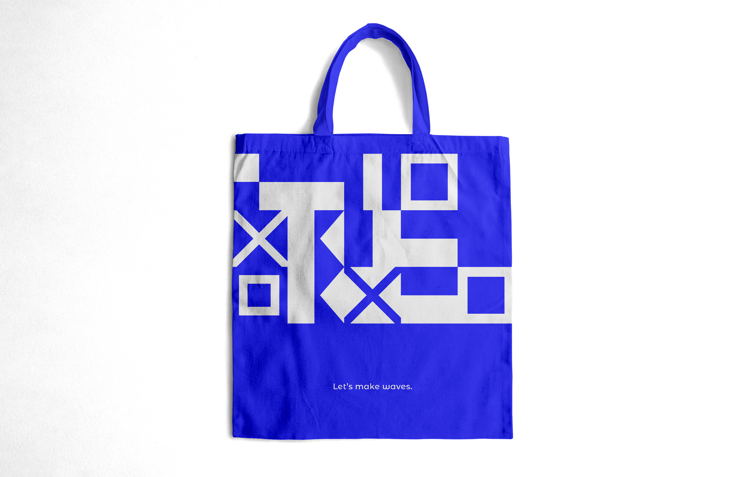
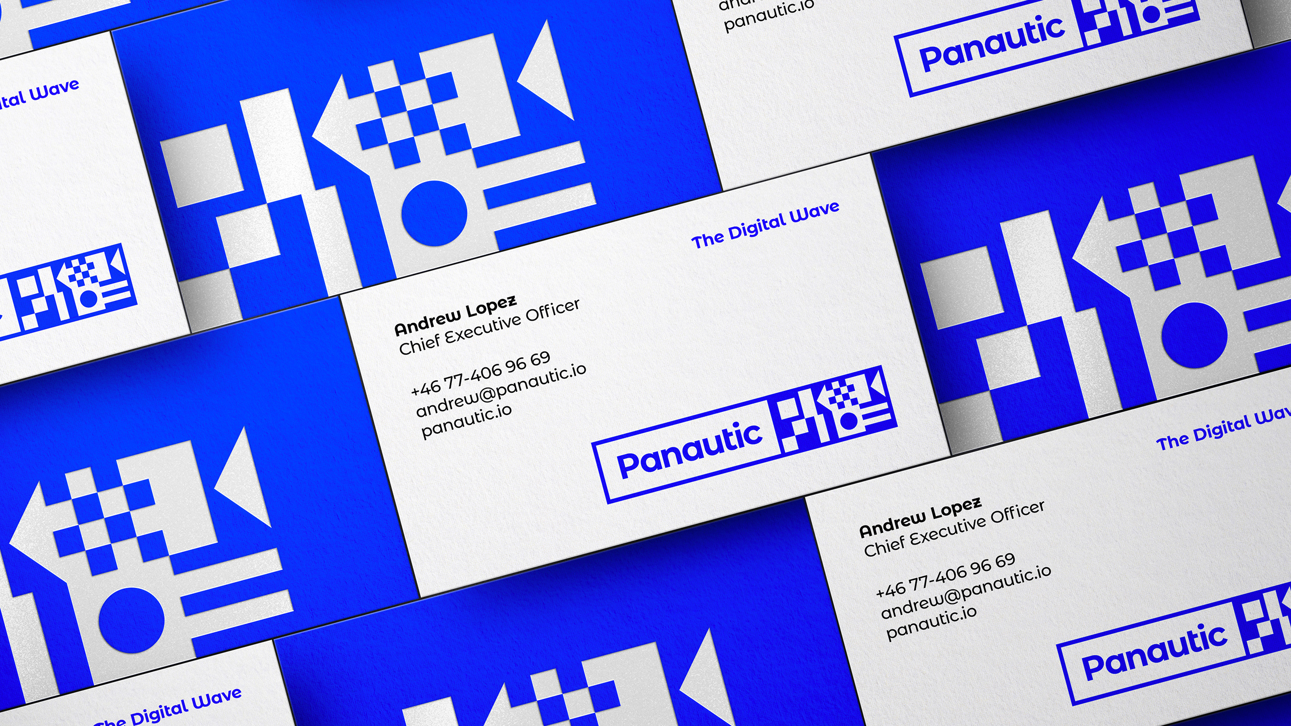
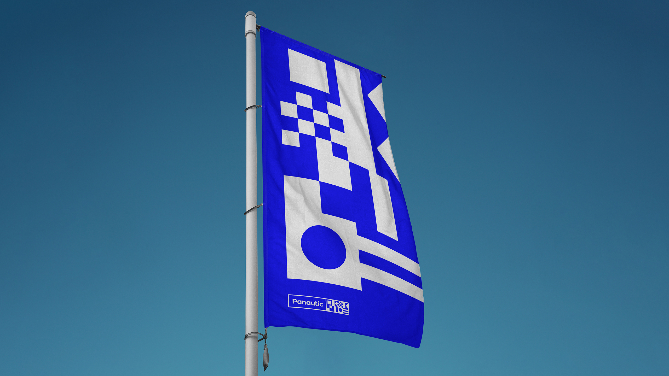
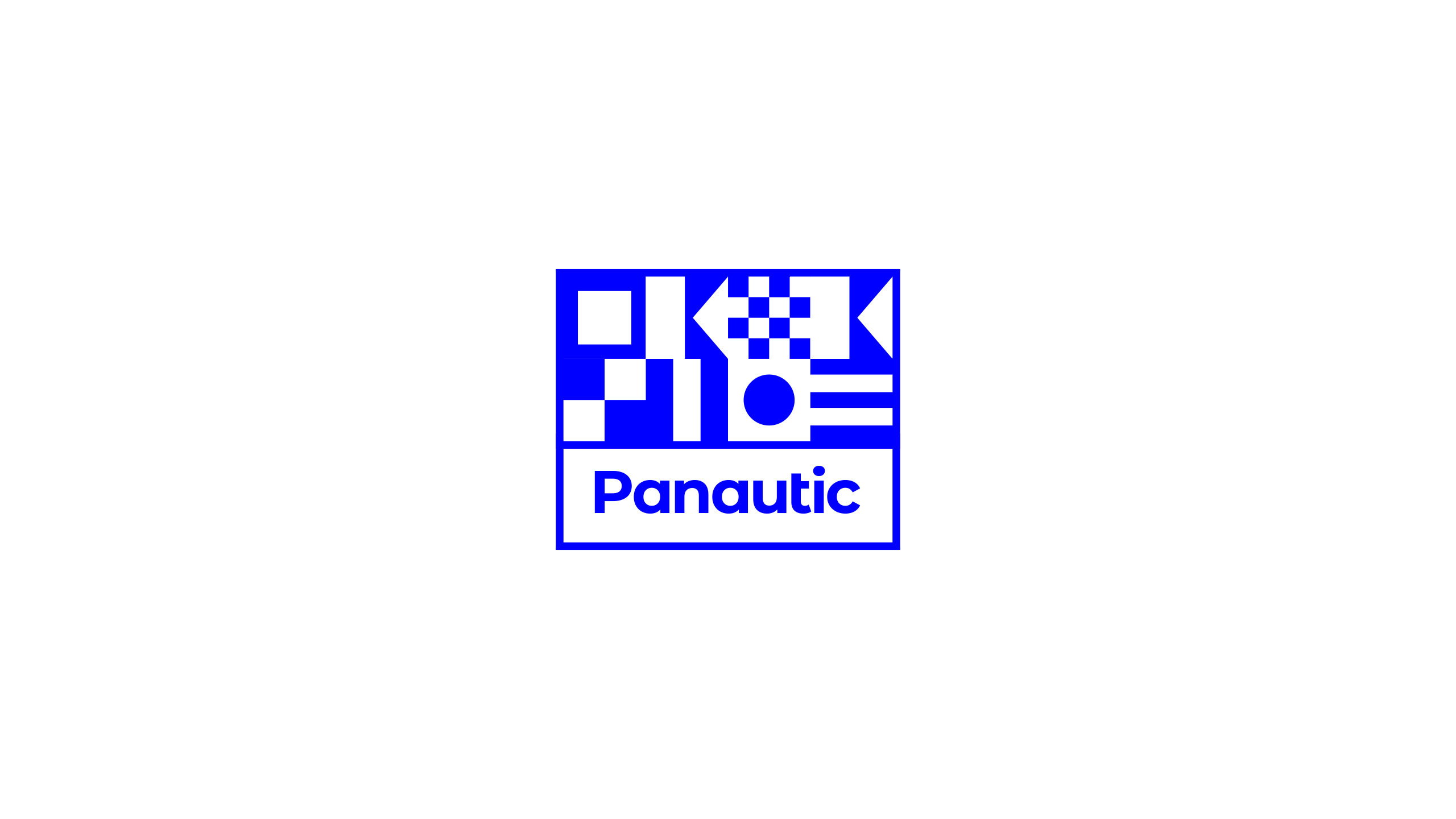
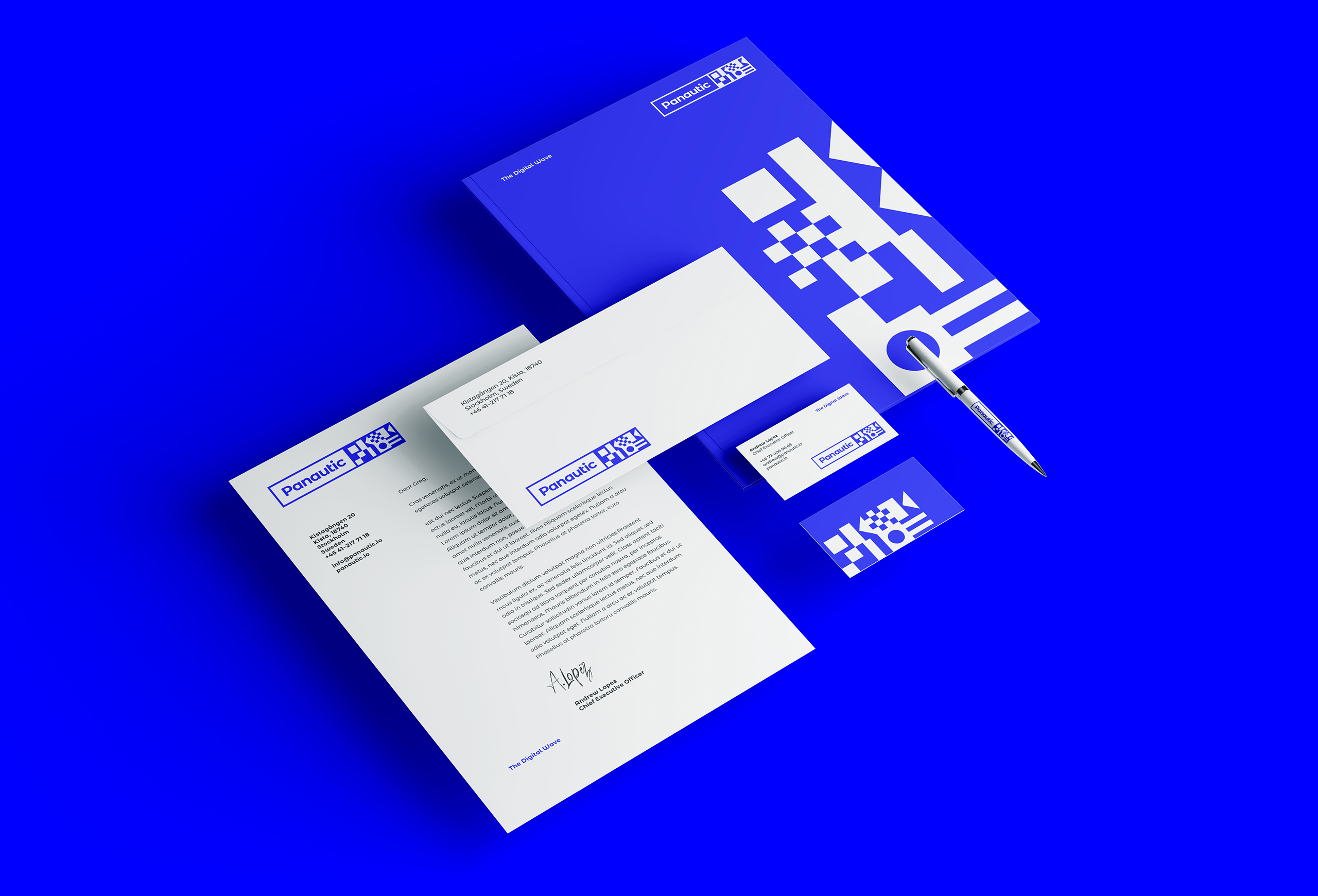
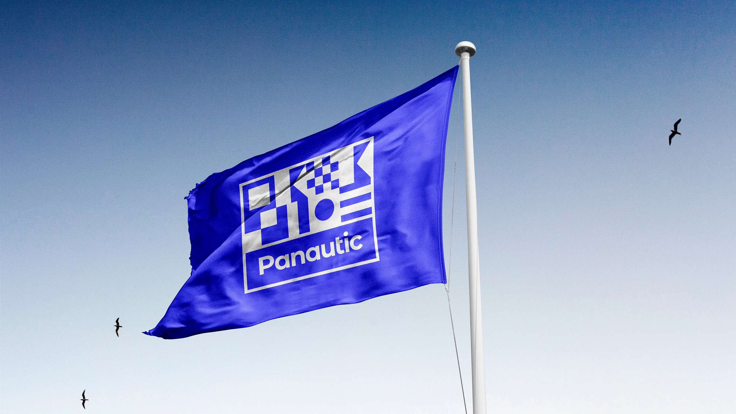
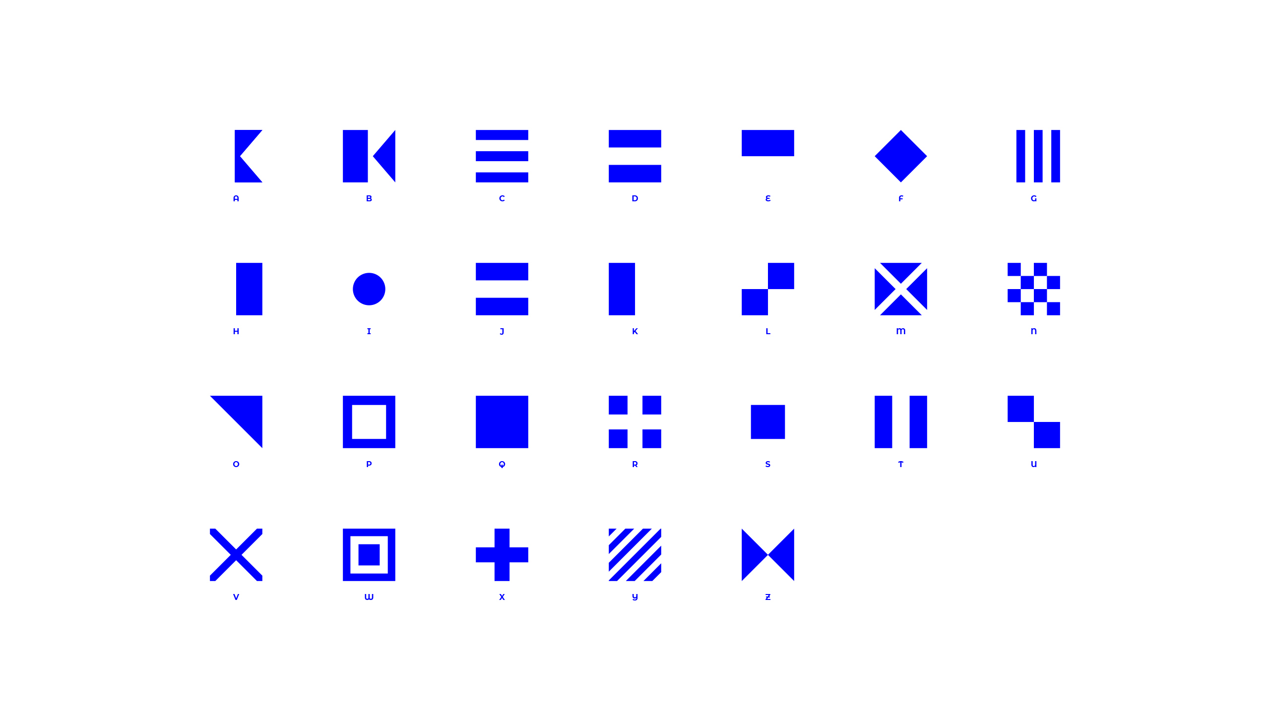
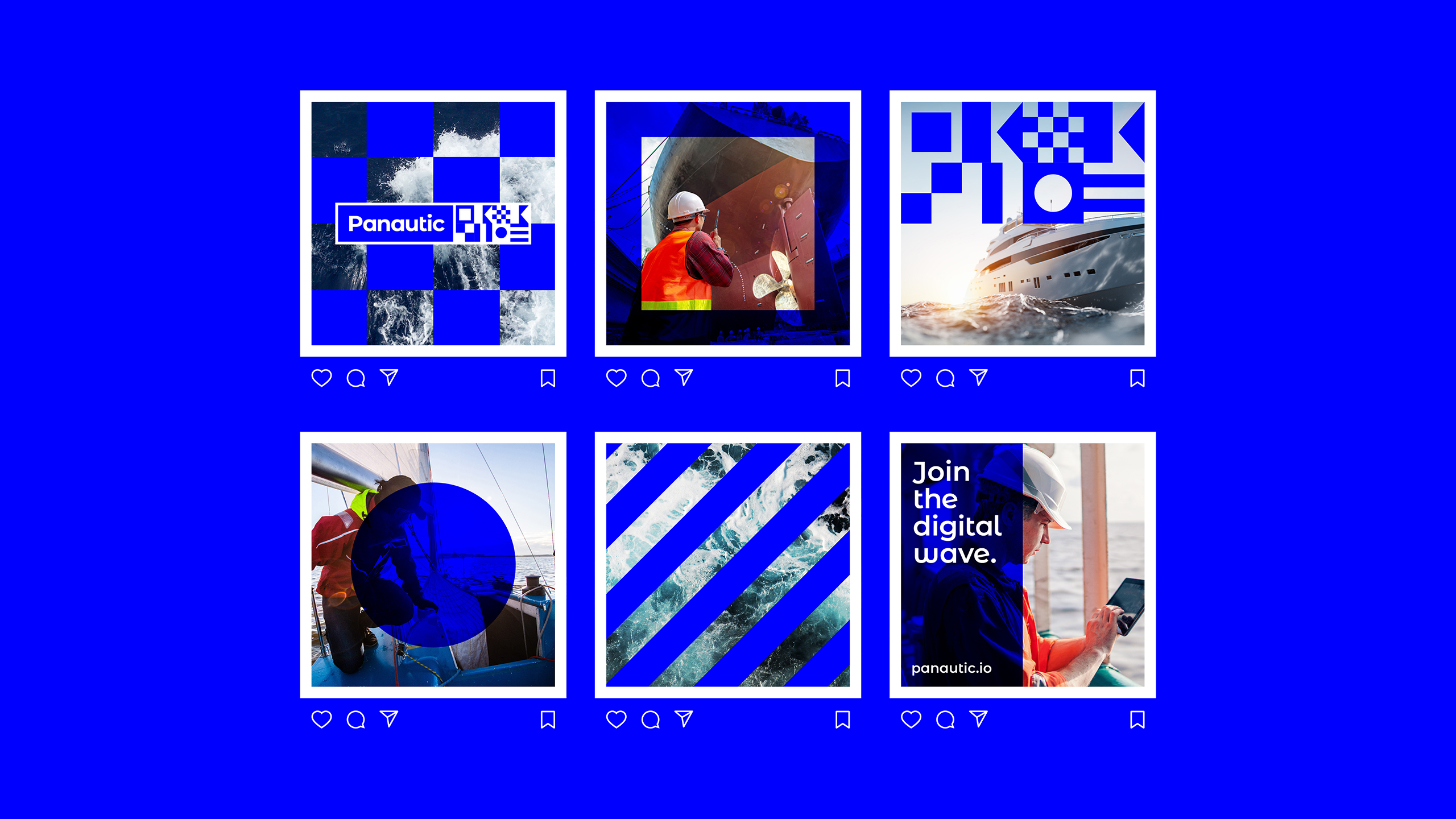
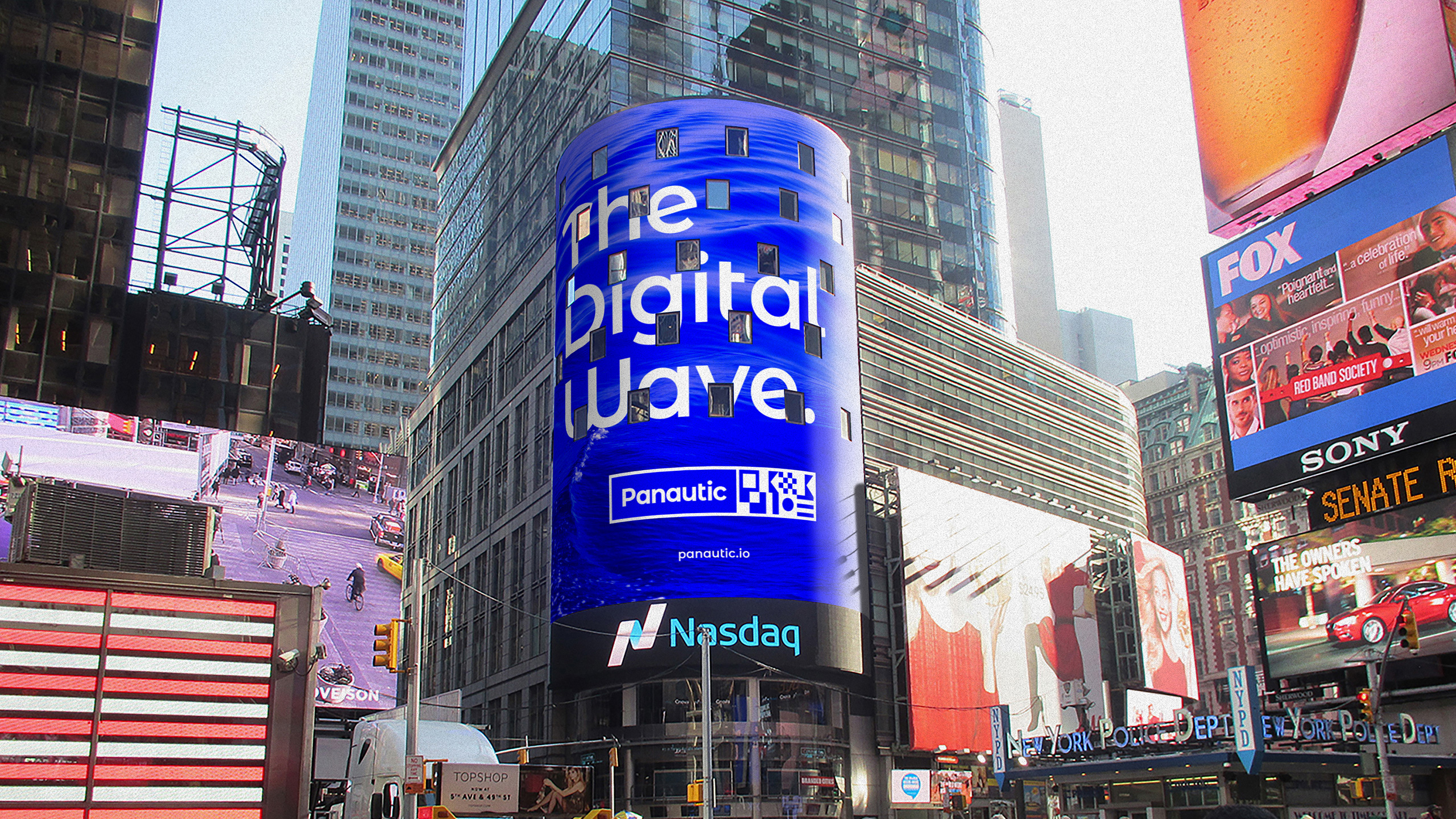
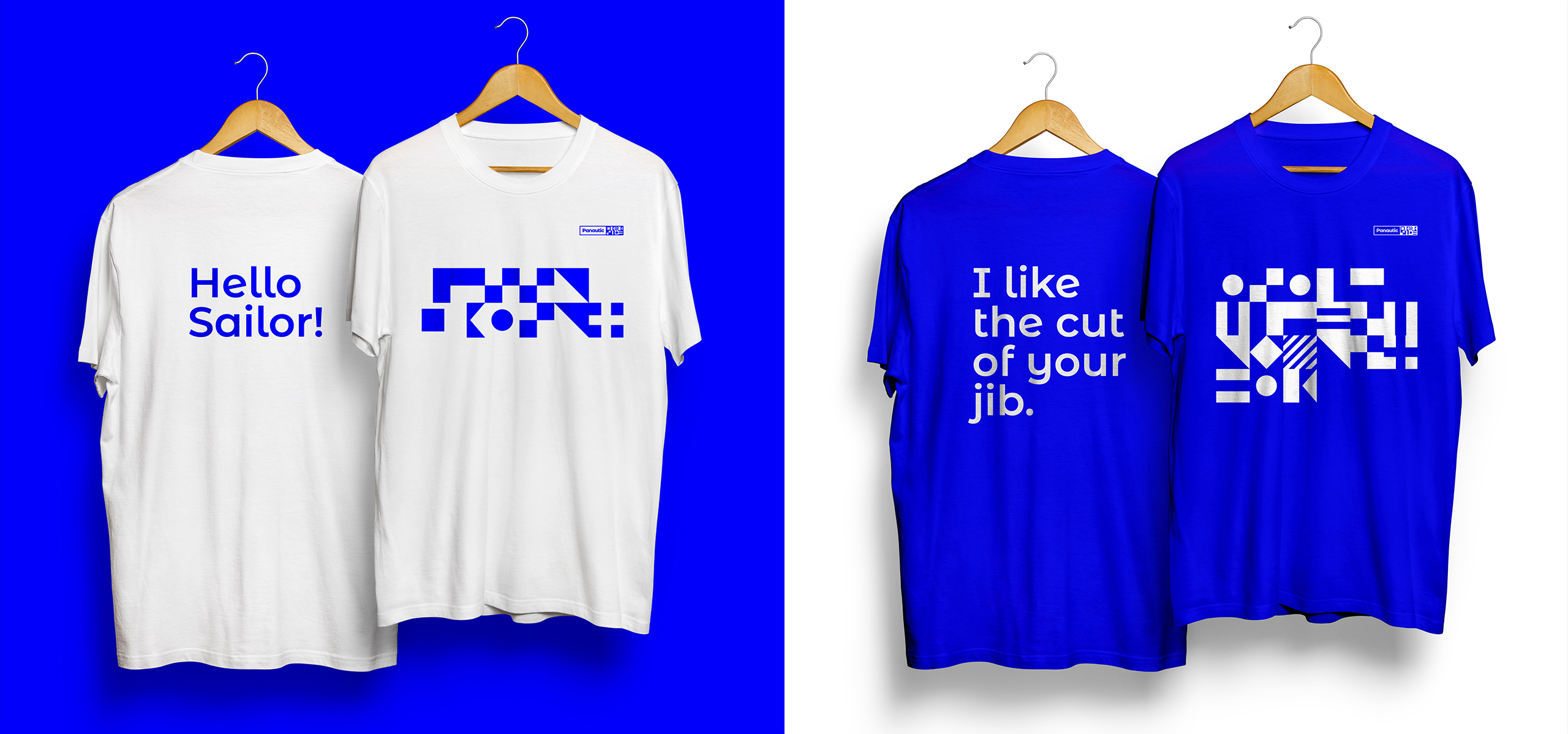
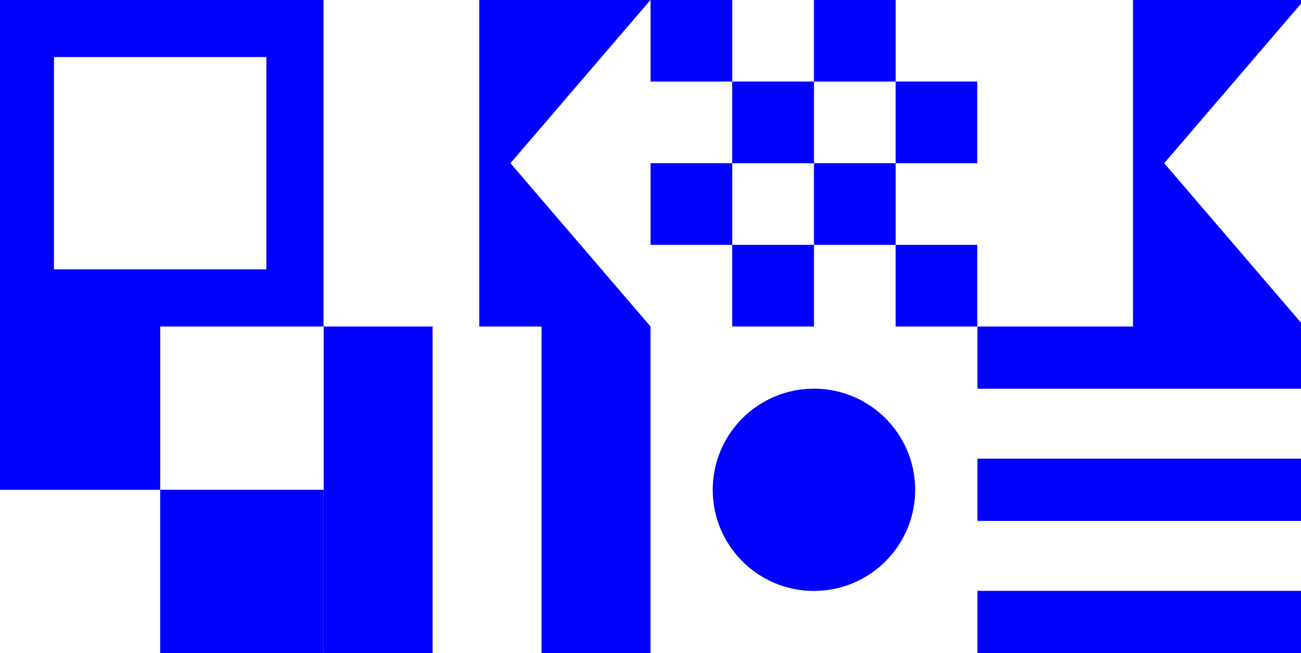
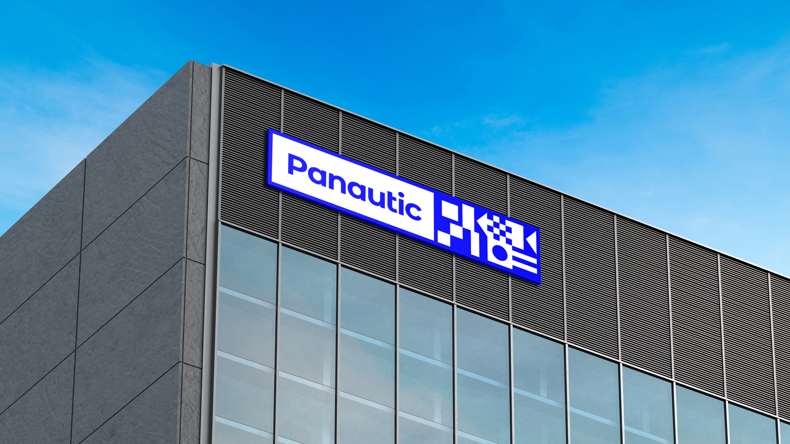
We then created a brand identity that gave a visual conversation to this sentiment, along with unifying maritime symbolism with a digital language. The symbols which are an interpretation of the nautical flag alphabet, spell out ‘Panautic’ in the brand identity. The nautical flags have been adapted in such a way that they have a strong digital presence that enhances the image of Panautic to its global partners and the wider maritime technological community.
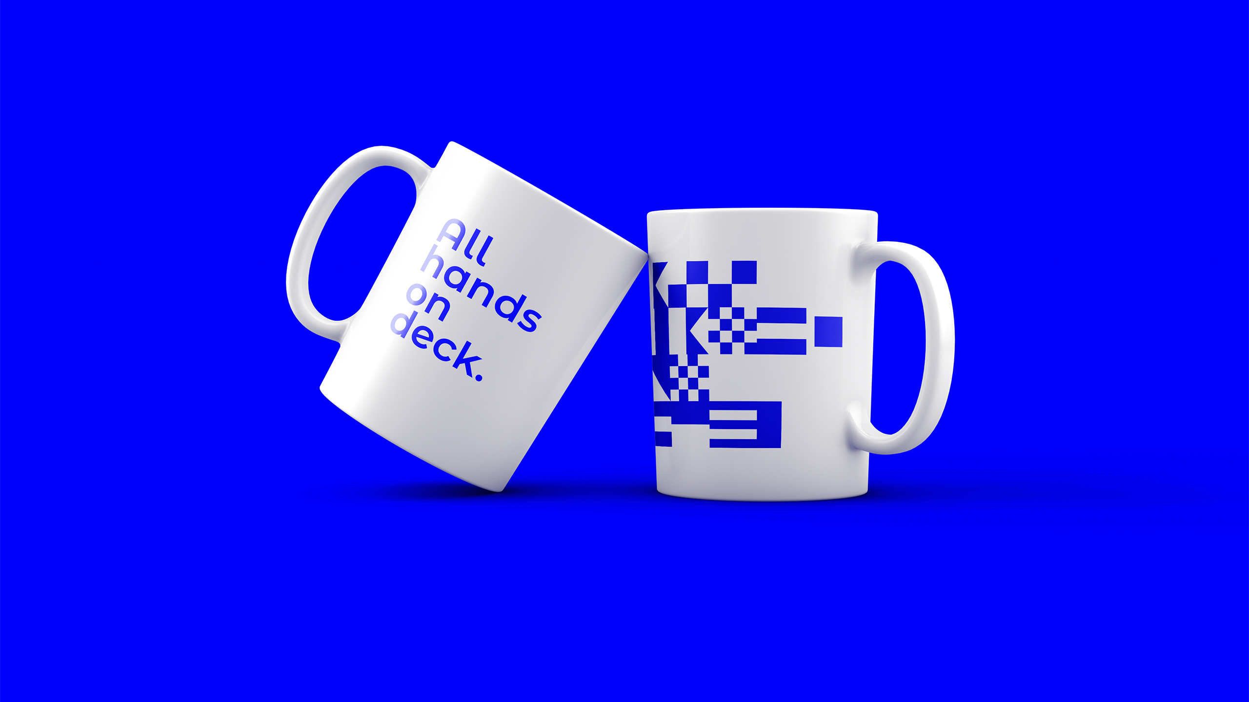
The brand lock-up can flex and change shape with the nautical flags to symbolise each global partner. Along with messaging and signposting, the nautical flag symbols have been used extensively throughout the brand language to give a very contemporary and confident voice that encapsulates the vison and ambition of the entire group. While the colour palette is limited to just white and blue to contrast and yet compliment the strong graphical language of the brand.