Rise at Seven
Rise at Seven are a creative SEO agency, specialising in Technical SEO, Content Marketing and Digital PR. Since their launch in 2019, the company has rapidly acquired an impressive list of clients including, Halfords, Matalan, Missguided, Game and Odeon.
THE CHALLENGE
As a new player entering a crowded and hugely competitive digital market, Rise at Seven needed a brand identity to match their bold start-up mission: ‘To pitch the biggest ideas, to the biggest brands, and the biggest media outlets against the biggest agencies and be confident of success.’ Our brief was to create something simple, clean, uplifting and fresh to capture the spirit of Rise at Seven’s confident and assertive attitude.
The Solution
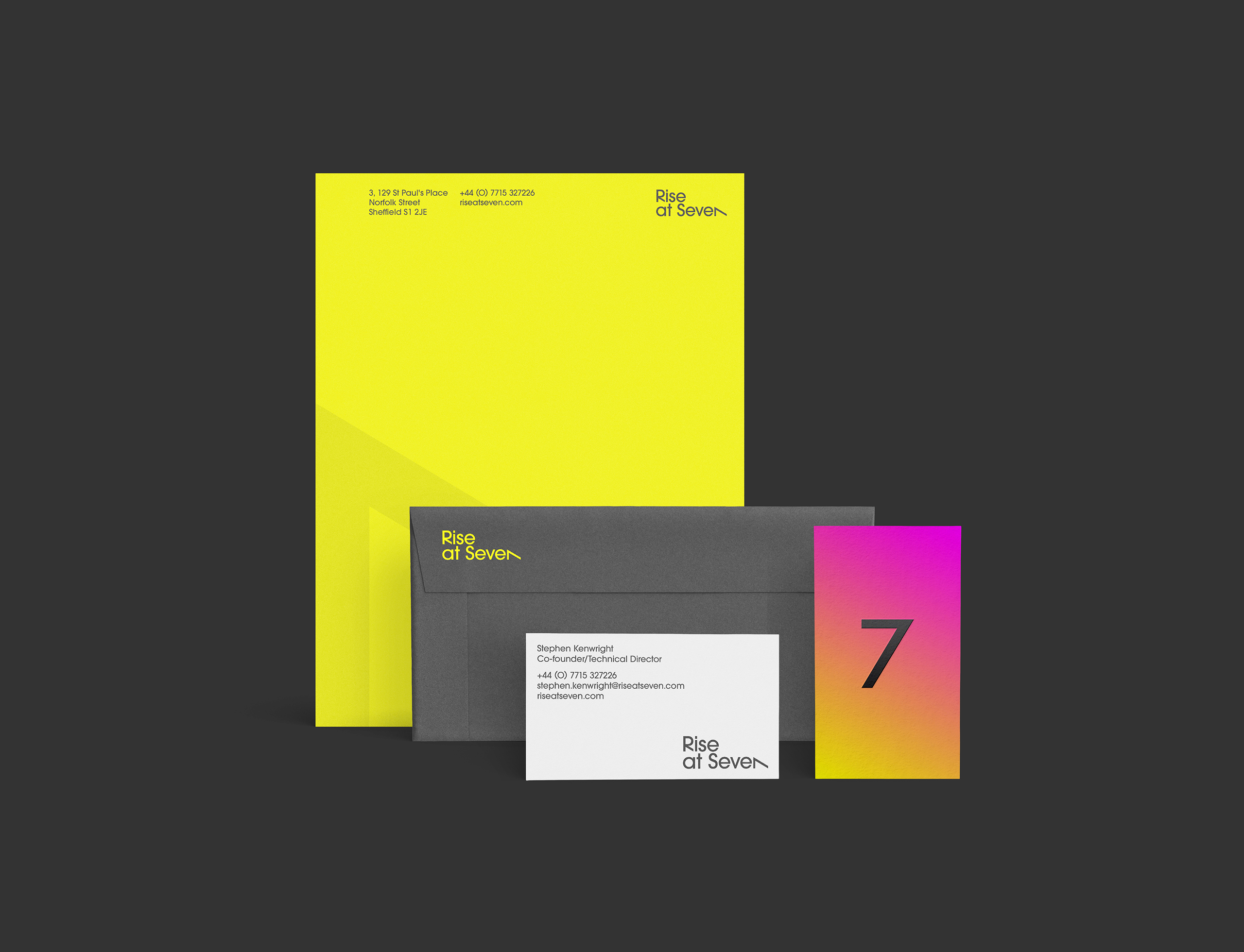
Brand Identity
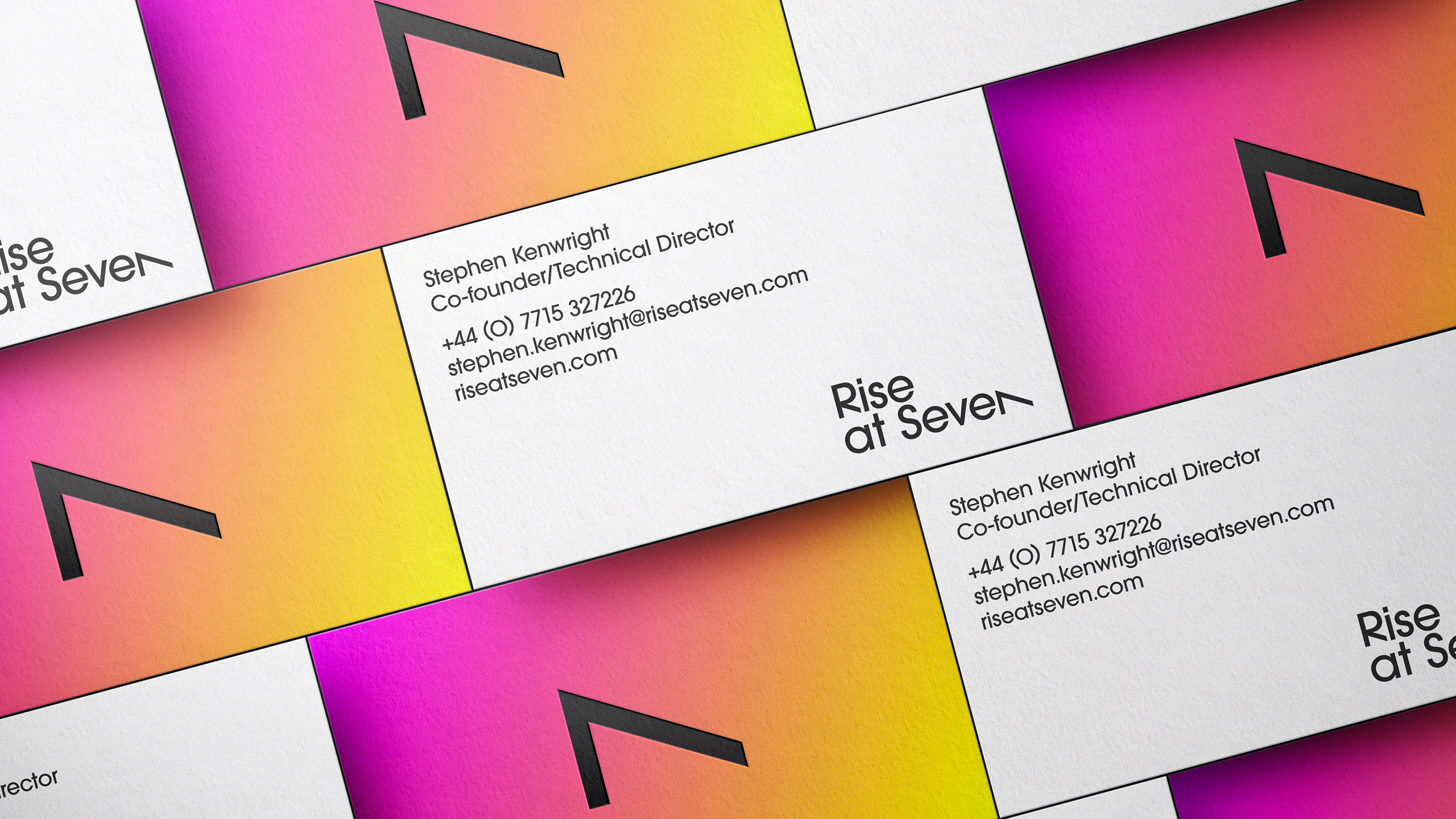
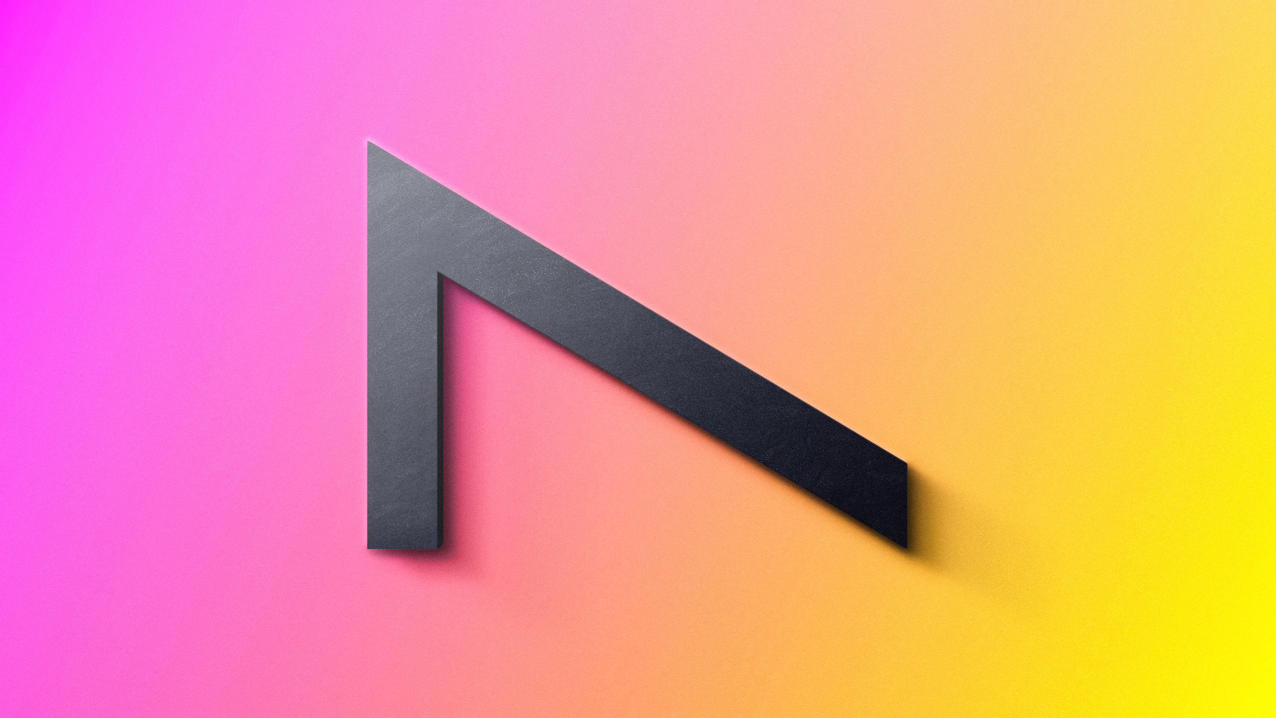
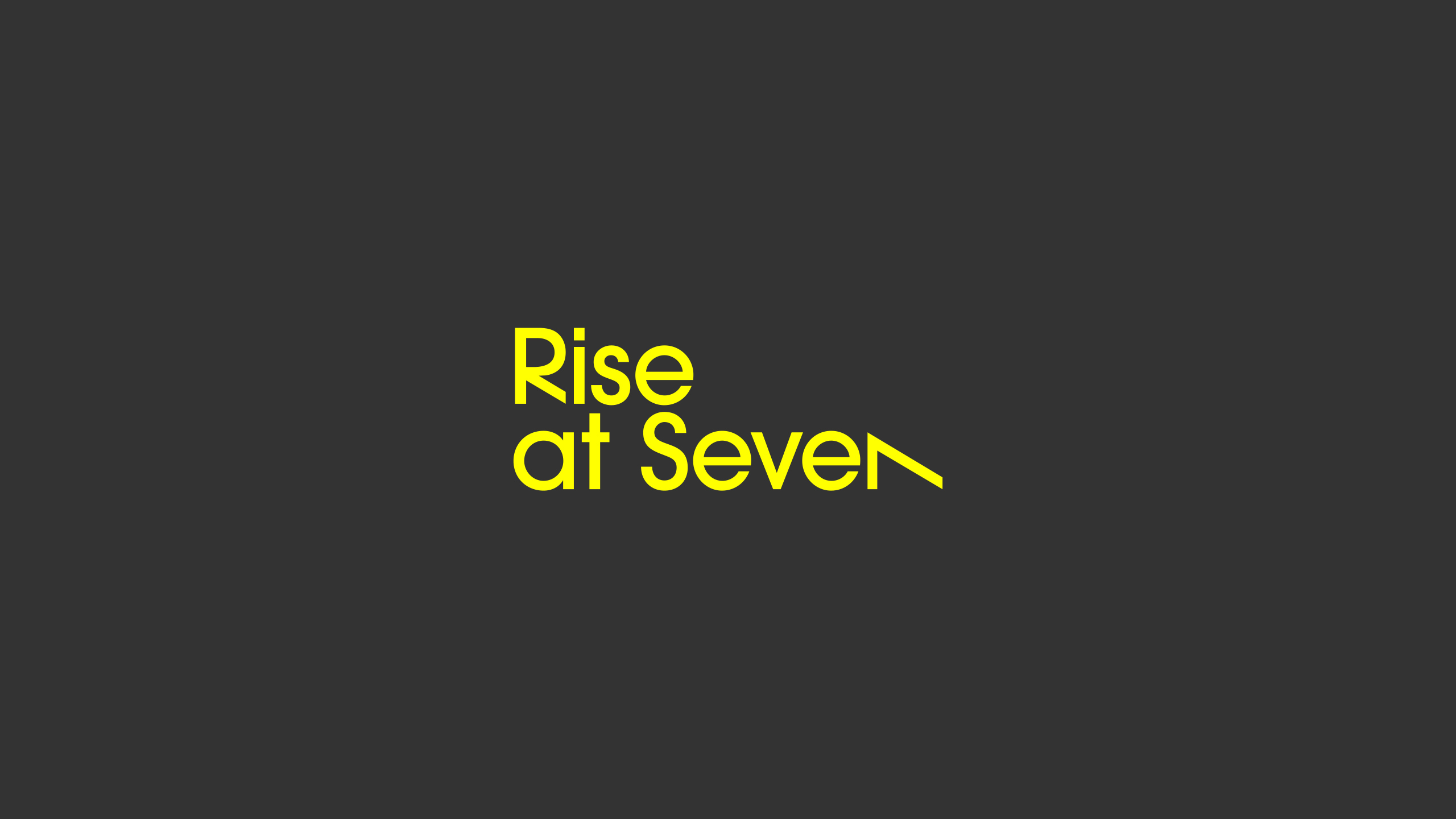
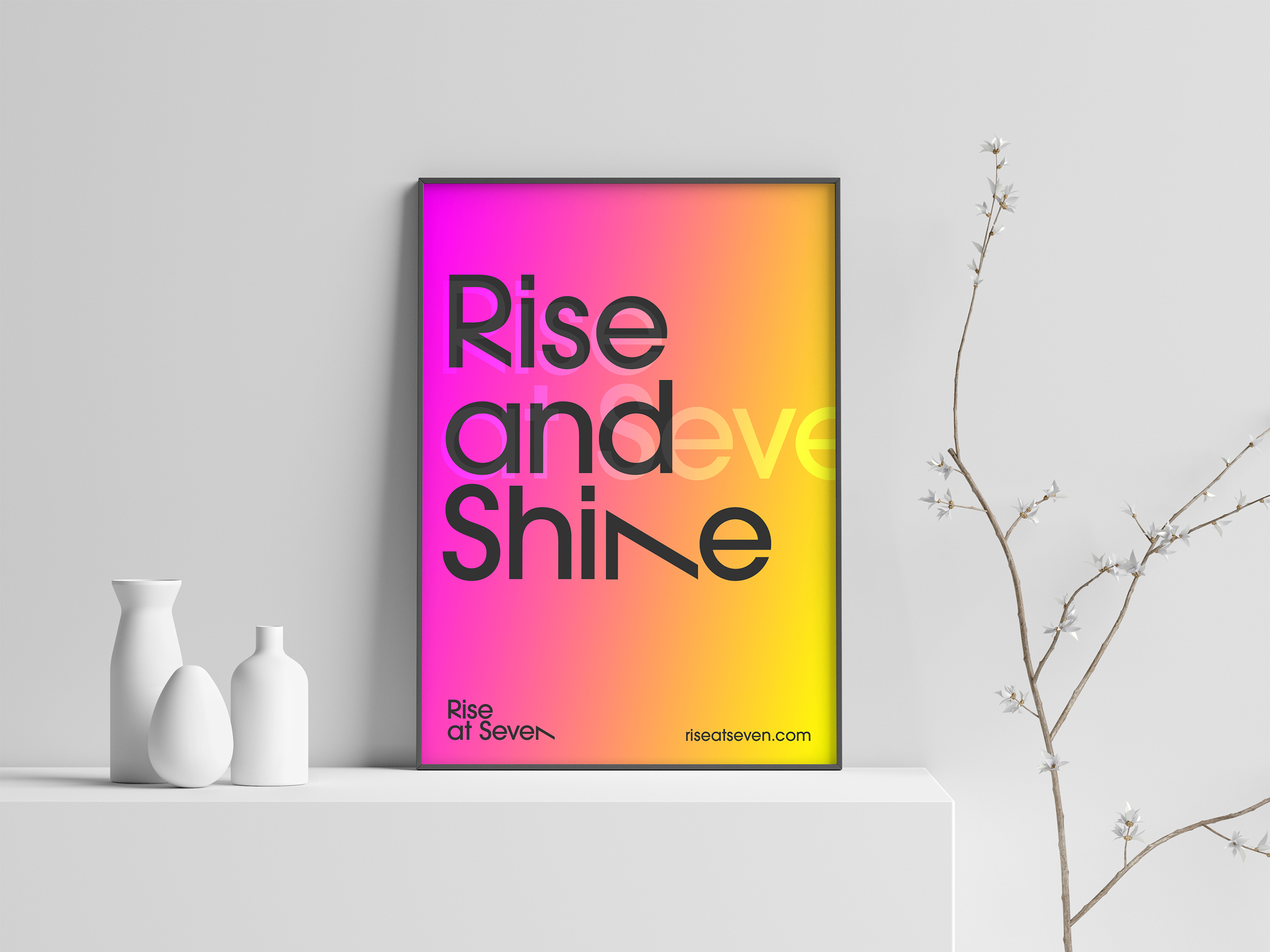
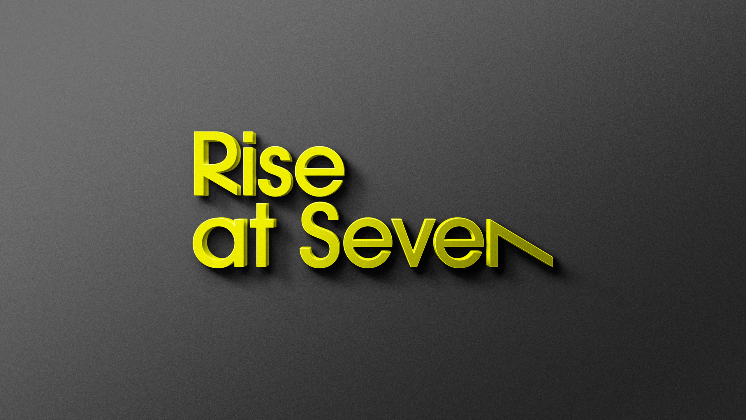
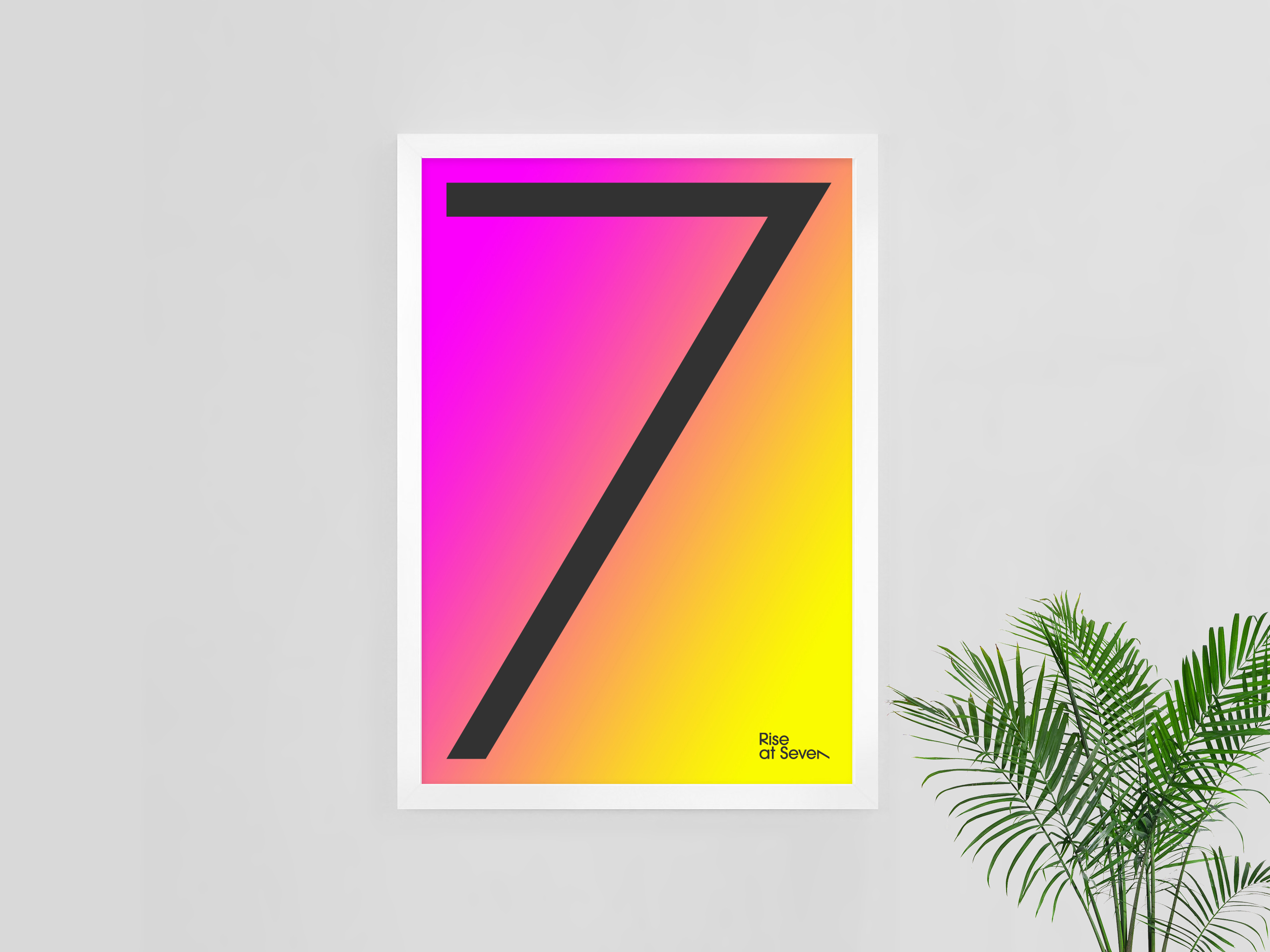
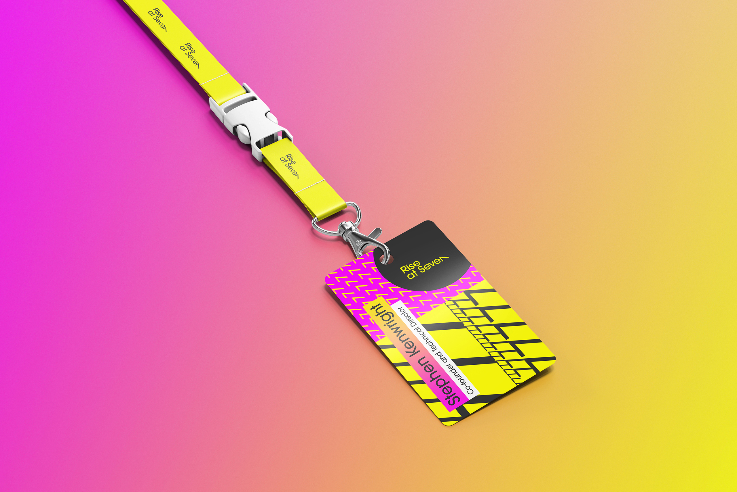
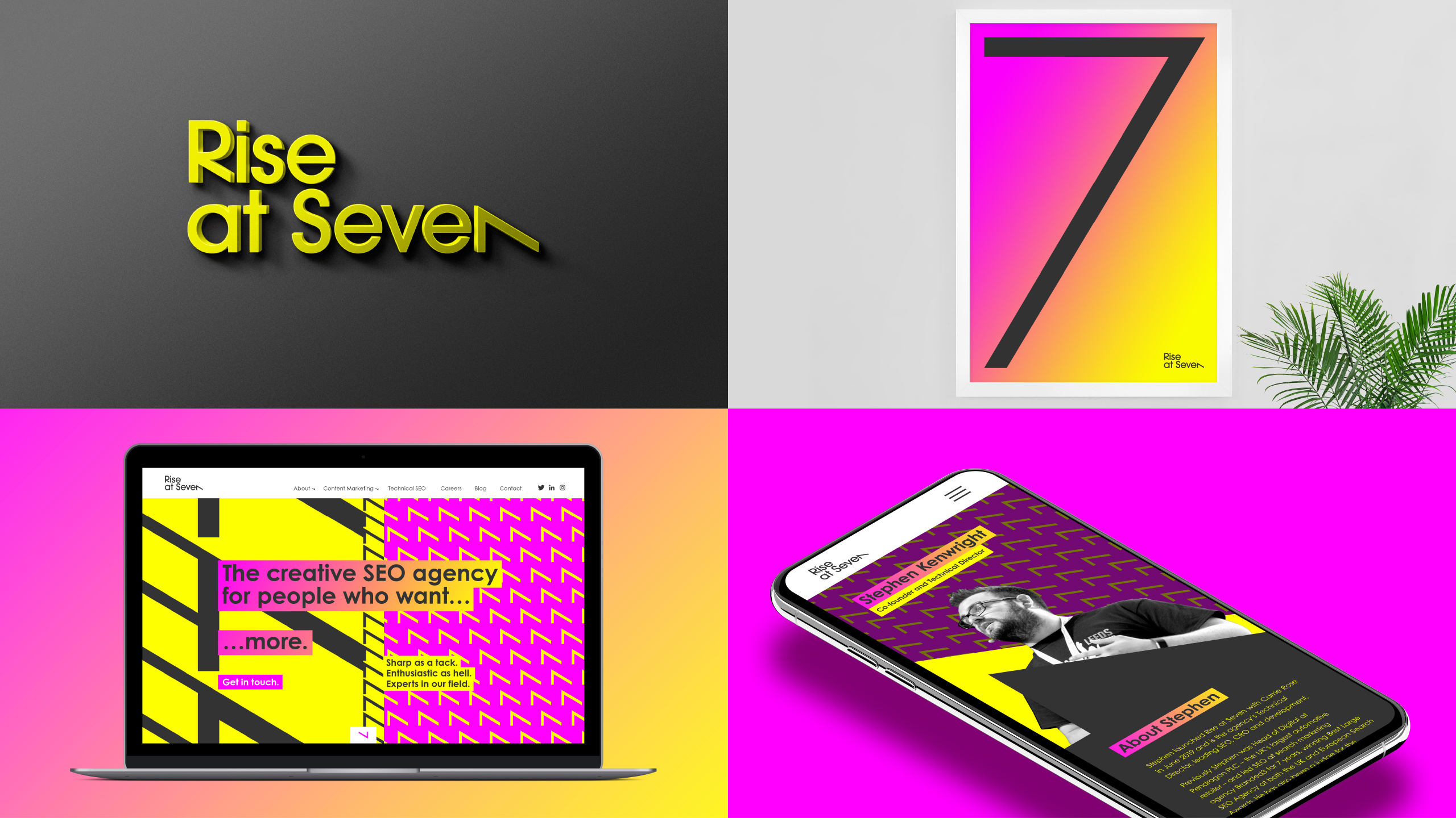
A simple but striking typographic execution for the logo supports the name and brand ethos of Rise at Seven. Two features within the logotype create that ‘smile in the mind’. The first has the word ‘Rise’ elevating above ‘at Seven’ and the second is the number 7 laying down on its side (in place of the ’n’ in seven) ready to rise and start the day, full of positivity and enthusiasm.
THE SOLUTION
Brand Language
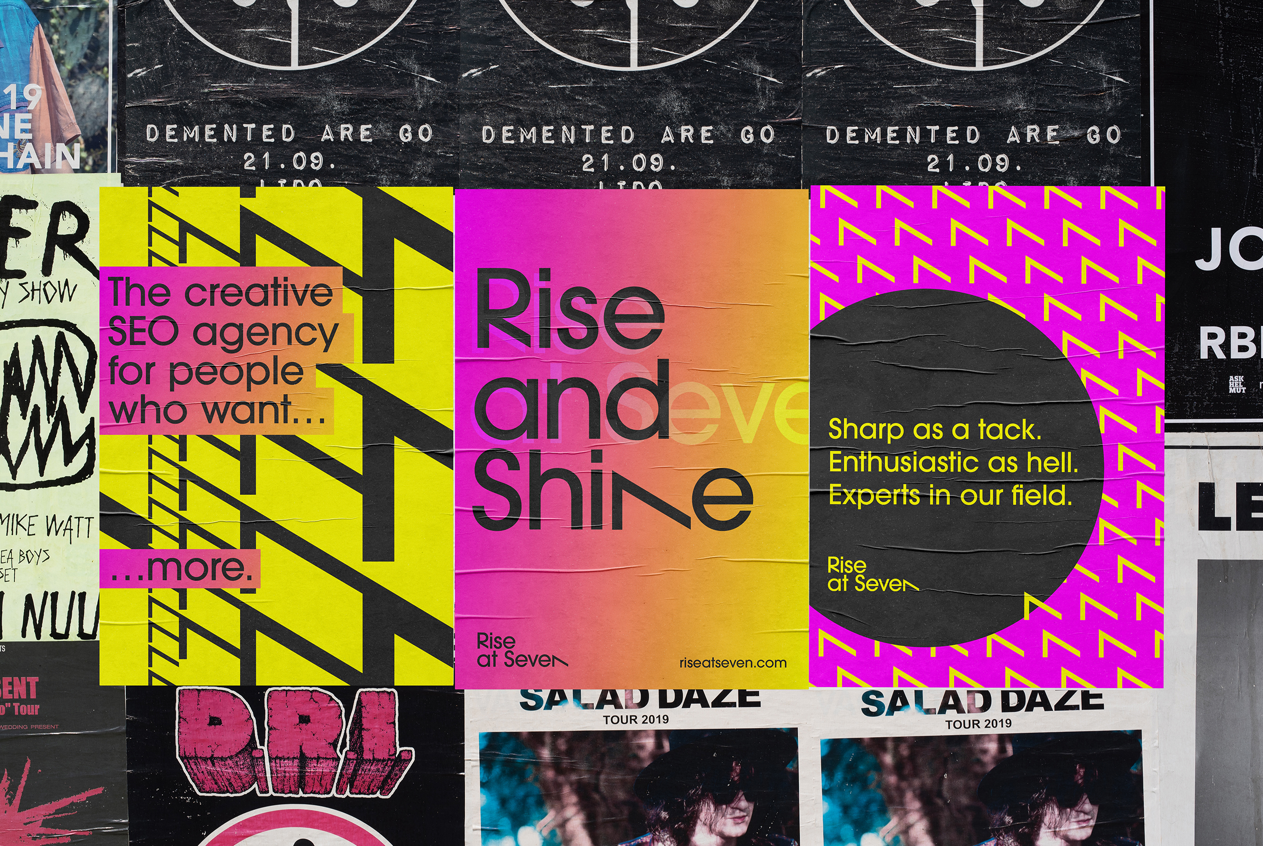
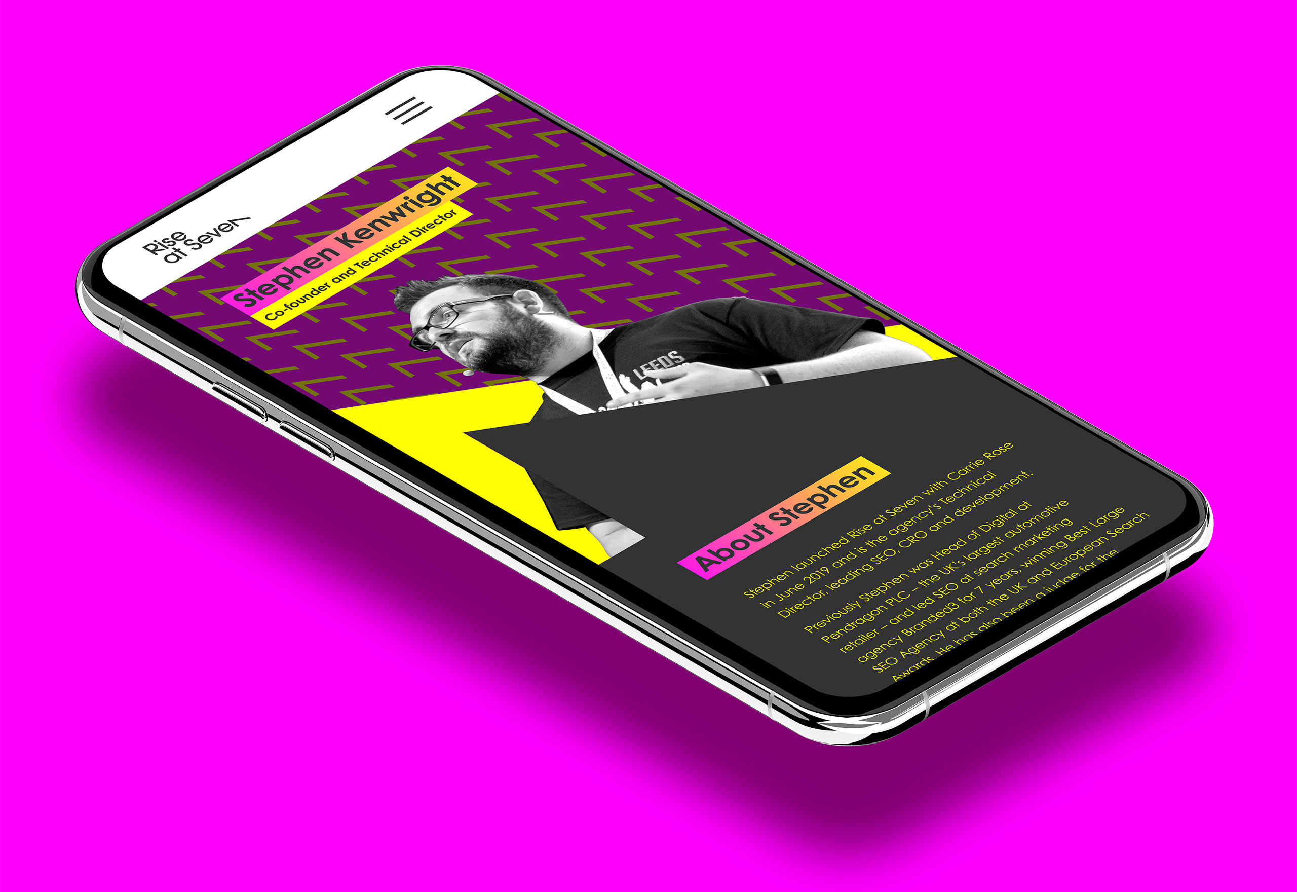
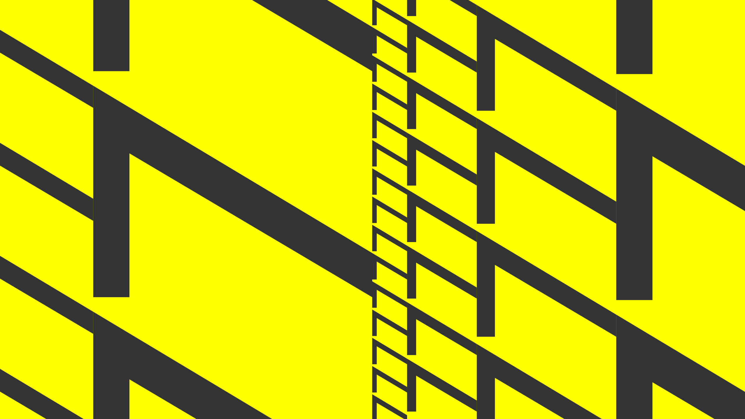
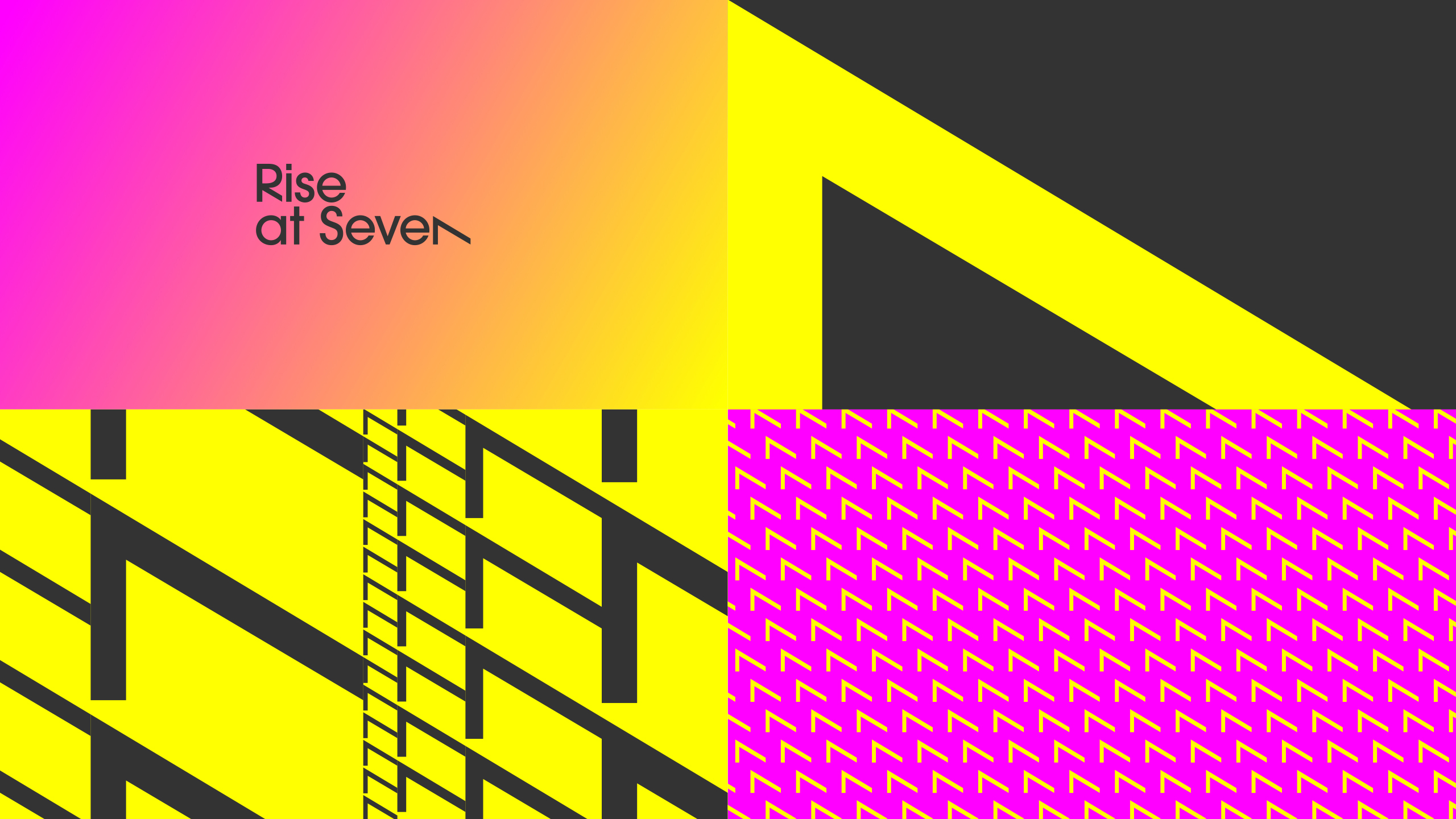
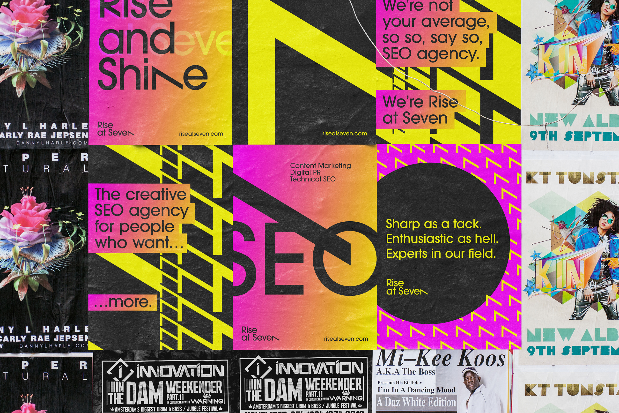
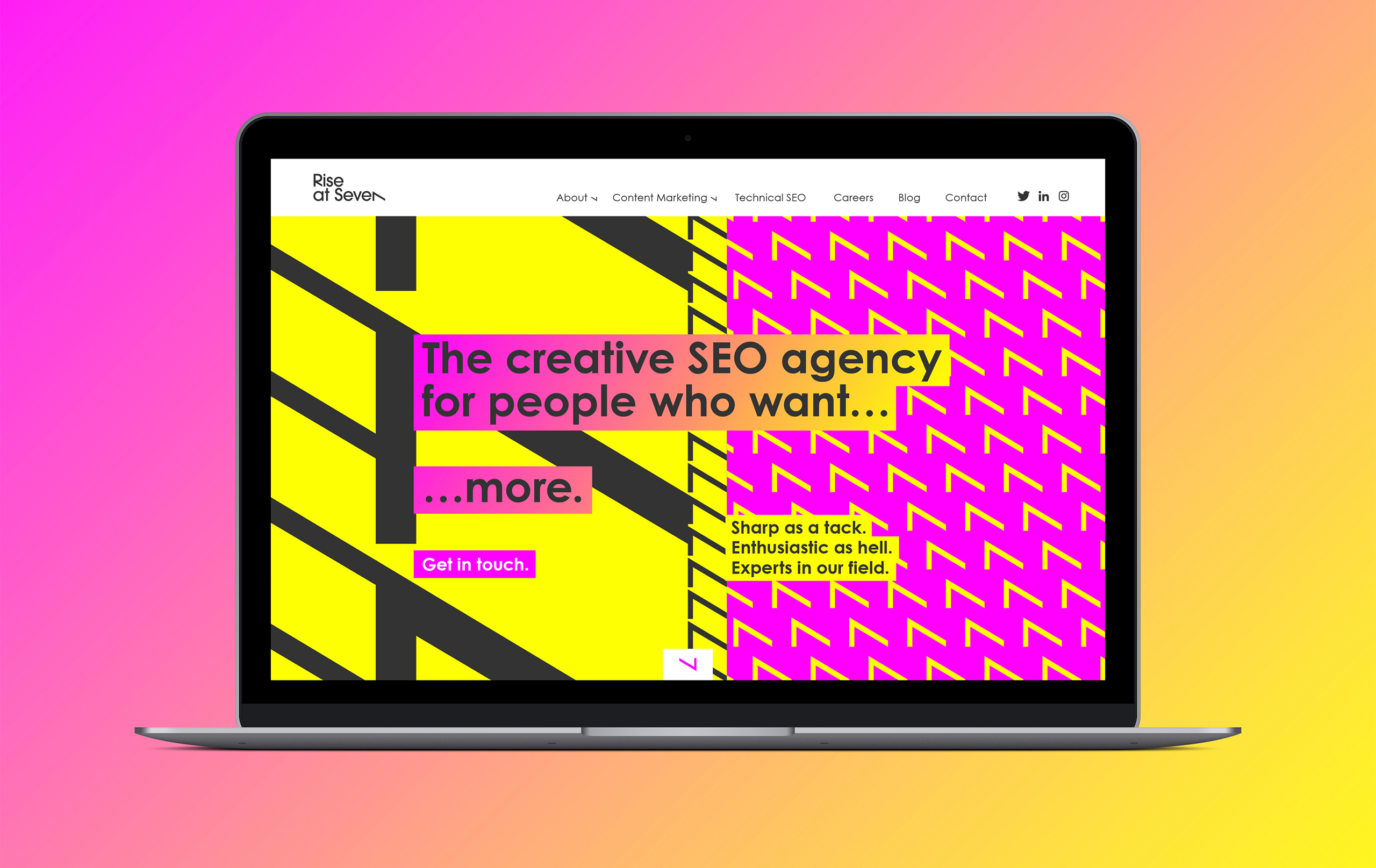
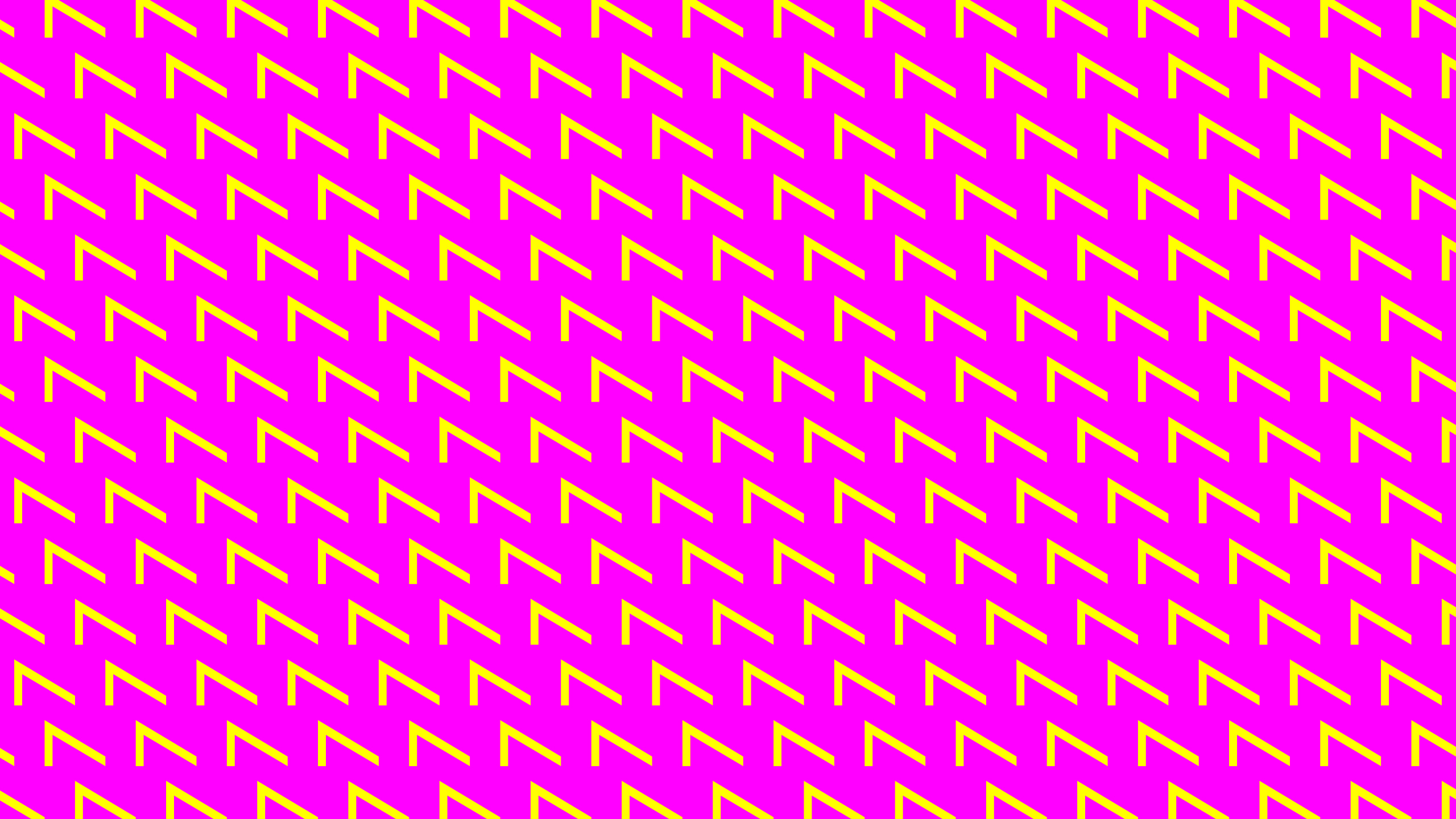
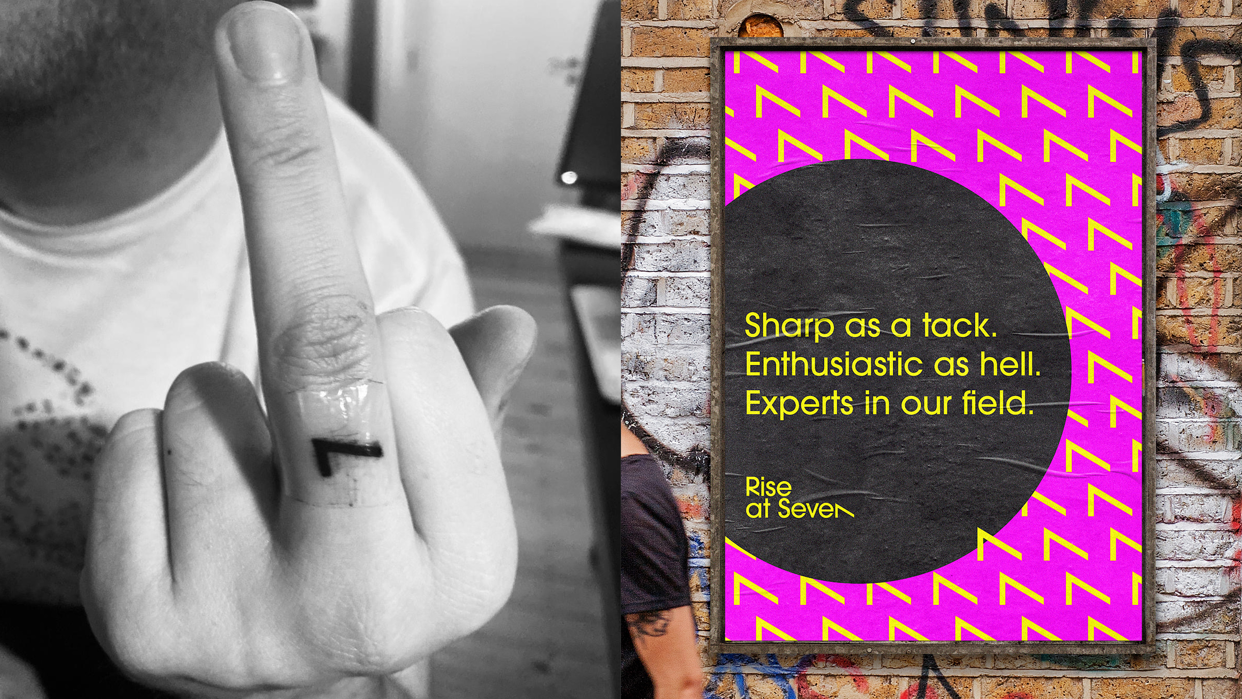
As ‘7’ is the focus in the name literally and visually, it’s used as a graphic device to extend the brand presence as a visual symbol, either on its own or as part of a digital data pattern. The look and feel of the brand language takes a lead from Rise at Seven’s brand values: Sharp as a tack, enthusiastic as hell and experts in our field.
The graphics, colours and use of typography are contemporary, bold and attention-grabbing. The graphics are (fittingly) a wake-up call and stand out from the crowd of other full-service SEO companies.
Rise at Seven are the new kids on the block, making a big impact from the get-go. The in-your-face nature of the brand language reflects this and Rise at Seven's vision of being a highly creative and highly effective SEO agency.